INSTALLATION GUIDE – PREMIUM
Add ‘PrintXpand’ app in your store
To add PrintXpand app in your store follow the below steps:
Step-1: Go to the Shopify app store page and search the “Tshirt & Product Designer” app.
Step-2: Complete the process by clicking the Add app.
Theme Changes
To customize theme files, follow the below steps:
Step-1: From “Shopify Admin”, select Online Store.
Step-2: Duplicate themes to create a backup copy.
Step-3: Select Actions > Edit code.
Add Snippet/Asset Files
Once app successfully added to the store, all the required snippets and assets are automatically added to the active theme.
Snippet
Under “Snippets”, find these files:
➔ PrintXpand-cart.liquid
➔ PrintXpand-product.liquid
➔ PrintXpand-custom-login.liquid
For any that don’t exist:
Step-1: Select Add a new snippet.
Step-2: Enter the correct snippet name in the “Create a new snippet called” field.
Step-3: Select Create snippet.
Step-4: Copy and paste the code found in each of these links into their respective files:
➔ PrintXpand-custom-login.liquid
Step-5: Select Save.
Asset
Under “Assets”, find these files:
➔ PrintXpand-standalone.css
➔ jquery-1.10.2.min.js
For any that don’t exist:
Step-1: Select Add a new asset.
Step-2: Either upload asset file or enter the correct Asset name and its extension(CSS/js) in the “Create a blank” field.
Step-3: Select Upload Asset/Add Asset.
Step-4: Copy and paste the code found in each of these links into their respective files:
Edit product-template.liquid file
Under “Sections”, select product-template.liquid.
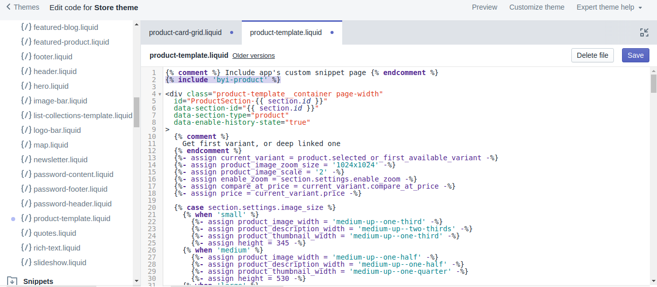
Add the following code in starting of the file:
{% include 'PrintXpand-product' %}
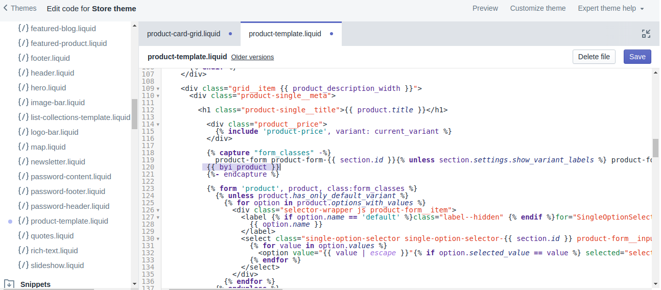
Find
{% capture "form_classes" -%}
and add following code before:
“{%- endcapture %}”
{{ PrintXpand_product }}
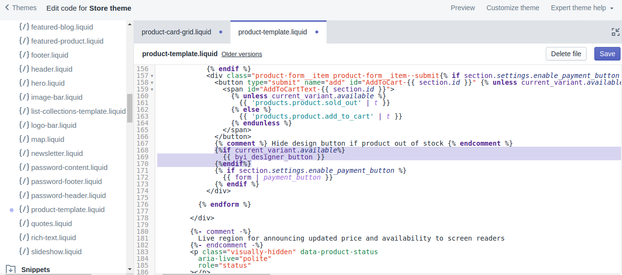
Add this code where you want to show the designer tool button:
{%if current_variant.available%}
{{ PrintXpand_designer_button }}
{%endif%}
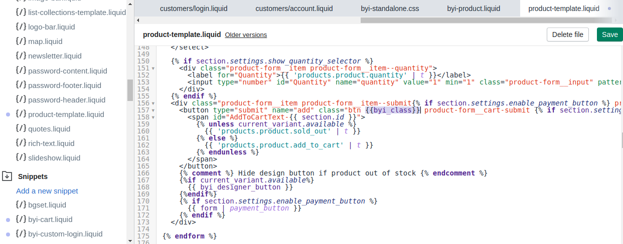
Add below code to add to cart button as a class
{{PrintXpand_class}}
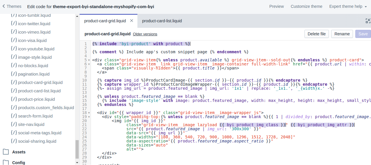
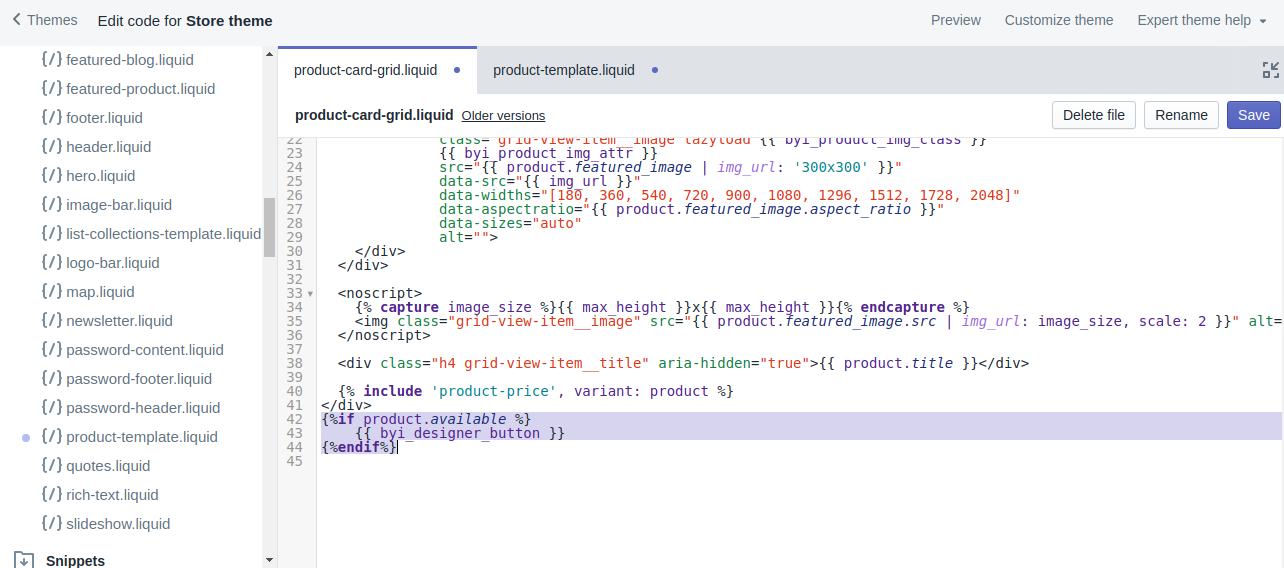
Edit product-card-grid.liquid
Under “Snippets”, select product-card-grid.liquid.
Add the following code at the start of the file:
{% include 'PrintXpand-product' with product %}
Add the following variable as a class where image tag placed:
{{ PrintXpand_product_img_class }}
Add this variable as an attribute where image tag placed:
{{ PrintXpand_product_img_attr }}
Add this code where you want to show designer tool button
{%if product.available %}
	 {{ PrintXpand_designer_button }}
{%endif%}
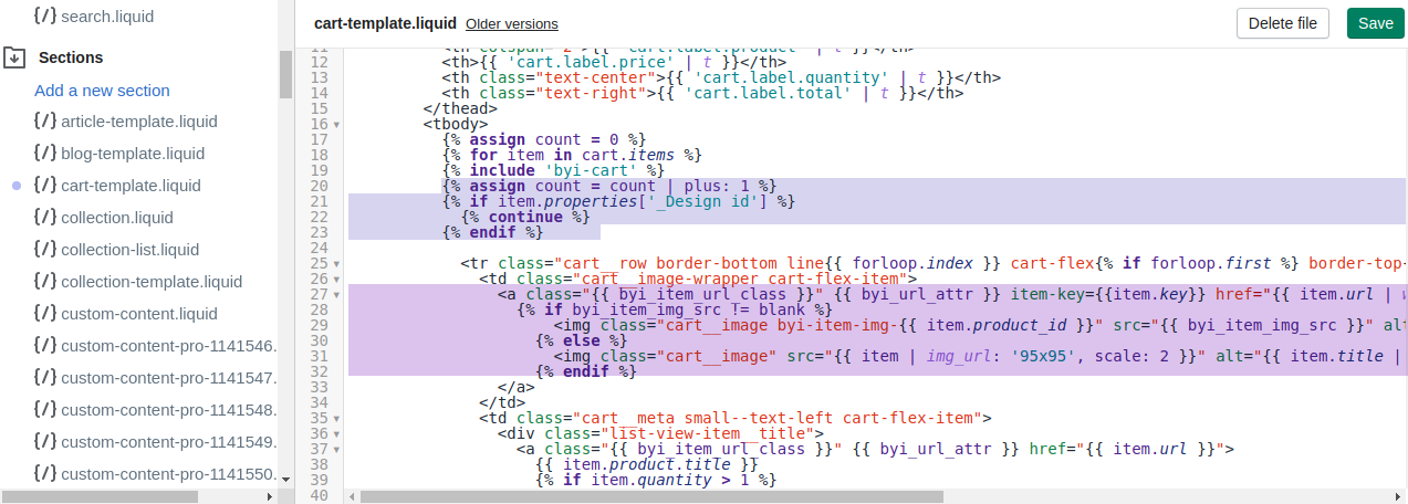
Edit cart-template.liquid
1. Under “Section”, select cart-template.liquid.
2. Find the section that with:
{% for item in cart.items %}
3. Add the below code after this:
{% include 'PrintXpand-cart' with item %}
  {% assign count = count | plus: 1 %}
  {% if item.properties['_Design id'] %}
  {% continue %}
  {% endif %}
4. Find any reference of this code:
<img class="cart__image{% if item.image == null %} hide{% endif %}" src="{{ item | img_url: 'x190' }}" alt="{{ item.image.alt | escape }}" data-cart-item-image>
5. Replace them with the following code:
<a class="{{ PrintXpand_item_url_class }}" {{ PrintXpand_url_attr }} href="{{ item.url | within: collections.all }}">
{% if PrintXpand_item_img_src != blank %}
<img class="cart__image PrintXpand-item-img-{{ item.product_id }}" src="{{ PrintXpand_item_img_src }}" alt="{{ item.title | escape }}">
{% else %}
<img class="cart__image" src="{{ item | img_url: '95x95', scale: 2 }}" alt="{{ item.title | escape }}">
{% endif %}</a>
6. Find any reference of this code:
<a href="{{ item.url }}" class="cart__product-title" data-cart-item-title>{{ item.product.title }}</a>
7. Replace them with the following code:
<a class="{{ PrintXpand_item_url_class }}" {{ PrintXpand_url_attr }} href="{{ item.url }}">{{ item.product.title }}</a>
8. Find any reference of this code
{%- for p in properties -%}
                    {%- unless p.last == blank -%}
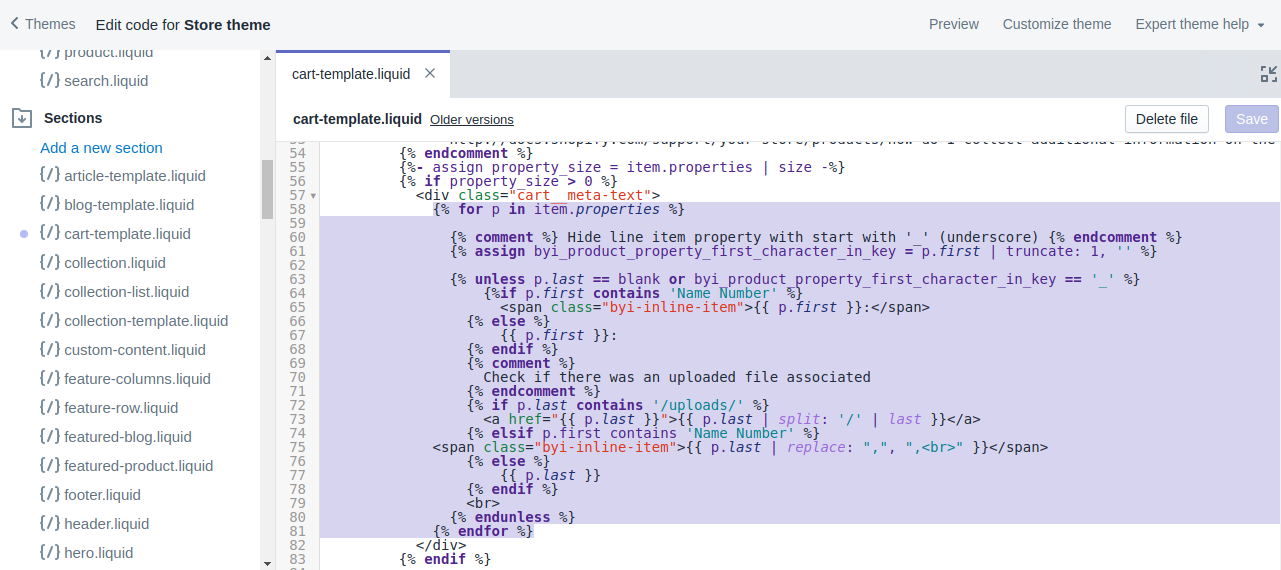
9. Replace them with the following code:
{% for p in item.properties %}
                	{% assign PrintXpand_product_property_first_character_in_key = p.first | truncate: 1, '' %}
                	{% unless p.last == blank or PrintXpand_product_property_first_character_in_key == '_' %}
                    	{%if p.first contains 'Name Number' %}
               			 {{ p.first }}:
               		 {% else %}
                     		 {{ p.first }}
                    	{% endif %}
                    	{% comment %}
                      	Check if there was an uploaded file associated
                    	{% endcomment %}
                    	{% if p.last contains '/uploads/' %}
                 	{{ p.last | split: '/' | last }}
                    	{% elsif p.first contains 'Name Number' %}
                	{{ p.last | replace: ",", "," }}
                    	{% else %}
                     		 {{ p.last }}
                    	{% endif %}

                  	{% endunless %}
                	{% endfor %}
10.Find any reference of this code
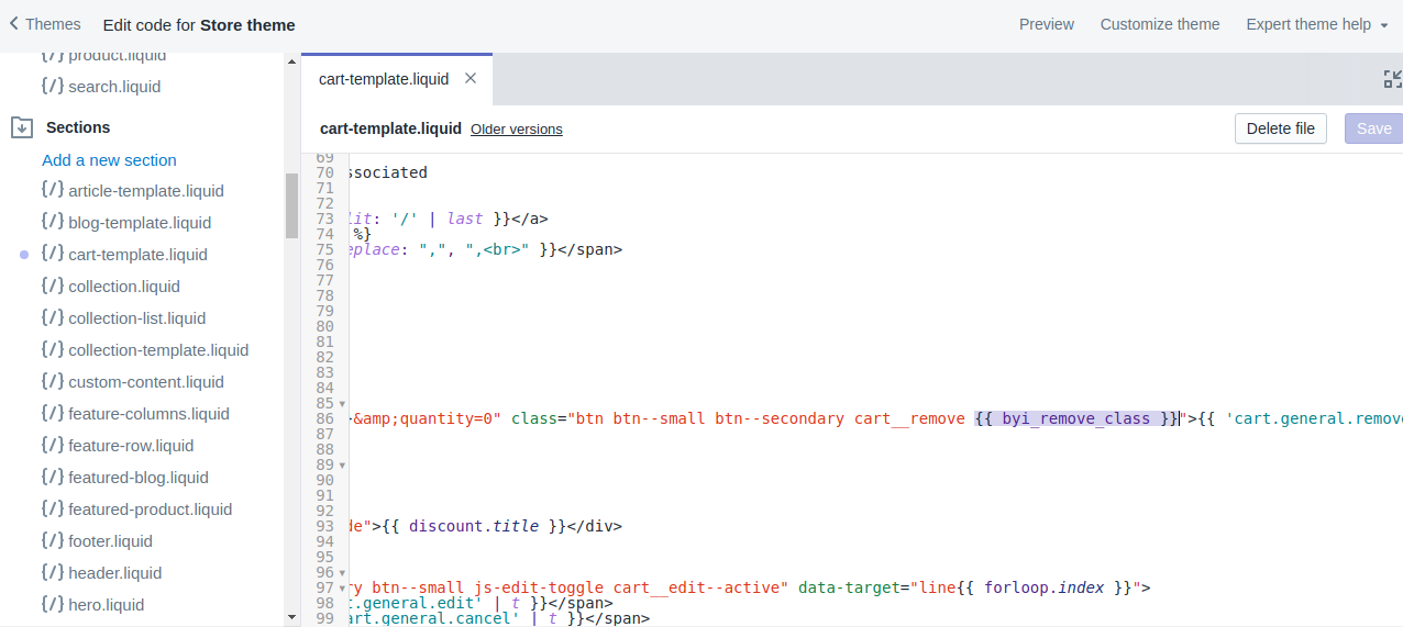
<a href="/cart/change?line={{ forloop.index }}&quantity=0" class="text-link text-link--accent" aria-label="{{ 'cart.general.remove' | t }} {{ item.product.title }}">{{ 'cart.general.remove' | t }}</a>
11. Replace them with the following code:
<a href="/cart/change?line={{ forloop.index }}&quantity=0" class="text-link text-link--accent {{ PrintXpand_remove_class }}" aria-label="{{ 'cart.general.remove' | t }} {{ item.product.title }}">{{ 'cart.general.remove' | t }}</a>
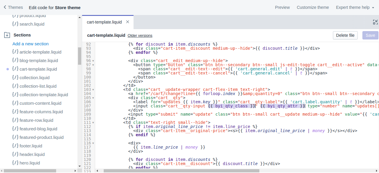
12. Find any reference of this code
<input class="cart__qty-input " type="number" name="updates[]" id="updates_large_{{ item.key }}" value="{{ item.quantity }}" min="0" pattern="[0-9]*" data-quantity-item="{{ forloop.index }}">
13. Replace with
<input class="cart__qty-input {{ PrintXpand_qty_class }}" {{ PrintXpand_qty_attr }} type="number" name="updates[]" id="updates_large_{{ item.key }}" value="{{ item.quantity }}" min="0" pattern="[0-9]*" data-quantity-item="{{ forloop.index }}">
14. Replace
{{ item.original_price | money }} to {{ individualTotalPrice| money}} and {{ item.final_price | money }} to {{ totalPrice|money}}.
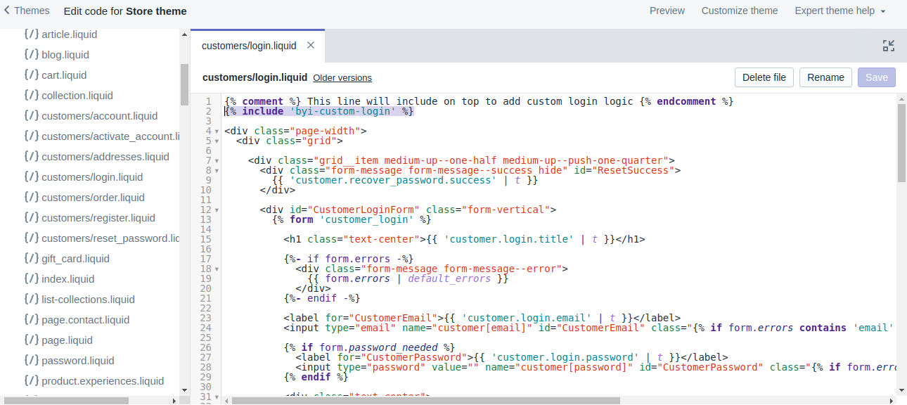
Edit customers/login.liquid
Under “Template”, select customers/login.liquid
Add below code at the top of file:
{% include 'PrintXpand-custom-login' %}
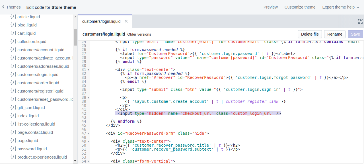
Add this line before login form complete
<input type="hidden" name="checkout_url" class="custom_login_url" />
Note: It’s mandatory to set Customer accounts with Accounts are optional from following path Setting->Checkout
Email template changes
We must customize the email template to display designer images to the customer when they placed a designer order. We recommended taking backup of all template before customization
Find Email template from path:
Admin->Settings->Notifications
Set these changes in line_items loop:
Find section with:
{% for line in subtotal_line_items %}
Add below code after this
 {% assign PrintXpand_img_url = '' %}
      {% unless line.properties == empty %}
      {% for property in line.properties %}
	{% if property.first == '_Designer Image' %}
  	{% assign PrintXpand_img_url = property.last %}
	{% endif %}
  {% endfor %}
{% endunless %}
Find below code as a reference:
{% if line.image %}<img src="{{ line | img_url: 'compact_cropped' }}" align="left" width="60" height="60" class="order-list__product-image"/>{% endif %}
and replace with below code:
{% if PrintXpand_img_url != '' %}<img src="{{ PrintXpand_img_url }}" align="left" width="60" height="60" class="order-list__product-image"/>
{% elsif line.image %}
  <img src="{{ line | img_url: 'compact_cropped' }}" align="left" width="60" height="60" class="order-list__product-image"/>
{% endif %}
INTRODUCTION TO FRONTEND
Header Area
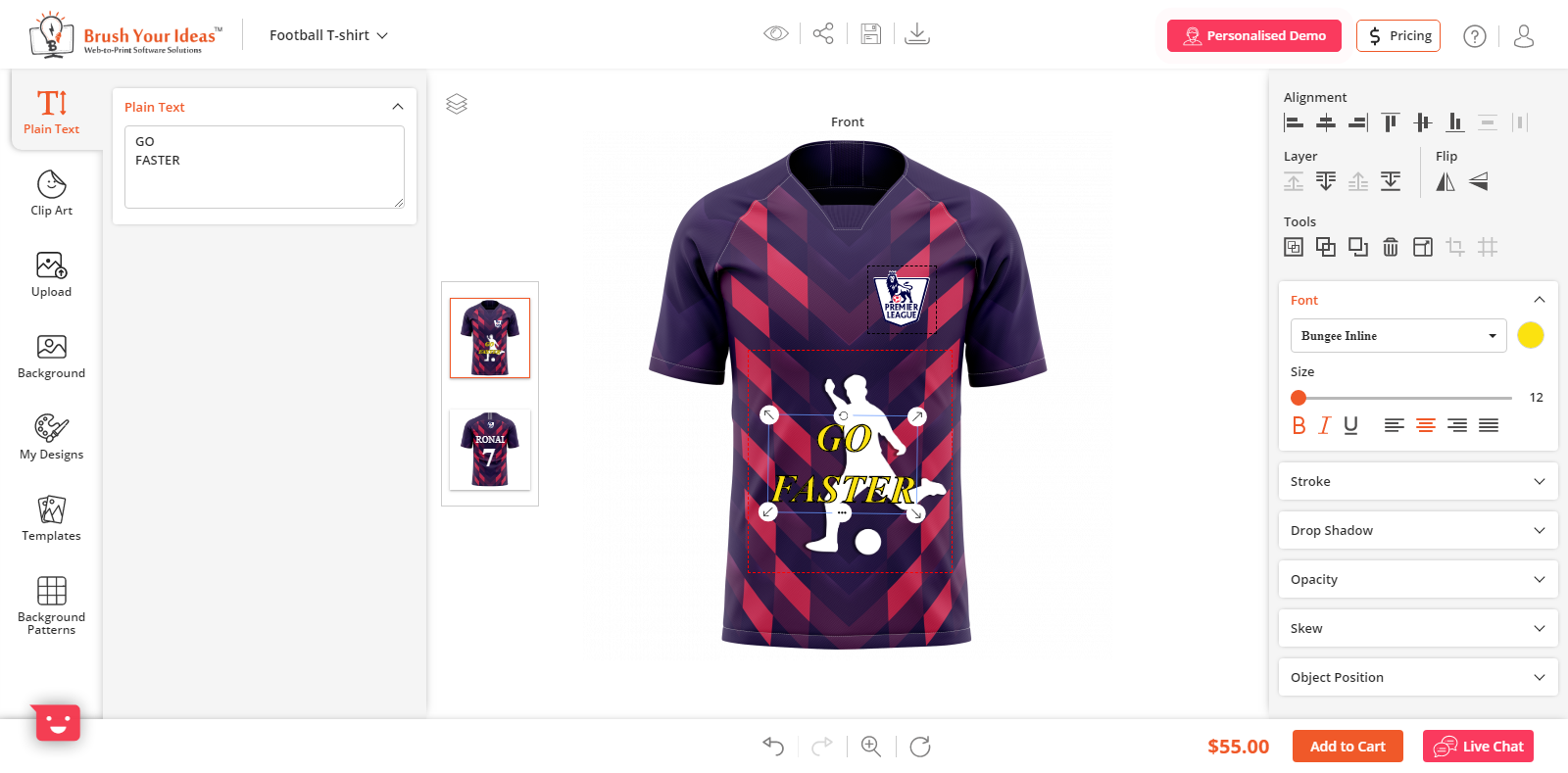
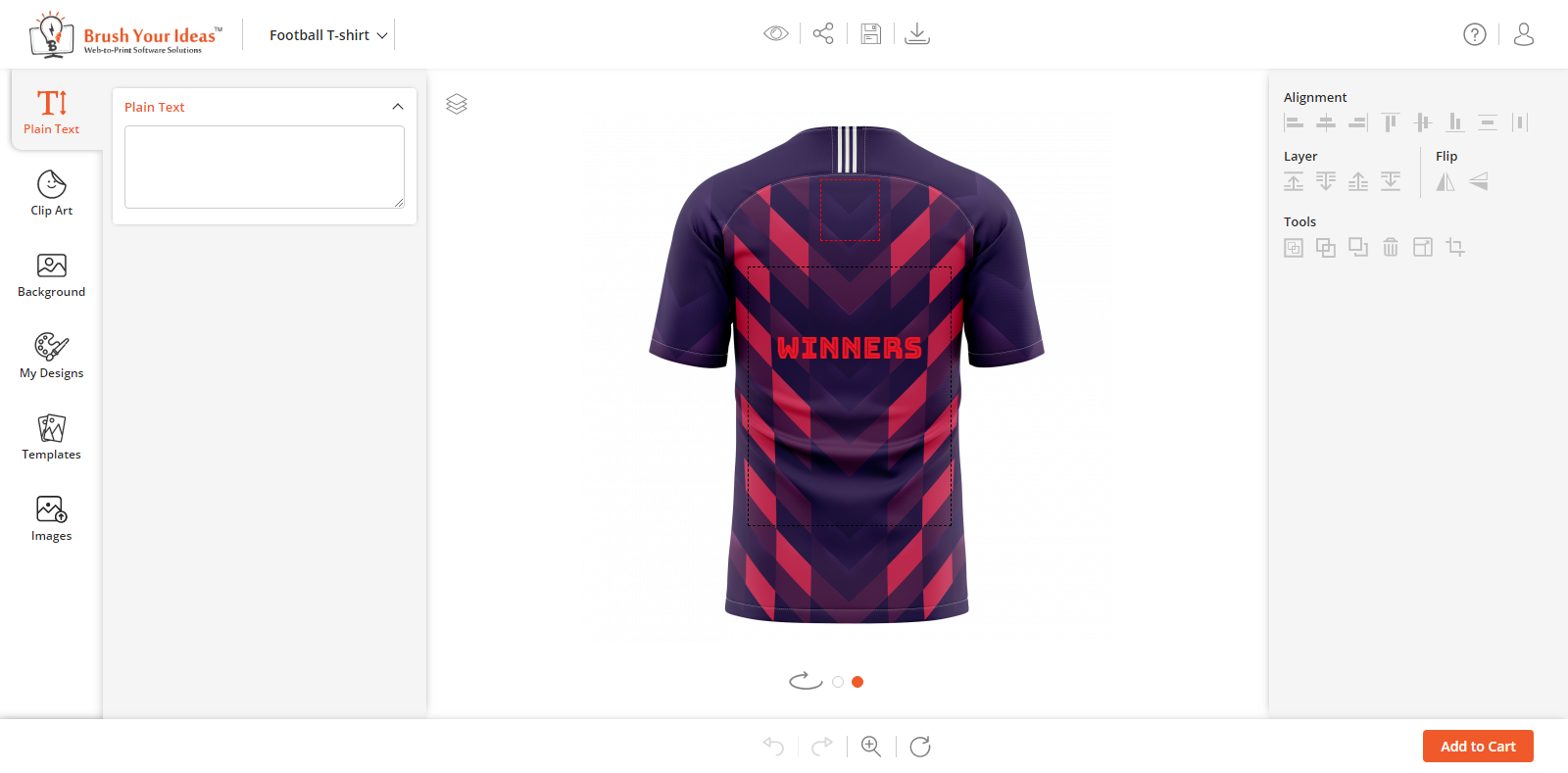
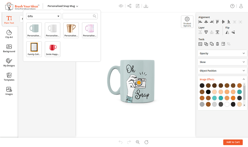
Here, your customer will get the options for Preview/Share/Save/Download the product design.
By clicking on the ‘Preview’ icon, your customers can view their designing Product in Full Screen.
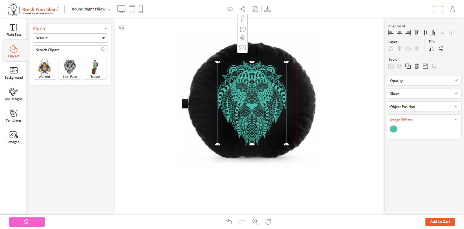
By clicking on the ‘Share’ icon, your customers can share their designed products using Social Media Platforms. (Facebook, Instagram, Pinterest & E-Mail)
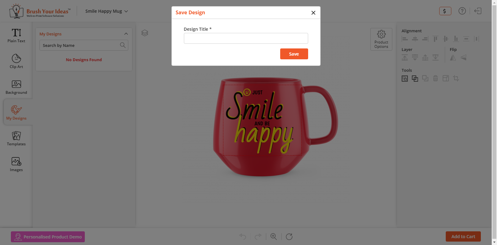
By clicking on the ‘Save’ icon, the customers can save their designed product. They must log in to save their designed products.
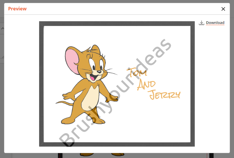
By clicking on the ‘Download’ icon, the customers can download a customized product image with watermark configuration
By clicking on the ‘Question Mark’ icon, it will prompt a quick user guide in the product designing page itself. From there, the customers can smoothly proceed further with the designing.
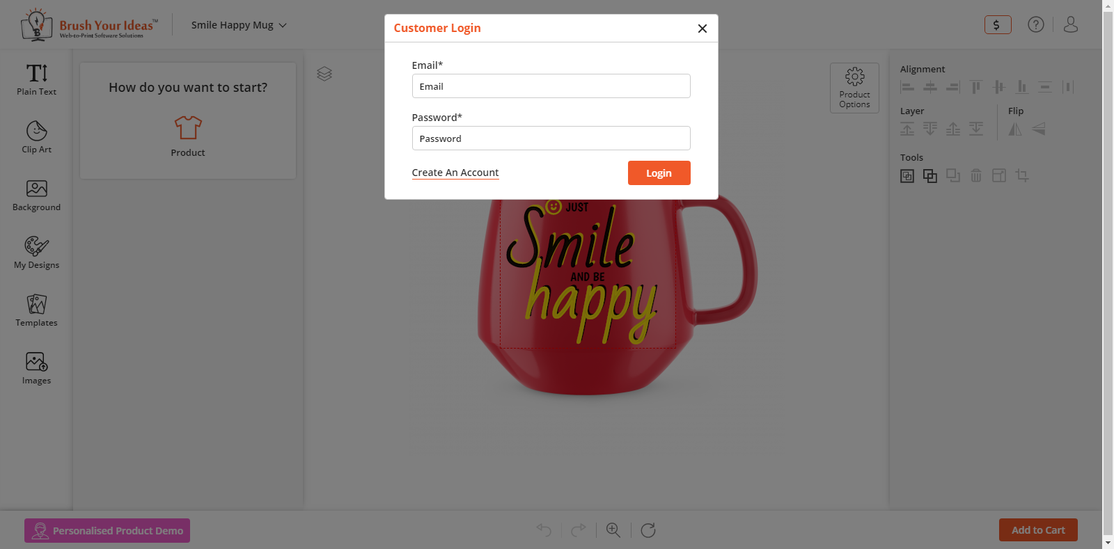
By clicking on the ‘Login’ icon, your customers can log in to their accounts with your e-store.
Designer Tool
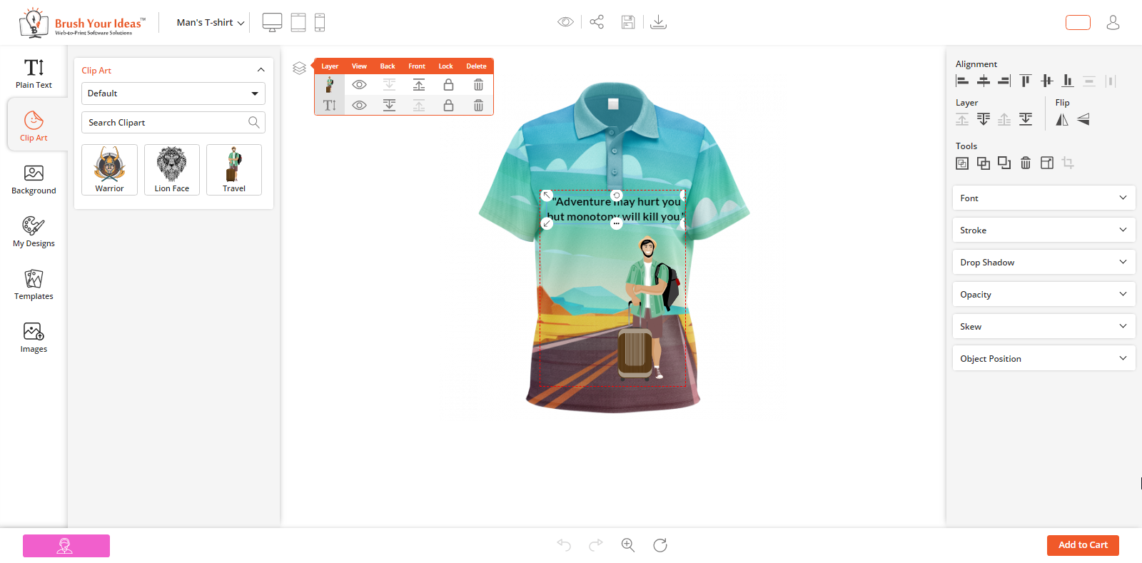
From here, your customers can design their product using the Tool.
They can set the position of the object by using the Alignment option.
They can set the order of the objects when more than one objects are on Product design area using the Layer option. They can also flip the object Vertically & Horizontally.
The image cropping option is also given to crop the area of an image.
They can edit the product design with the Tools like Select all- deselect all objects, duplicate object, Best Fit, etc.
Footer Area
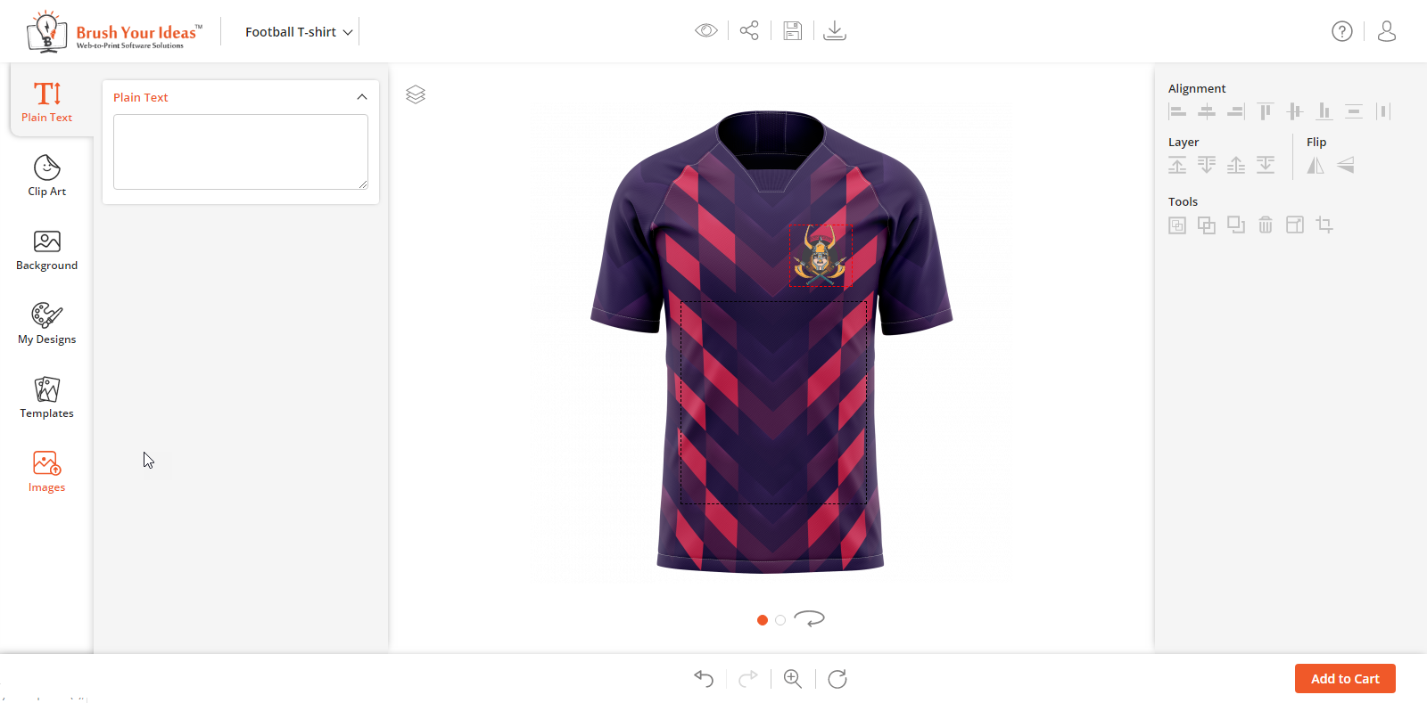
In the Footer, the “bullet navigation buttons” are given to change the sides of the Product. Under the bullet navigation buttons, the Zoom & Reset icons are given.
By clicking on the ‘Zoom’ icon, the slider will appear. By dragging that slider left-right, you can zoom the Product and set it according to your canvas.
By clicking on the ‘Reset’ icon, the customer can reset all the design area but note that the unsaved design area will also be removed.
By clicking on ‘Undo – Redo’, the customer can switch among the edit history.
Design Explorer
From here you can manage the Tabs like Upload, Plain Text, Clip Art, Background, Name Number, Templates, etc. You have all the rights to manage the Tabs. After the Back End configuration, your customer can access the Designer option.
Tabs and Sub Tabs: Let your customers access the Tabs and Sub Tabs as per the Back End configurations.
All Products: You can showcase the customizable Product list & Product Categories.
Shopify App Backend Configuration
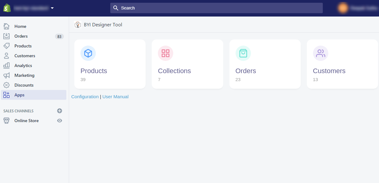
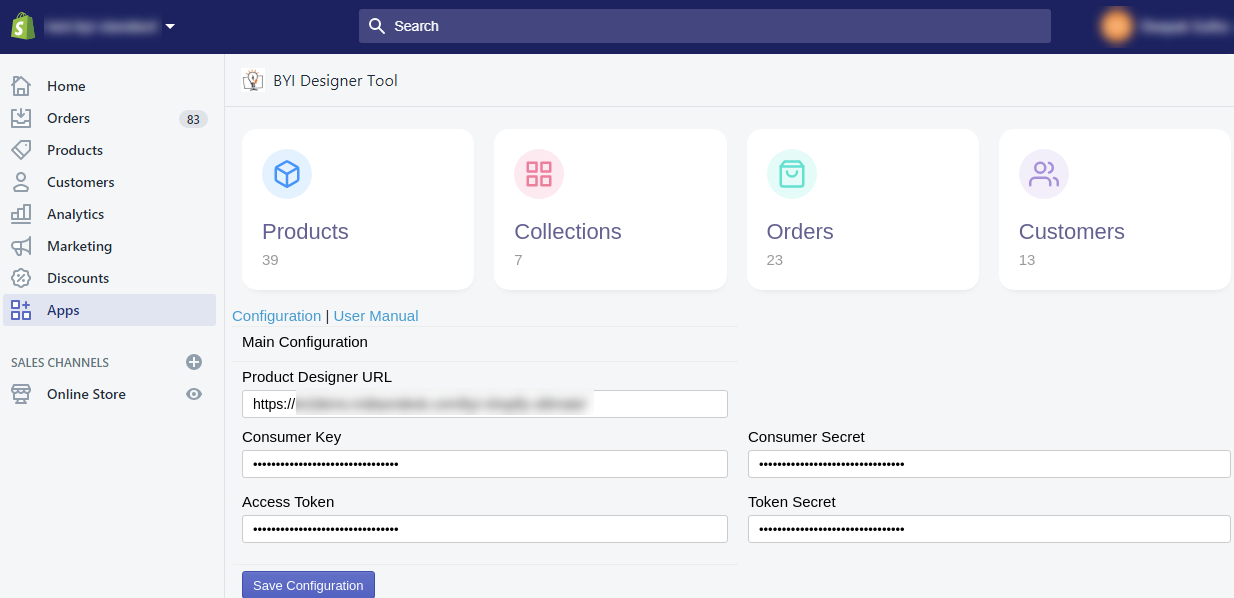
After Installing the “PrintXpand” designer tool under the Shopify App, click on the Apps, you will get PrintXpand Designer Tool under the “Installed Apps”.
By clicking on “PrintXpand Designer Tool” you will find 4-modules with their total available records count. Under these records, Configurations & User Manual options can be seen.
By clicking on Configurations, the “Main Configuration” will appear. Here you need to insert the URL of “product designer tool” and API-related details as per integration and configuration of the API from the Designer tool.
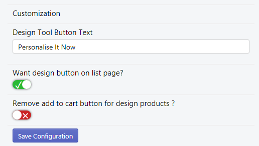
Customization
– Design Tool Button Label: Insert the button text by clicking on that the customer will be redirected to the “Product Designer” Page for that product.
– Want a design button on the list page? : Enable this option to display the “Design” button on the product listing page to the products.
– Remove add to cart button design products: Enable/disable this option to display/hide the “Add to cart” button from the design products.
After configuring the “PrintXpand Customization” options, click on the Save Configuration button.
Add a New Product to design
How to add a new Product for designing?
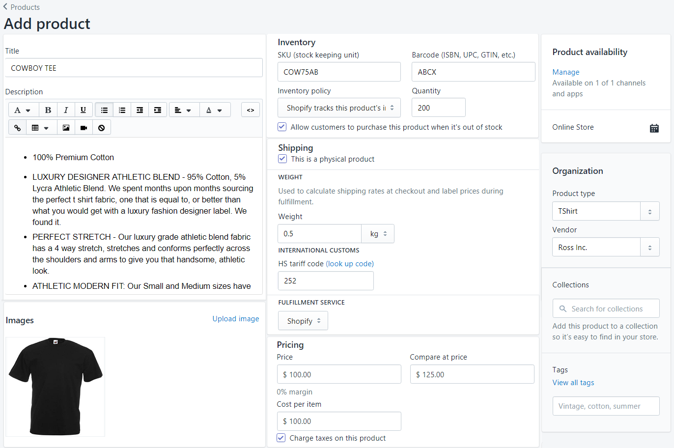
To add a new product, go to Products -> All Products -> Add Product. By clicking on it, you will be redirected to the product detail page.
Here, enter the required details like Title, Description, Images, Pricing, Inventory, Shipping, Variants (If any), etc.
It is important to note that the compare price must be greater than the Price option and the ‘Product availability’ field must be set to ‘Online Store’.
Once all the details are added, you can add the product to the store. If required, you can edit it as well afterward.
Note:
~Admin can create up to 100 variants for a product. Each product can have up to 3 attributes.
~The attributes can vary product vise. For example, one of the products has size, color, and style attributes. Whereas, another one has weight, finish, and material.
Module Synchronization (Shopify App Dashboard)
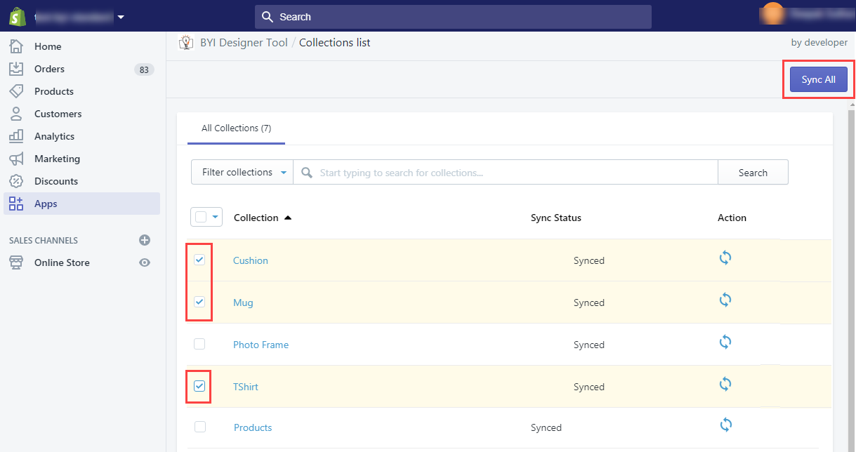
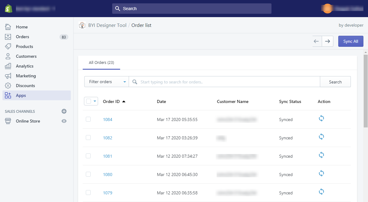
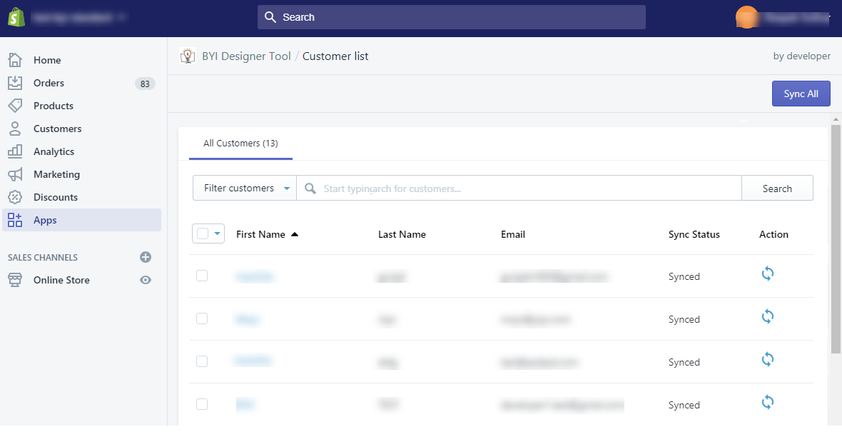
‘PrintXpand Shopify’ solution also enables you to manage the ‘sync process’ of each record from the Shopify app dashboard into the Designer tool backend. To synchronize the modules, go to Apps → PrintXpand.
By clicking on ‘PrintXpand’, you will find 4-modules with their total available record count.
Products: You can see all the products created in the ‘Shopify’ on the list. The designer enabled product will be auto-synced once you enable it.
Collection (Product’s Categories): All the product categories created or managed from Shopify will be synchronized in the Designer Tool.
Orders: As the customer place an order, the details of the order will be synchronized in the Designer Tool backend.
Customers: When the user/customer Signs up on Shopify, you can check his/her details on Shopify admin. As a new user/customer will sign up, the details will be synchronized in the Designer Tool backend.
By clicking on any module, the list page will be displayed. From here you can search, filter with their sync status, sort records and check record details by clicking on record name.
There will be sync now button for each record. By clicking on it, the respective record will be synced in the tool immediately.
There is a functionality of mass sync. To use it, select records in mass and click on the Sync All button. After it, all selected records will be synced (in pending status).
Note:
You need to sync every new product manually. All other updates and modules will be synced automatically.
Product Configuration for Product Designer Activation
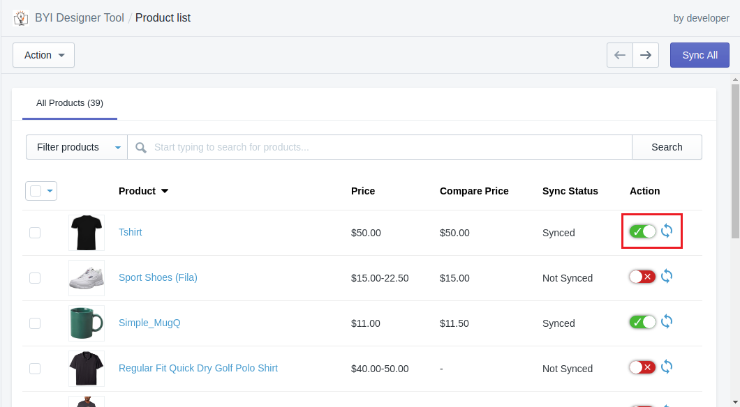
To enable ‘PrintXpand’ for a product, navigate to Shopify Dashboard, Apps -> PrintXpand→ Products. You will get the list of the products.
When you have added a new product, you must ‘Sync’ the product by clicking on the Sync Now button for the first time. This will also enable the Product Designer tool. You do not need to enable it manually.
You can ‘Enable’ the Product Designer for the product from the ‘Actions’ dropdown.
To disable it, you can select ‘Disable’ the Product Designer for any product from the Actions dropdown list.
Here you can also Search, Filter, Sort Product List, and check product details by clicking on a product name.
Note:
~Product details will get updated only if they are synchronized already (Images will not be updated/changed, except the specified fields)
~The designer tool only supports the simple and configurable/variate/variable product.
Backend Configuration for Designer Tool
Configure Default Design (Set Image Sides & Design Area)
Once the ‘Product Designer’ is enabled for the product from ‘Shopify’, you must set ‘image sides’ and ‘design area’ of the product. For that, navigate to your ‘Designer Tool backend’.
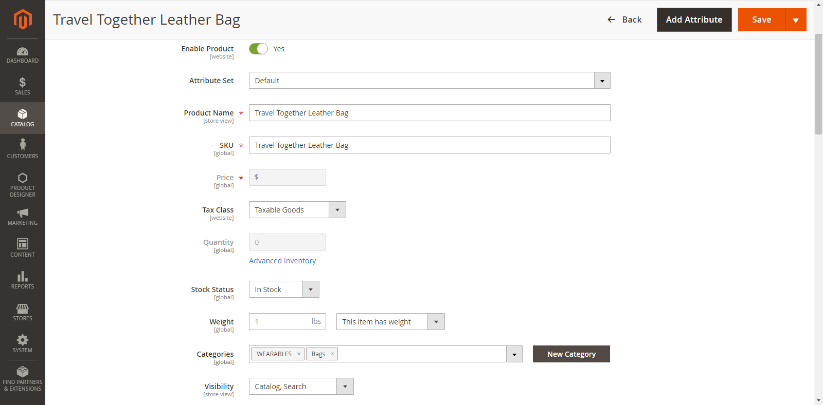
Go to: Catalogue -> Products and navigate to the detail page of the product for which you have enabled the PrintXpand-designer tool.
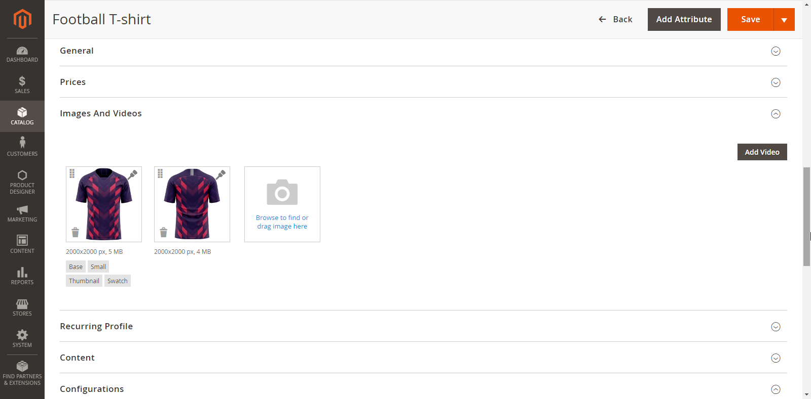
Now, you can set ‘image sides’ by clicking on the image and after saving the product, you can set the design area in the image manually.
There is another way to configure the product in just one click. On the product detail page, there is a green button on top named Configure Default Design. By clicking on this button, the image side and the default design area will be added to the center in the first image of the product. Other attributes like Base, Small, Thumbnail can be added automatically.
Click “OK” button and then “Save” the product. Once completed you will get a success message.
Select Image Sides
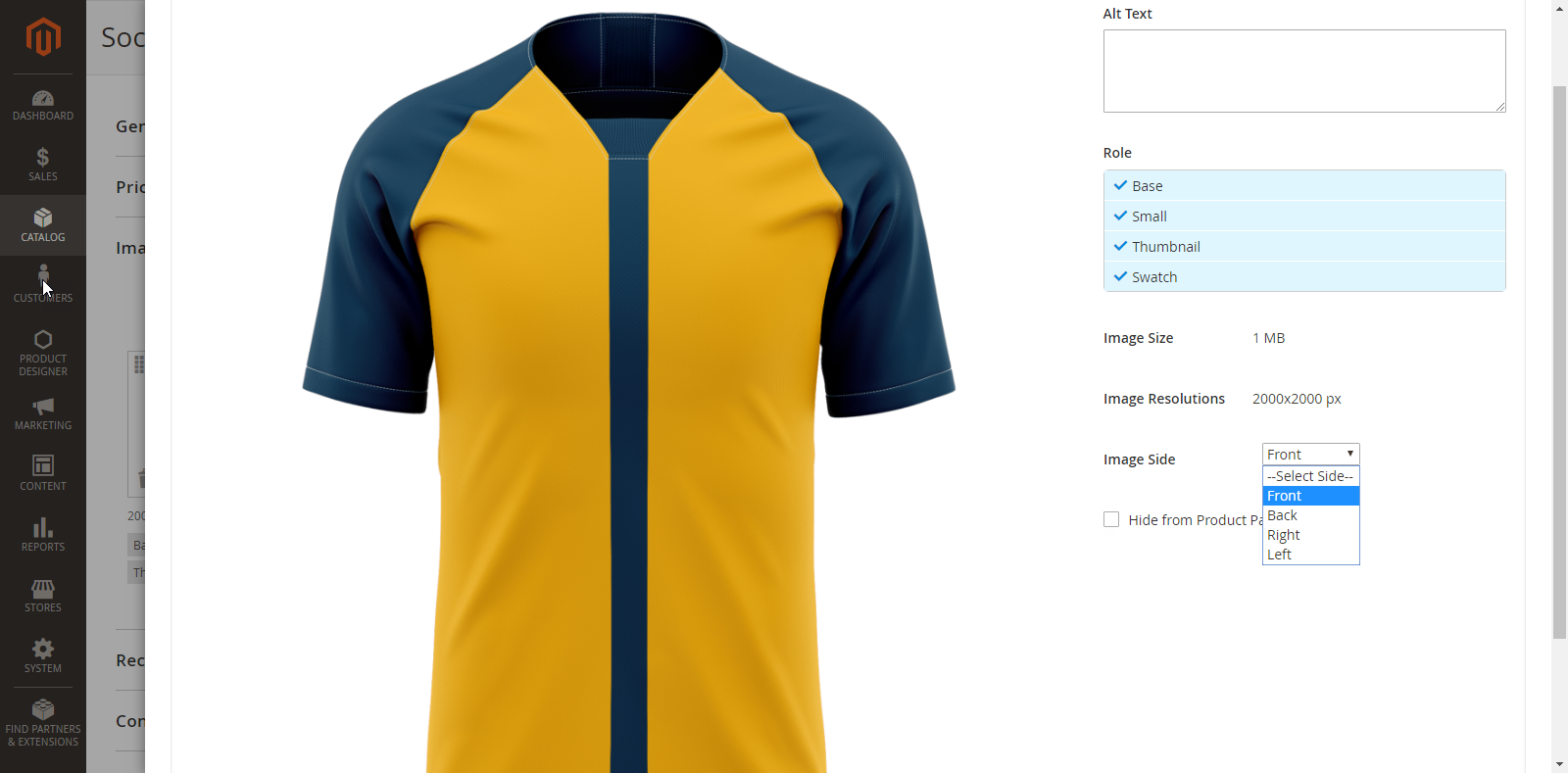
By clicking on Product Image, the ‘Image Detail’ pop up window will appear on the screen. Add ‘Alt Text’ and to display this image as the default image on Thumbnail, Product View and any other area, select the option of Role: Base, Small, Thumbnail, Swatch accordingly.
Select the “Image side” for the product image from ‘Image Side’ dropdown list.
After adding all the details, don’t forget to save it. You will not be able to create a design area for the product until you save it.
Create Design Area
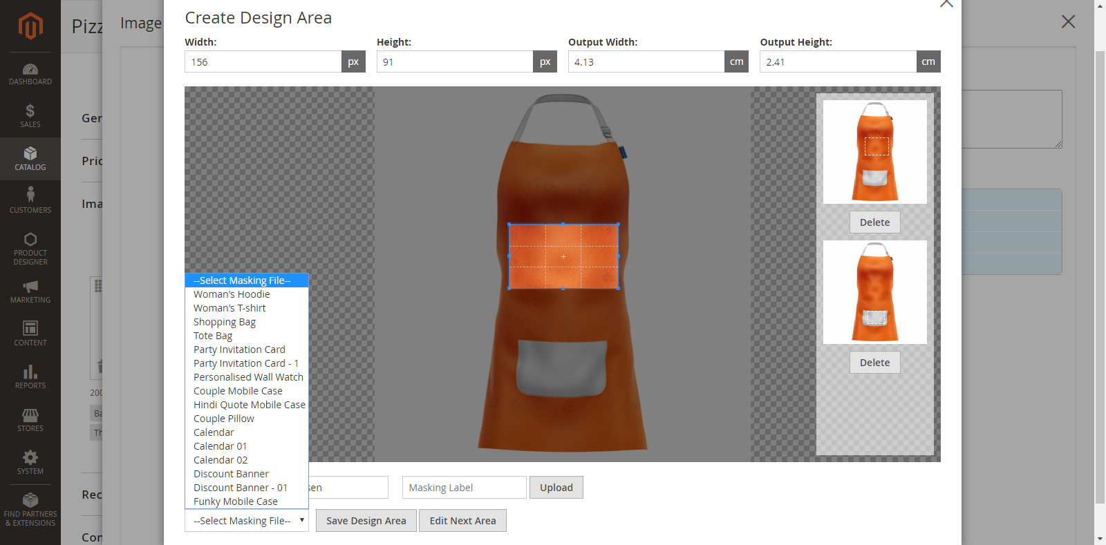
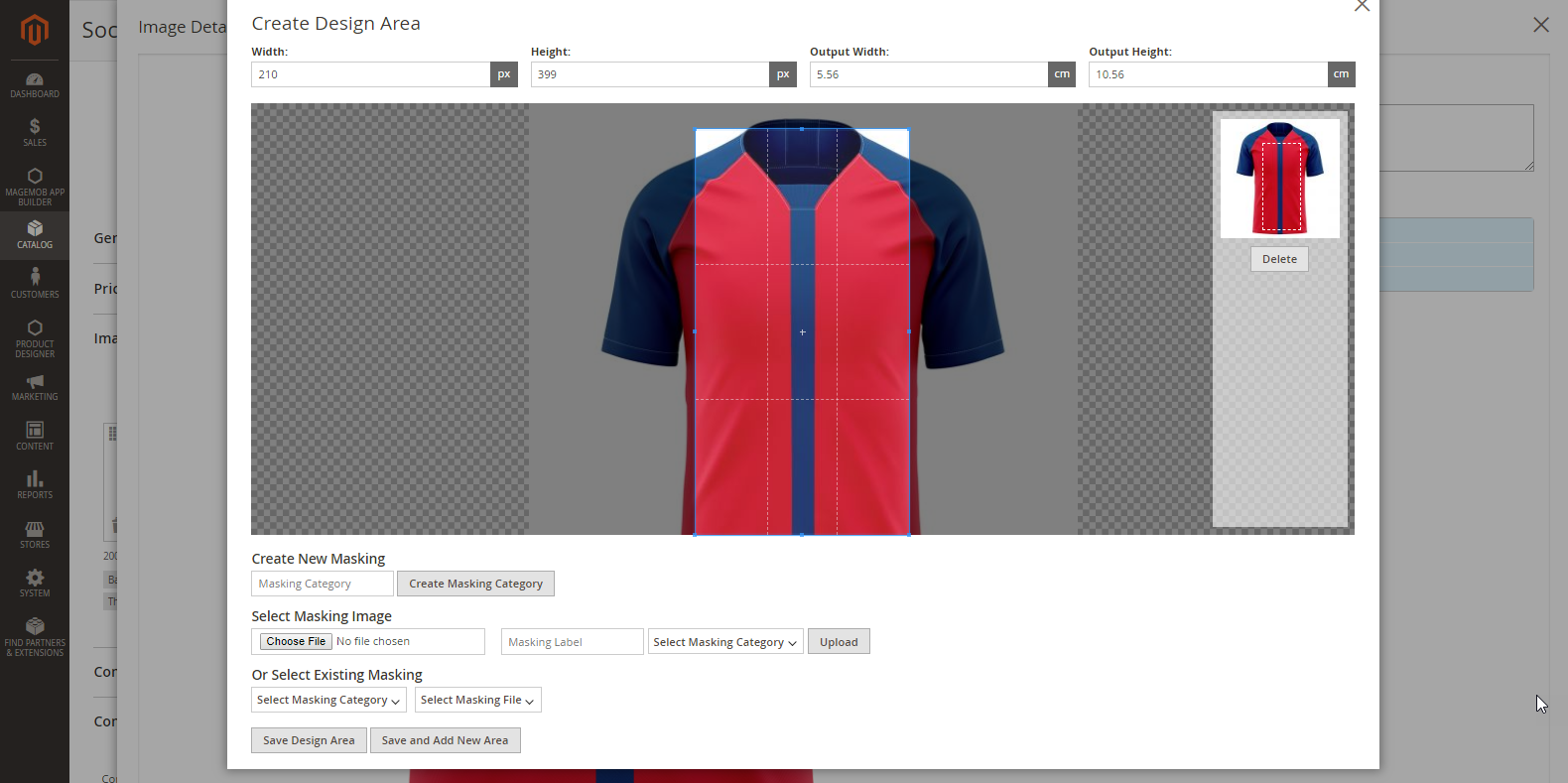
After saving, click on the “Brush” icon and “Create Design Area” window will pop up on your screen. To add a design area, use the mouse cursor and resize the selection box on the product image to set the design area for that particular product image side. (e.g. Front Side)
After creating a design area, click on “Save Design Area” button.
You can delete a design area by clicking on the “Delete” button from the right side.
Masking Category And Masking File
You can create, upload, delete or assign masking categories and masking files from here only.
You can add a Masking file by choosing a masking category and masking image that must be SVG file from Select Existing Masking.
To select any pre-uploaded masking file, select its masking category from the Masking Category dropdown. The names displayed in the Masking dropdown will be as per the name assigned while creating them.
You can also create any category by just providing the name and save to create a new masking category at Create New Masking.
Similarly, you can create a new masking file by selecting Upload new masking files and assigning a category to it. It will provide options to save any masking file to use anytime.
Note: If you have any doubts regarding the SVG file and how to mask the image, you can contact us. Our support team will guide you on how to mask the image.
Enable Product Designer
To enable the Product Designer for a Product, scroll down to “Product Designer” option and set ‘Yes’ for ‘Enable Product Designer’ option.
Default Associated Product
When you have added a Configured Product, you should have also uploaded images as per the different attributes and variations.
To display the ‘default product’ on the Front End, you must select a ‘Default Associated Product’ from the Product → Product Designer option.
As you click on it, you will get the dropdown list to set a default product to display on the Front End.
Designer Tool Front End Configuration for Shopify
Once the modules and their relevant data have been synchronized into the designer tool, you can manage the following configurations from the designer tool backend.
Go to: Stores → Configuration → Product Designer API Configuration
General
You must insert the following details:
Source System Base URL: Insert your Source System Base URL.
i.e. https://domain.com/
Customer Login URL: Insert URL Source System Login.
i.e. https://domain.com/account/login/
Customer Logout URL: Insert URL Source System Logout.
i.e. https://domain.com/account/logout/
Customer Authenticate URL: Insert source system URL for “customer authenticate” to check customer login sessions.
i.e.https://domain.com/account/checklogin
Add To Cart URL: Insert source system URL for “Add To Cart”.
i.e. https://domain.com/save/cart/
Save Design URL: Insert Source system URL for Save/Update Design/Image.
i.e. https://domain.com/account/saveDesignerUrl/
Locale: Select your language for your store view.
Base Currency: Select default currency to display on your website for the designer tool.
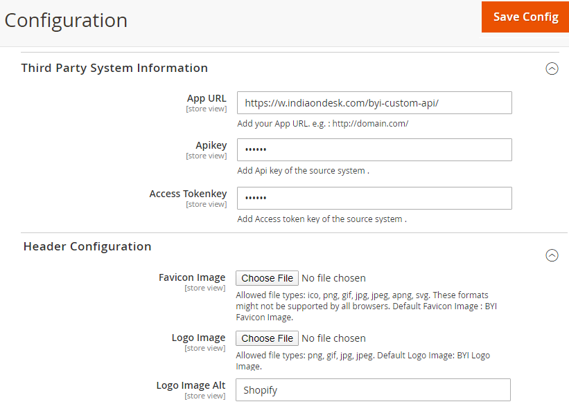
Third-Party System Information
Insert the following details of the Third-Party System Information:
App URL: Insert URL for your App.
API Key: Insert the API key of the source system.
Access Token key: Insert Token key of the source system.
Header Configurations
You can manage the following header details of the Shopify user page:
Favicon Image: To specify the favicon image of the product designer page.
Logo Image: To specify the logo image for the product designer page.
Logo Image Alt: To specify the text for the logo image.
Shopify Front End View
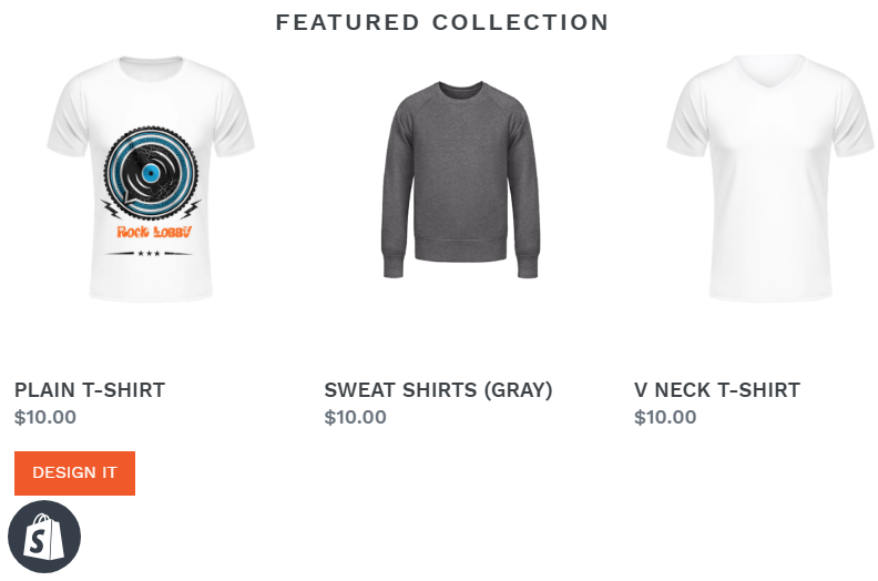
Once all the product configurations are made for product designer activation, users will be able to ‘View’ and ‘Design’ the products from the store.
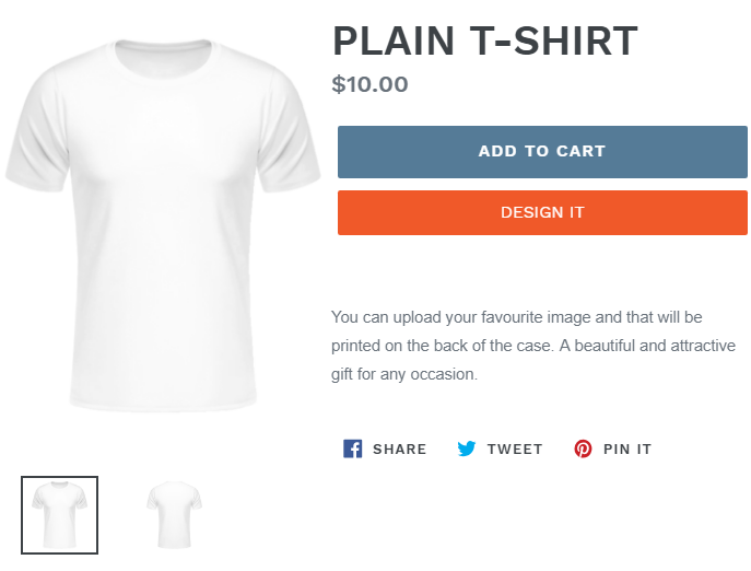
To design the product, the user can click on the ‘DESIGN IT’ button from the Product List Page or Product Detail Page on the Shopify front end page.
By clicking on it, the user will be redirected to the PrintXpand-Product Designer Tool page from where they can design products as per the requirement.
Shopify – Add To Cart
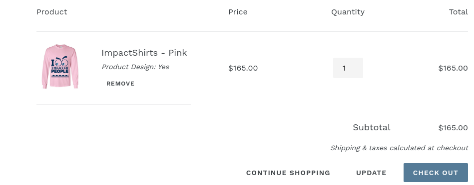
Once your customers have designed products from the ‘Product Designer Tool’ page, they can add product(s) to cart.
Now, from the cart page, your customer will be able to view two products i.e. Main Product and Custom Designed Product (which will work as an ‘Add on’ Product).
Note:
– If the Designing Price is not applicable or somehow 0, then the customer will only find the Main Product with a designed image along with the selected attributes.
– As per the latest version, the custom design product will not be visible on the Cart page, which will directly display on the checkout page only.
Additionally in Premium
The premium package comes with an option to show the real-time thumbnail of the product as well. To enable it, go to Stores → Configurations → General and set ‘Enable Image Thumbnails’ as Yes.
You can also add multiple areas in a single product image-side by clicking on “Save and Add New Area”. After creating a design area, click on “Save Design Area” button.
MANAGE IMAGE SIDES
You have all the right to customize the number of sides of any product or restrict them to only one side as per your printing compatibility and cost considerations. From the Back End, you can make these changes and they will reflect in the Front End.
To add and manage the sides of the images of Product, go to:
Product Designer → Manage Image Sides
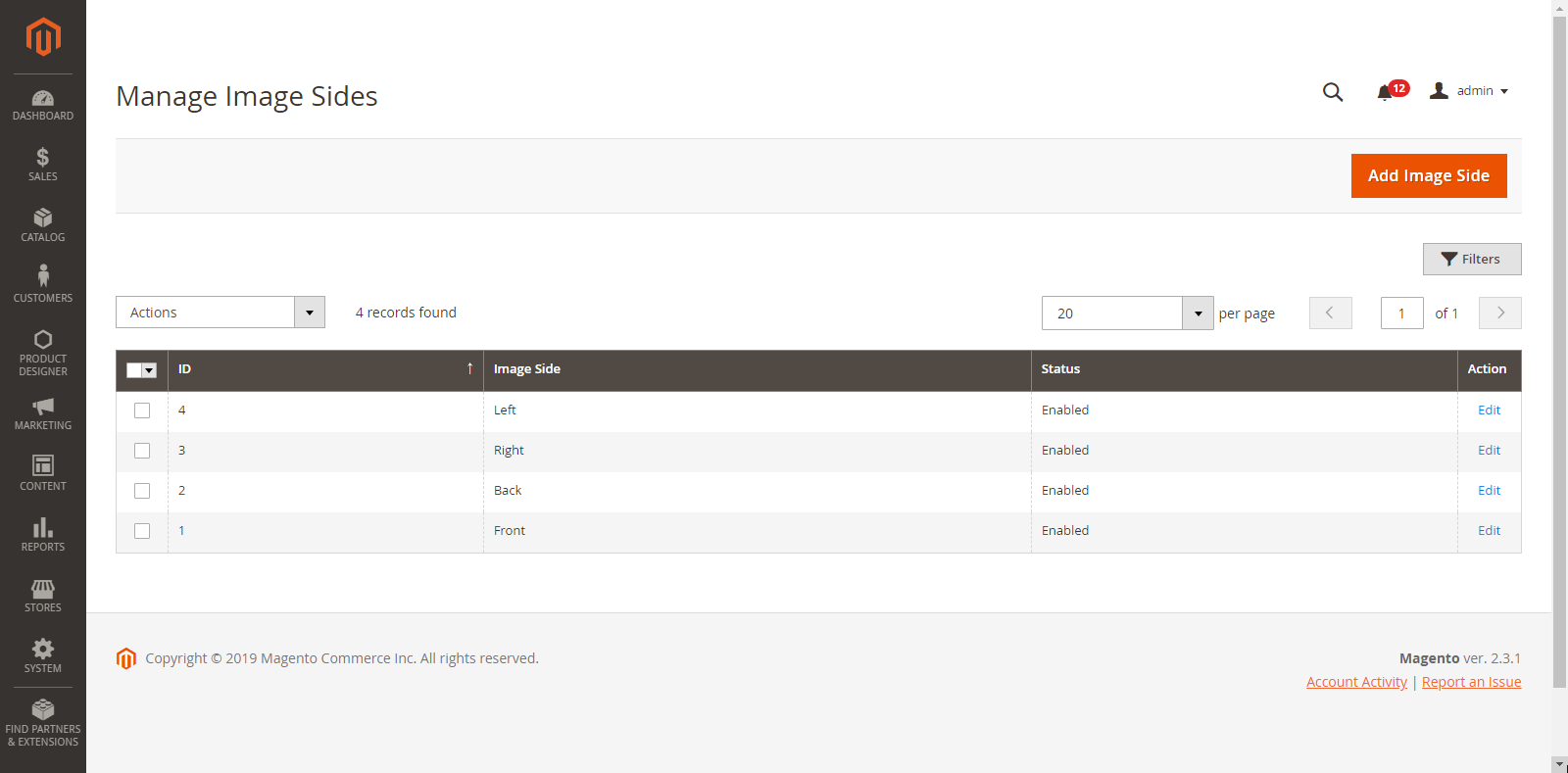
By clicking on it, you will get the list of inserted image sides with the details like ID, Image Side, Status, Action.
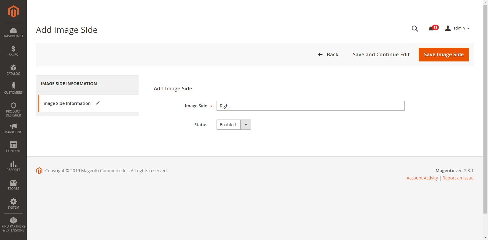
To add a new image side, click on the “Add Image Side” button. By clicking on it you will be redirected to the “Add Image Side” page.
Enter the following details:
Image Side: Enter the name of the Image side. (e.g Front, Back)
Status: Select the current status for Image Side.
After inserting the details, click on the “Save Image Side” button and you will be redirected again to the list of Images sides.
You can ‘Edit’ any Image side by clicking on the ‘Edit’ option. After editing press the Save ‘Image Side’ button.
If you want to ‘Delete’ any Image Side, select it and click on ‘Delete’ from the ‘Actions’ dropdown. By clicking on it, a confirmation message will appear. Press ‘OK’ to delete the selected image side.
MANAGE DESIGN TEMPLATES
Displaying the products with an eye-catching design will attract the customers when they visit your store. Use pre-loaded templates and display them on your store to get your customers started. The customers will get an idea as to how the customized product will look like. It will help them conceptualize their designs for own product.
Back End Configuration
Manage Template Categories
To manage design templates categories, navigate to
Product Designer -> Manage Design Templates Categories.
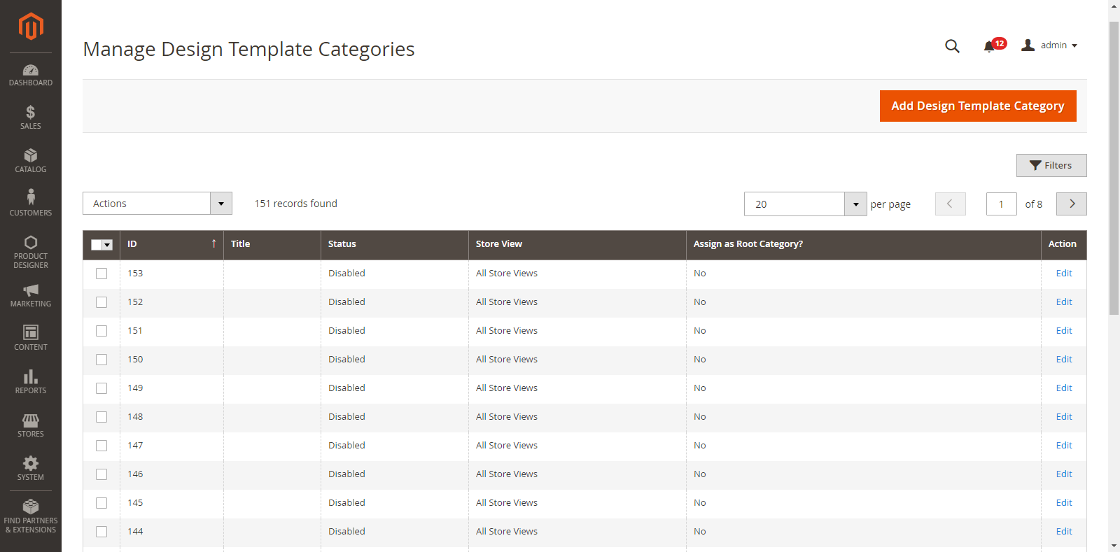
Now you can view a complete list of Template Categories along with their details like ID, Title, whether it is a root category or not and on which stores it is displayed.
To add a new Design Template Category, click on the ‘Add Design Templates Category’ button. On clicking it, you will be redirected to the “Add Design Templates Category” page.
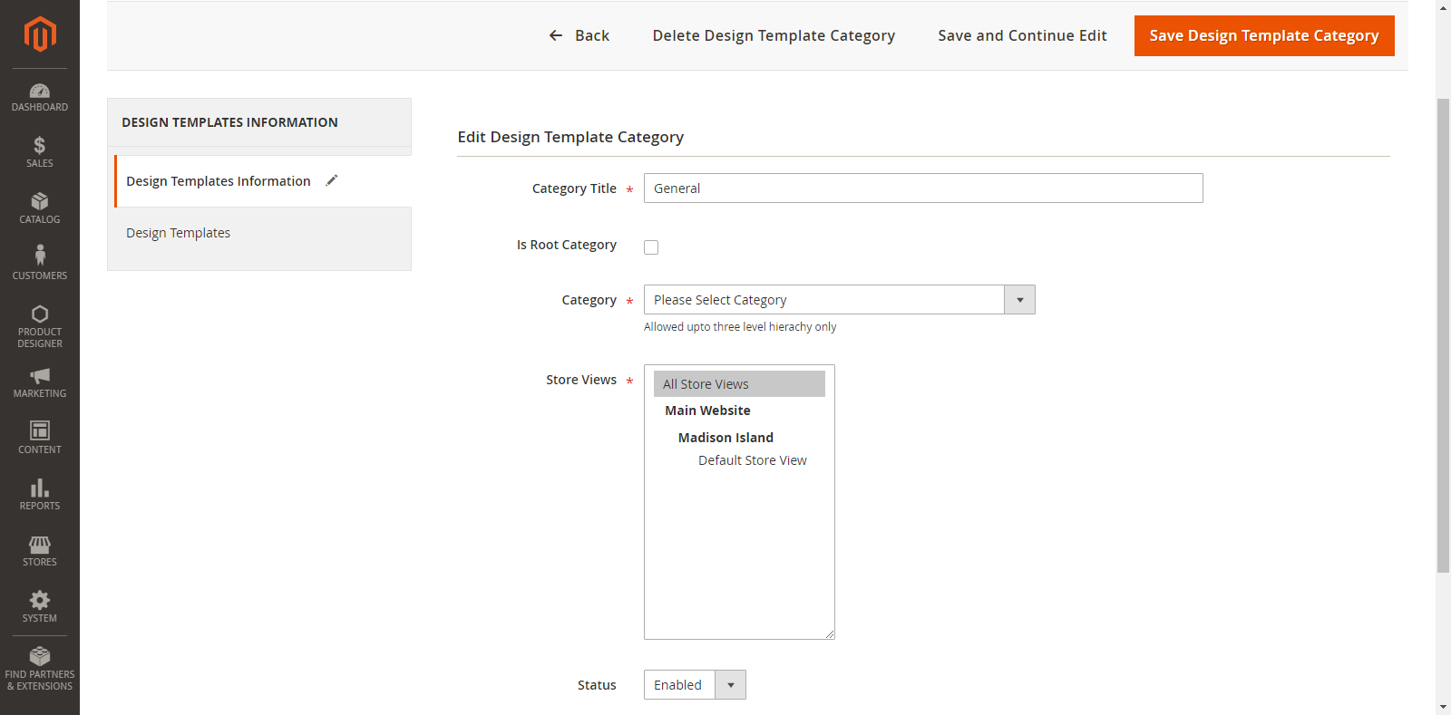
Now, enter the following details of the Template Category:
Category Title: Enter the relevant title of design template category.
Is Root Category: If you are inserting a ‘Parent Category’, tick mark on this checkbox. But, if you are inserting a child Category, then select its parent category from the “Category” dropdown.
Store Views: Select the stores in which the design templates category will be displayed.
Status: Choose the current status of the template category. (Enable/Disable)
Thereafter, click on the “Save Design Template Category” button to save the details and it will appear on the “Design Template Category” list.
You can ‘edit’ any Design Template category by clicking on the “Edit” option from ‘Action’ column.
To ‘Delete’ any Template Category, select it and click on “Delete” option from the “Actions” dropdown. As you click on the ‘Delete’ option, a confirmation message will appear. By clicking on the “OK” button, the selected Template Category will be deleted.
Make Design & Assign Category
You can create templates for Simple & Configurable products by navigating to Catalog → Products. From the Product list, click on “Make Design” option from the ‘Select’ option under the ‘Action’ tab.
Note: The Make Design option will appear only if you have enabled “Product Designer” option, set the Images Sides and Designing Areas.
By clicking on ‘Make Design’, you will be redirected to the designing page of the product.
Here, you can create a design template by designing a product using the “Designer explorer tab” (left side) and designer tool (right side) on the tool.
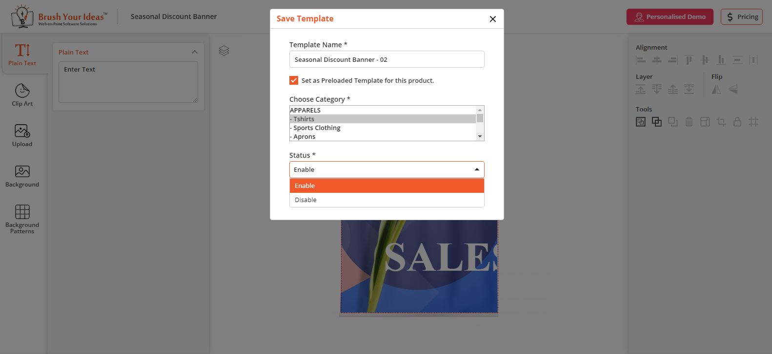
Once you are satisfied with the template, save the Design by clicking on ‘Save’ icon.
By clicking on it, a popup window named “Save Template” will open where you can add/edit a ‘Template Name’ and select the option “Set as Preloaded Template for this product” if you want to set as Preloaded Template. Choose a ‘Category’ in which you want to display this template from the drop-down list.
Note: You can also select multiple categories by pressing ‘Ctrl’ key while selecting options.
This design template will appear in the list of the “Manage Design Templates” in “product Designer” module at the backend.
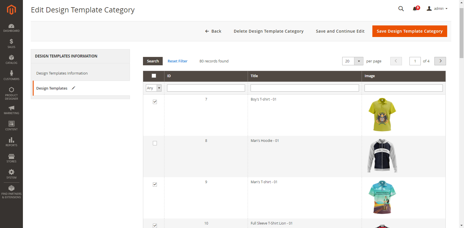
You can also assign or remove the templates from the sub-tab “Design Templates” in “Manage Design Template Category” module of “Product Designer” at the backend.
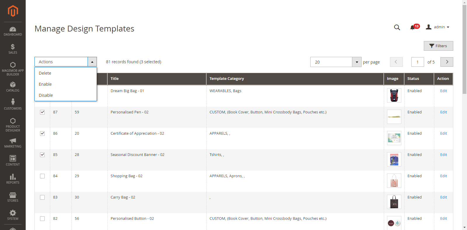
Admin can also enable or disable the design template anytime.
Go to the `Manage Design Template` listing page and select design templates you want to enable or disable in the bulk. Select Enable/disable from Action dropdown at the top of the list.
You can also enable/disable the design template while you save any new design template.
Manage Design Templates
To manage design templates, navigate to
Product Designer → Manage Design Templates
You can view a complete list of Design Templates along with their details like Template ID, Product ID, Title, its Category, Image and Action to Edit.
As you click on the “Edit” option, you will be redirected to the designer page of the product.
Here, you can edit and change the design by using the Designer explorer (left side) and designer tool (right side).
Manage Default Design Template
You can set the design template for any product. In a configurable product, you can set the design template for all the child products. The parent product will carry the latest updated child’s design template. And the child products without any design templates will follow the parent product template.
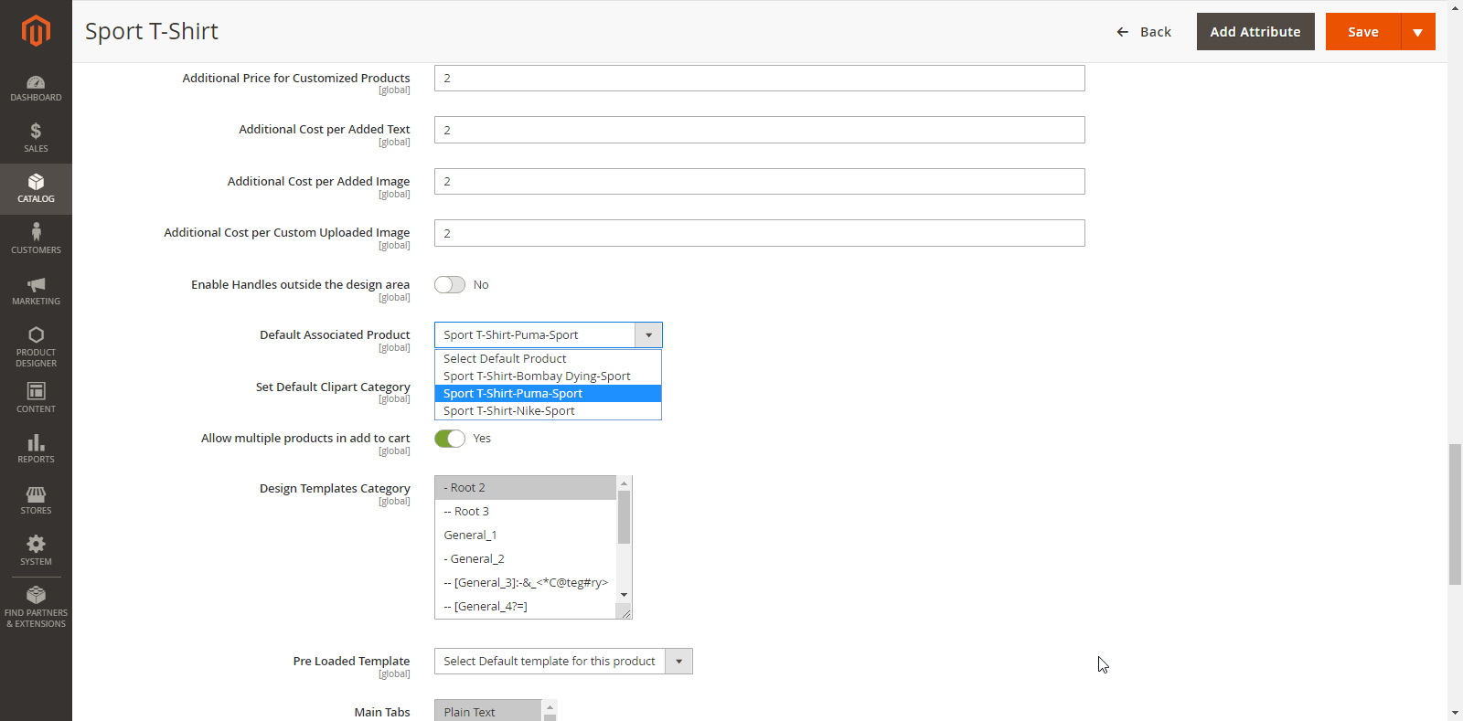
Preloaded Template
To set a “Preloaded Template” which would be displayed on the Front End for the specific product, select the template from the Preloaded Template dropdown list. It will contain the list of templates which are designed for a particular product.
After selecting the default template, click on the ‘Save’ button to save all the configurations.
Frontend View
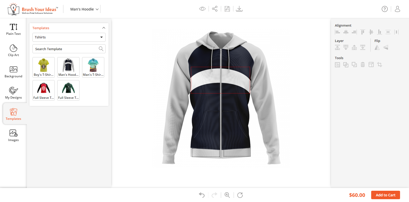
Once the design templates are managed and configured from the Back End, your customers can load the Default Templates by clicking on the ‘Templates’ tab in the Product Designer Page. They can view the Design Templates as per the assigned Design Template categories to the product.
The customers can also search the templates by name from the ‘Search by Name’ text field.
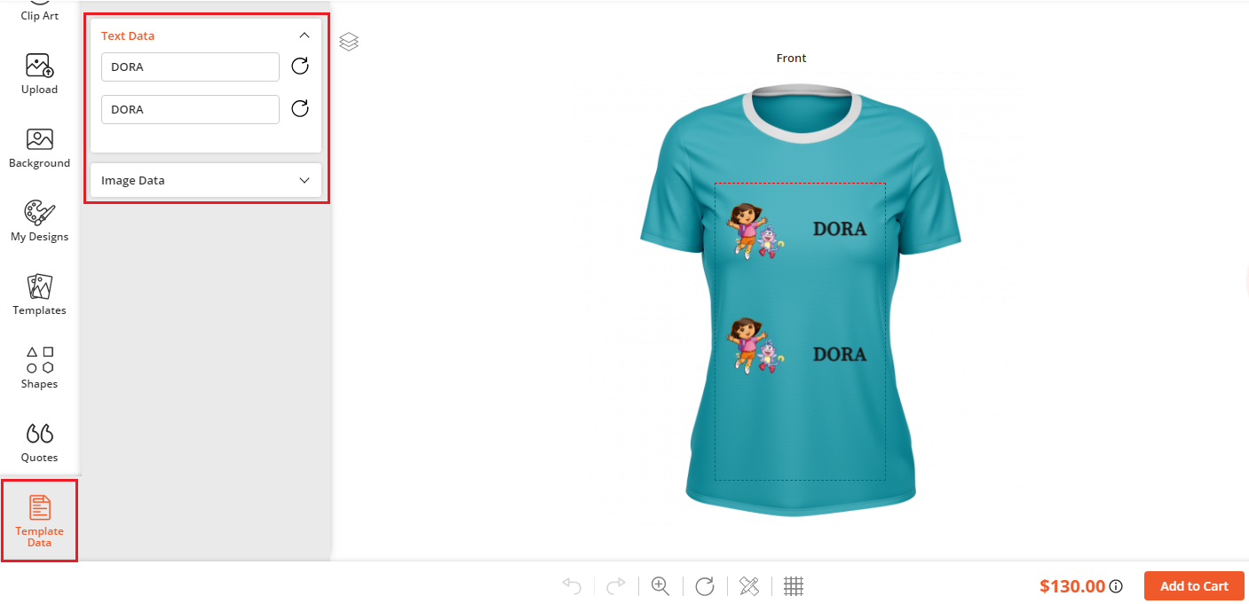
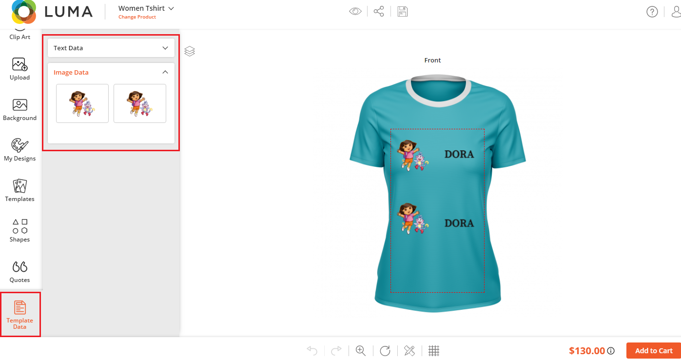
If the customers load the designer template product, they will get the Template Data tabs with the “Text Data” and “Image Data” of the selected designer product.
From the “Text Data”, the customers can add/edit the text captions, and from the “Image Data”, the customers can add/replace the images.
DESIGNER TOOL TABS CUSTOMIZATION
You have all the rights to select Main Tabs & Sub Tabs as per your business requirement.
Backend Configuration
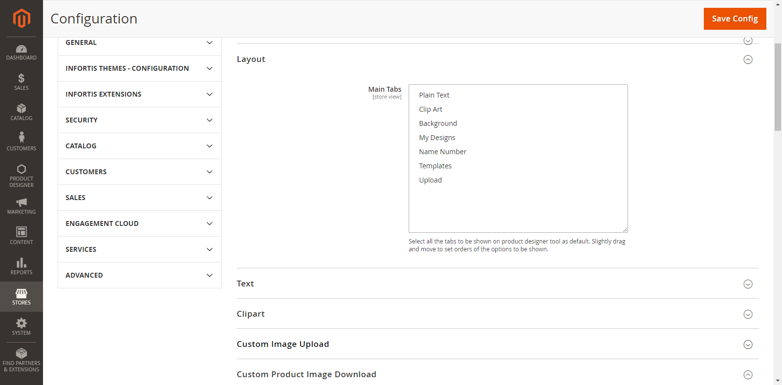
For general tab layout configurations, go to Stores → Configurations → Layout
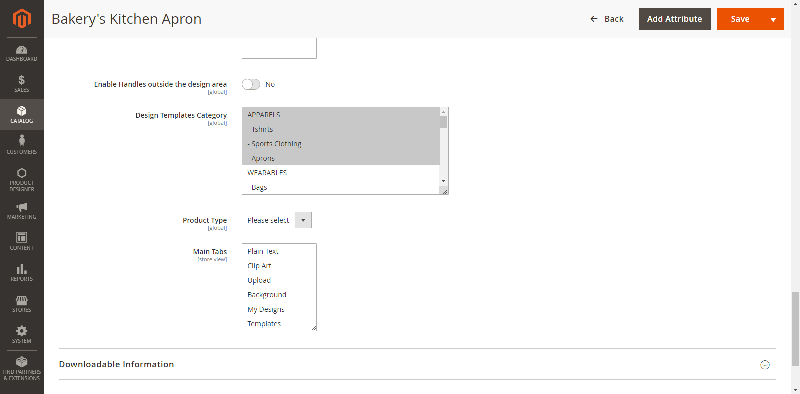
From here, you can select the “Main Tabs” by multiple selections.
Suppose, if you have selected any 5 tabs, the remaining 2 tabs will be eligible for subtabs.
Manage Tabs
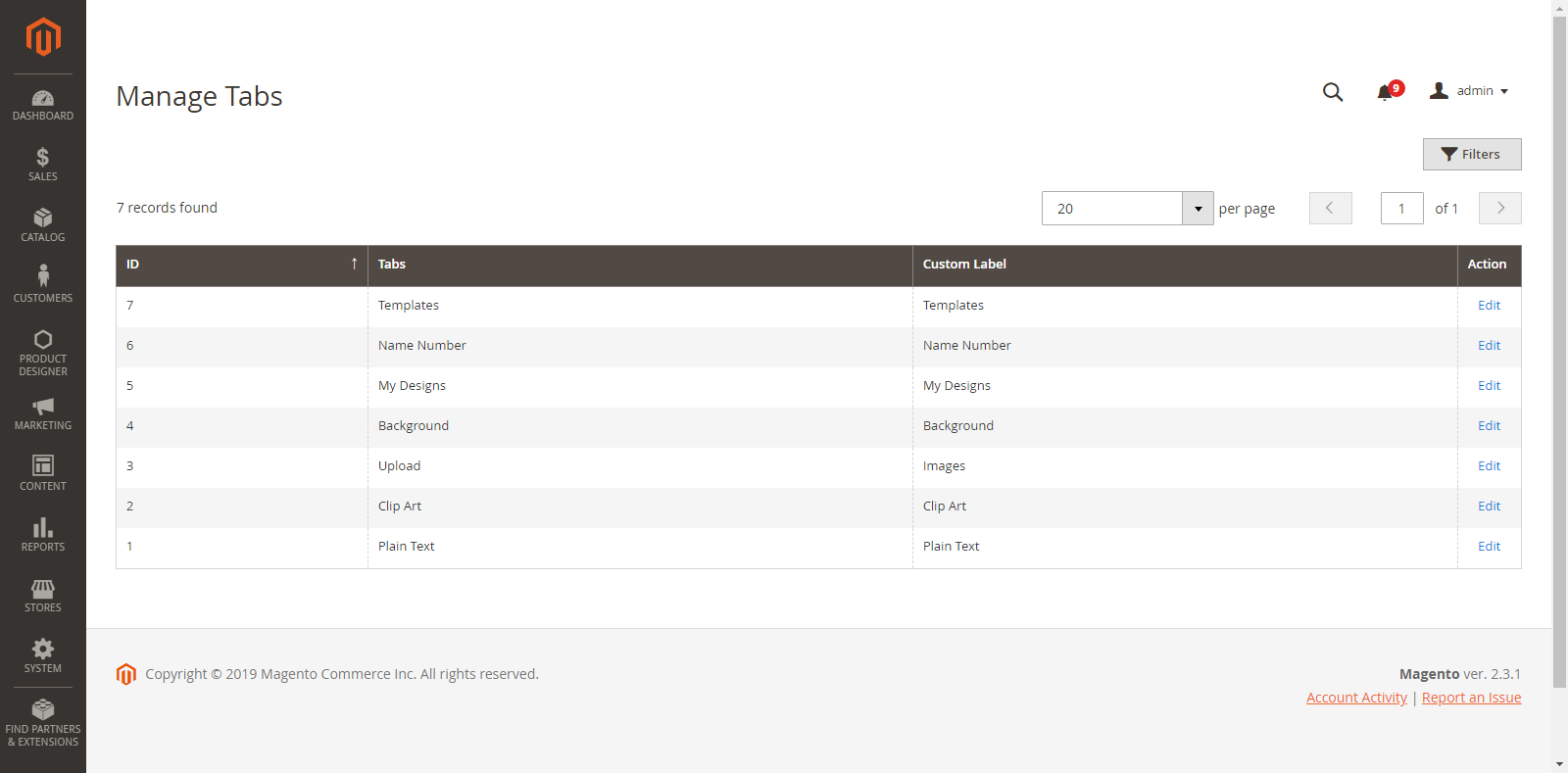
After configuration of the Tabs, you can Manage the Tabs from Product Designer → Manage Tabs. By clicking on it, you will get a list of all the Main Tabs.
From here, you can change the Custom Label (Name of the Tabs) which will be displayed on the “Designer Explorer” tab (left side) on the Front End. Click on the “Save Tab” button to save the changes.
Manage SubTabs
After managing and editing the Main Tabs, you can also manage the Sub tabs.
Go to Product Designer → Manage Subtabs
From here, you can easily manage the Sub tabs under the Main Tab and show the customization Tabs for all Products.
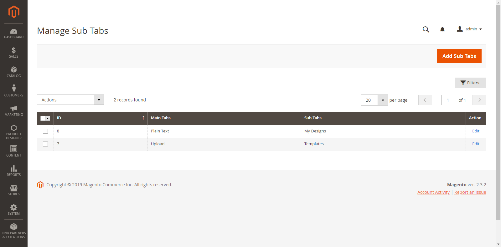
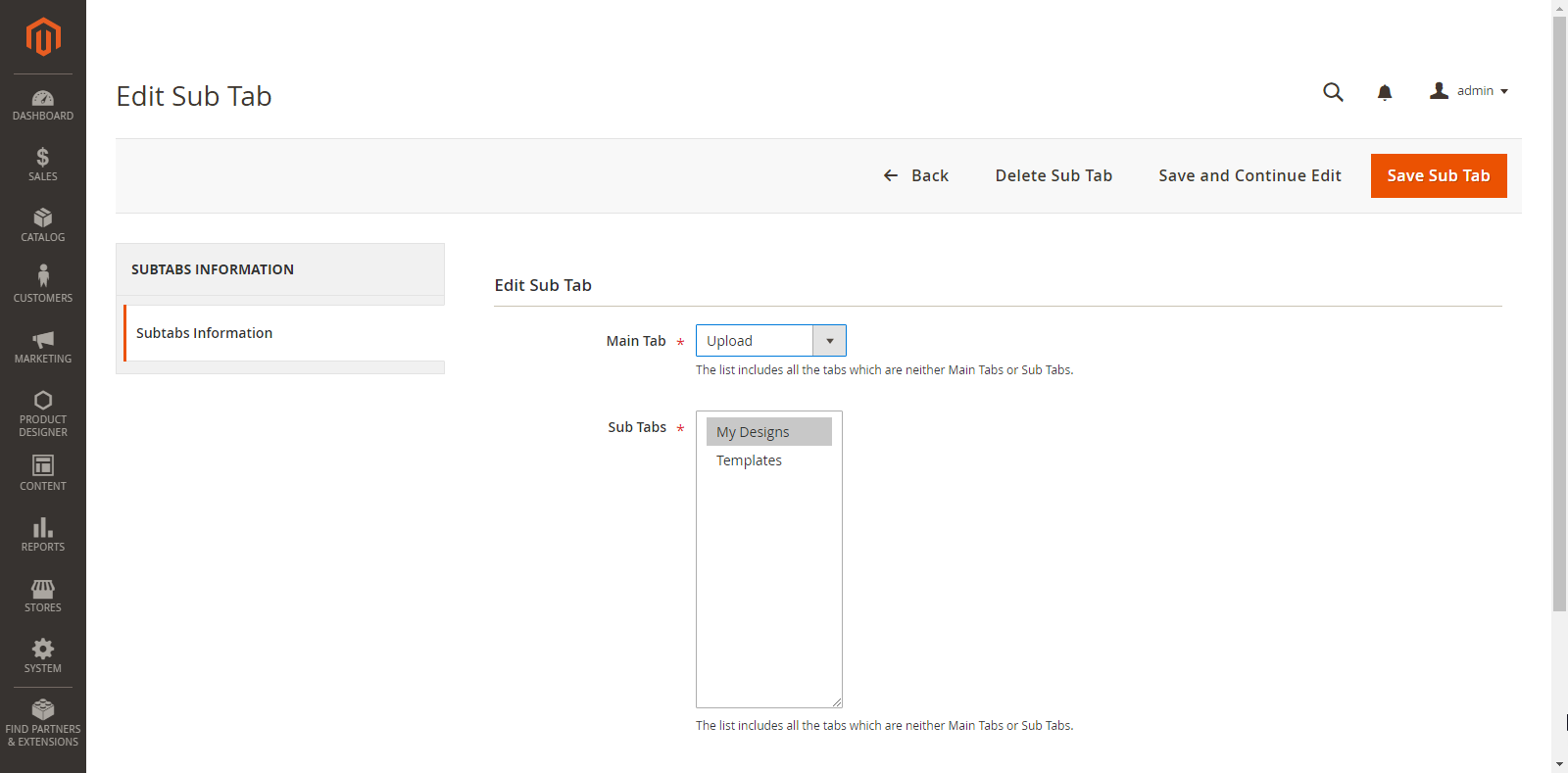
You can add a new Sub Tab by clicking on the “Add Sub Tabs” button. By clicking on it, you will be redirected to the ‘Add Sub Tabs’ page.
Enter the following details to add Sub Tab:
Main Tab: It will display Main Tabs chosen from the “Stores → Configuration → Product Designer Settings”.
Sub Tabs: It will display tabs which are not selected as Main Tabs.
Later you can ‘edit’ any Sub Tab as per your need by clicking on ‘Edit’ option and you can also ‘delete’ any Sub Tab by clicking on ‘Delete’ option from the ‘Actions’ dropdown.
Additionally in Premium
Back End Configuration
For general tab layout configurations, go to Stores → Configurations → Layout
From here, you can select the “Main Tabs” by multiple selections. To set ‘orders’ of the Tabs, click an hold a Tab and drag up or down as you want to set.
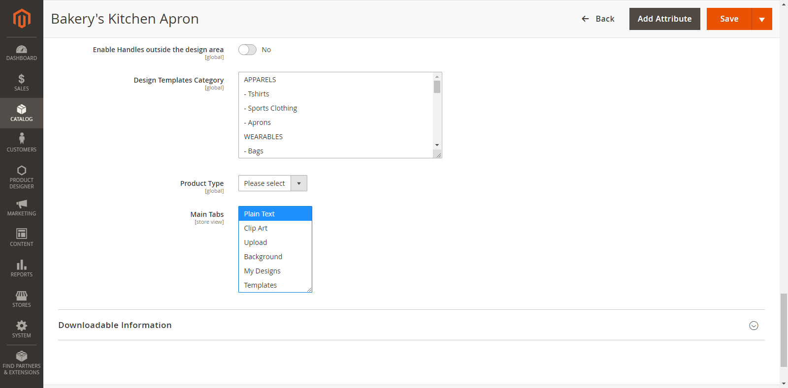
Select the Main Tabs from the Product page
You can set the tabs at the product level as well. To select the Main Tabs of Product, go to Product Page → Product Designer option and select the Main Tabs.
Note: If you have selected the Main Tabs here, this would be set as the first priority.
MANAGE TEXT AND FONT EFFECTS
Our PrintXpand Designer Tool provides unique text features for your customers to insert their favorite slogans, dialogues and one-liners on their choice of product (e.g. t-shirts, mugs, cards, etc.). Your customers can add attractive text like multi-colored text, text-shadow, and other designer text styles.
Backend Configuration
Manage Fonts
First, you must Manage the fonts which will be shown for the Text formatting during product designing to your customers.
Go to: Product Designer → Manage Fonts
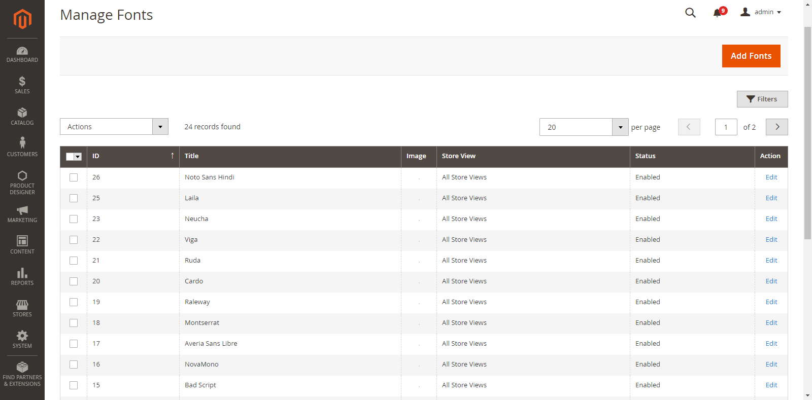
As you click on “Manage Fonts”, you will get the list of already inserted Fonts along with details like Id, Title, Thumbnail Image (if available), Store View, Status & Actions.
You can edit any font just by clicking on “Edit” from the Action Column.
If you want to ‘Delete’ any Font, select the Font and click on the ‘Delete’ option from ‘Actions’ dropdown list.
A confirmation pop-up will appear after you click on the ‘Delete’ option. Select “Ok” to perform the delete action.
Similarly, you can change the font status to Enable / Disable from ‘Actions’ dropdown list.
Text Configurations
You must set the general Text Configurations from the System Configuration.
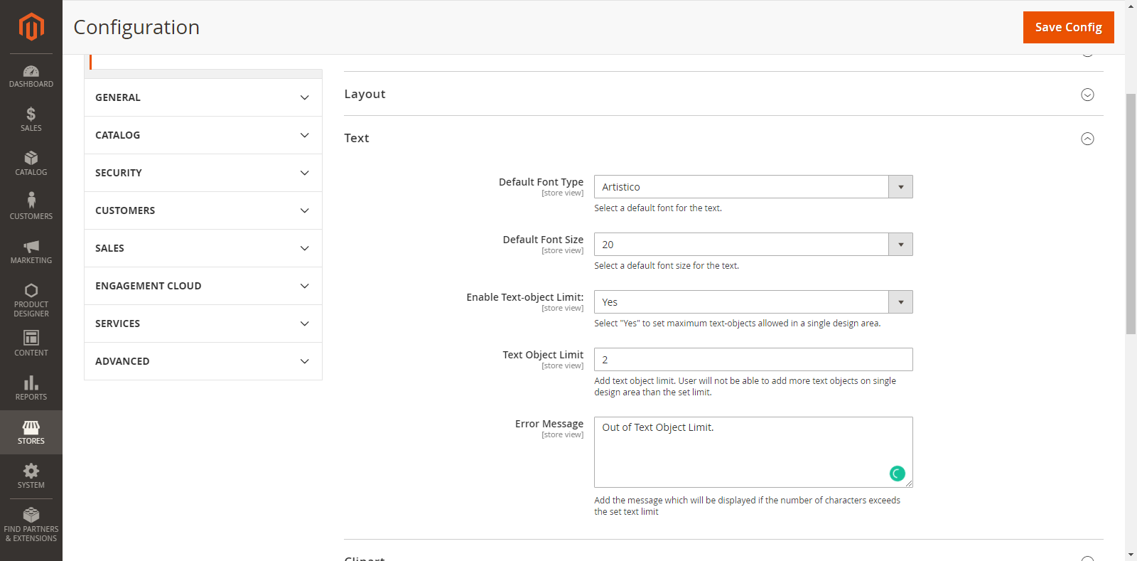
Go to: Store → Configuration → Text option
The general Text Configurations are shown as below:
Default Font Type: Select a default Font for the Text from this dropdown list. The text will appear in the default Font Type during Product designing in the front end.
Default Font Size: Select a default Font Size for the Text from this dropdown list. The text will appear in the default Font Size during Product designing in the front end.
Enable Text-Object Limit: If you select Yes, you can set a limit of the Text Object for your customers so they cannot cross the limit on the single design area.
Text object Limit: To add a limit for the Text Object, enter the value of text limit in this field.
Error Message: Enter the message which will be displayed if the customer exceeds the limits of the Text Object.
Frontend View
Text Design for a Product
After setting the Back End Configuration (Product Designer → Manage Fonts ) and General Text Configurations (Stores → Configuration → Text), the customers can start designing the product by adding a text element.
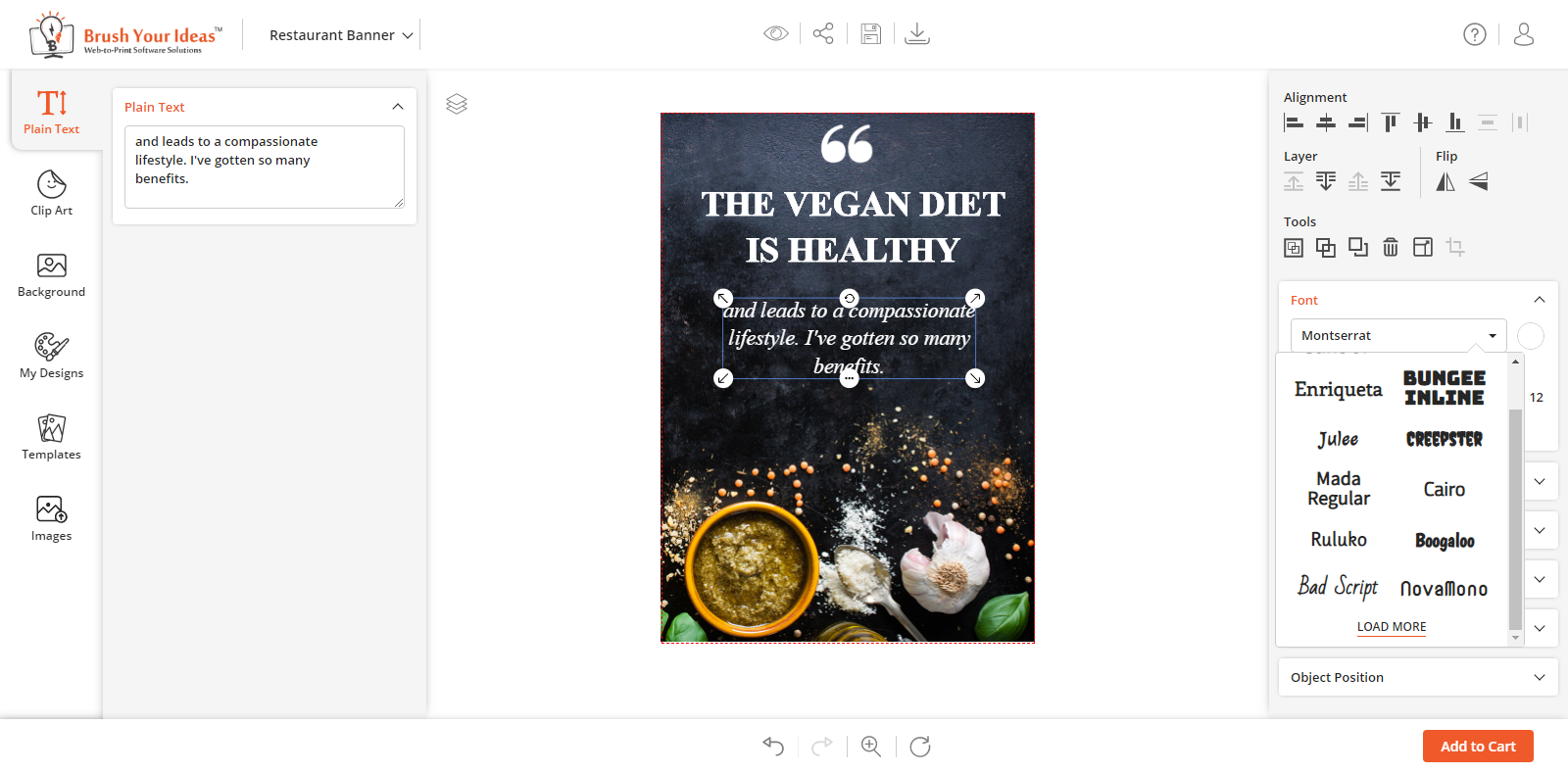
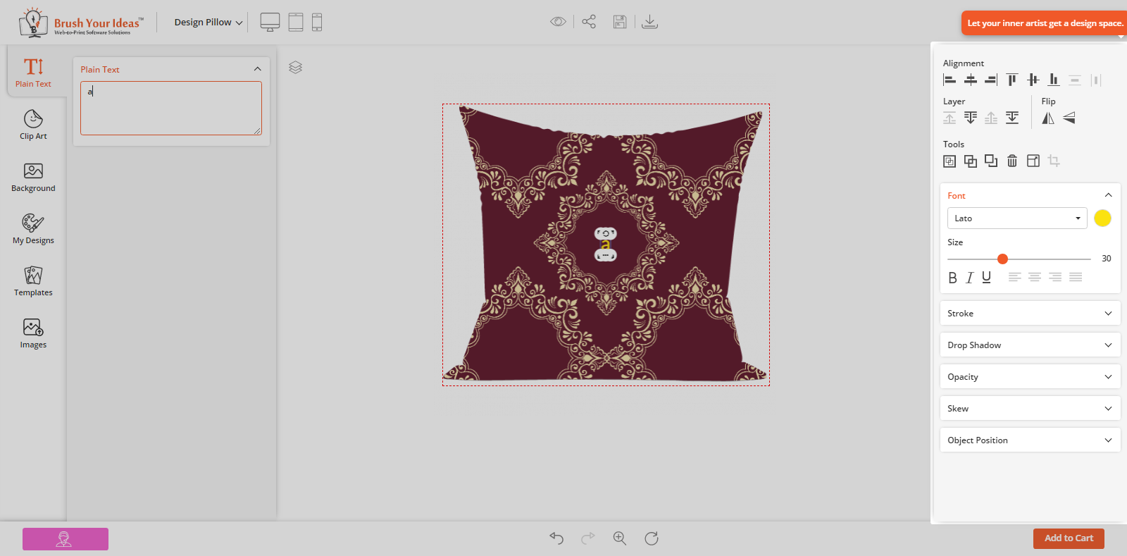
Now, click on the ‘Text’ tab in Designing Explorer. The customers can enter the Text which they want to show on their product. The customers can insert the Text until the text limit has exceeded. The customers will get an Alert message on exceeding the configured Text limit.
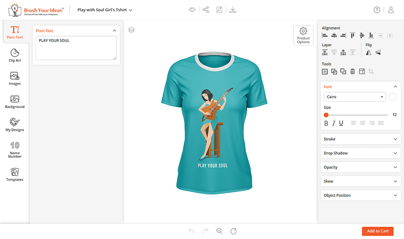
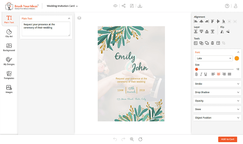
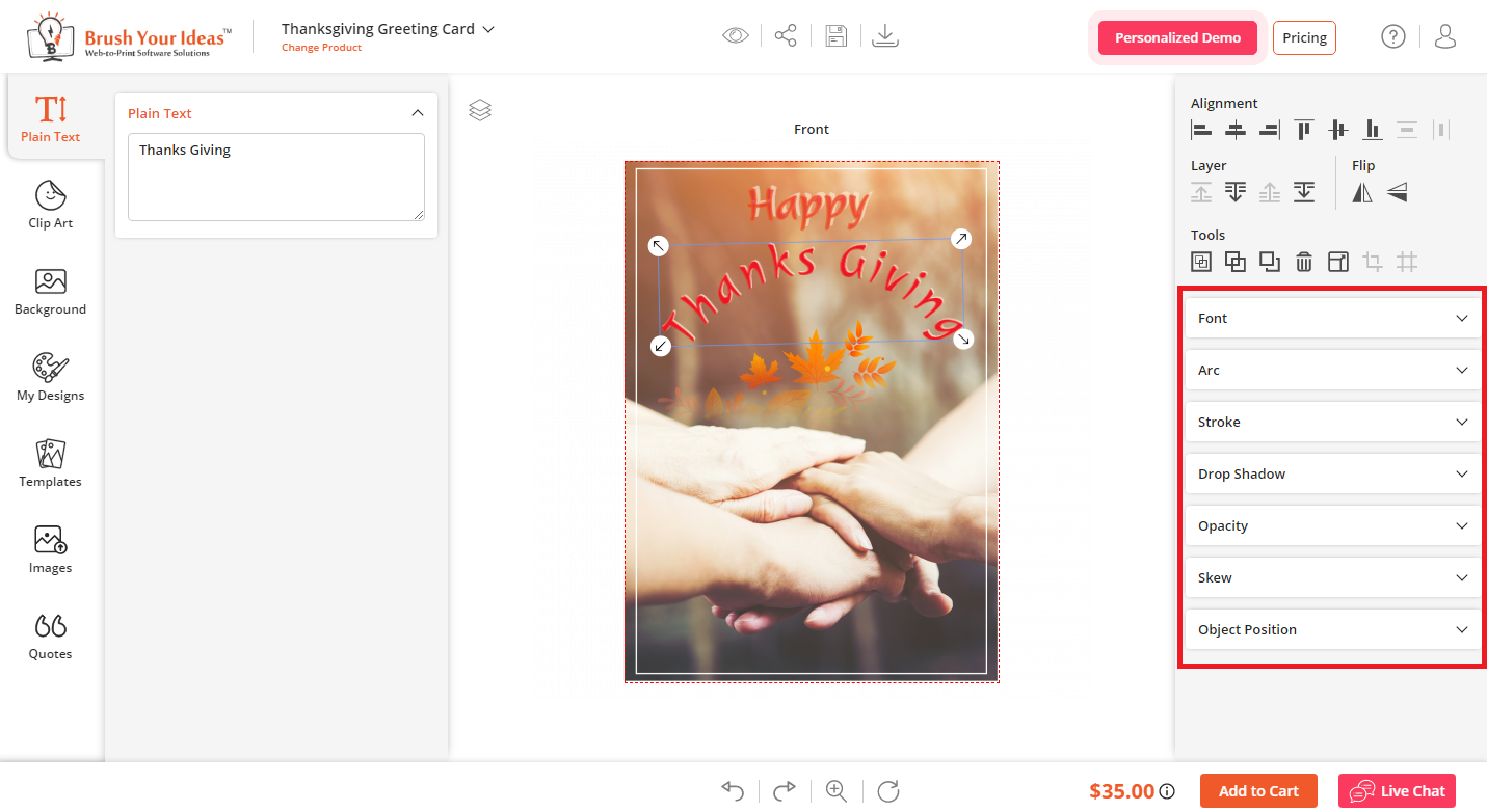
After inserting the Text, the Designer tool will be enabled on the right side. From here, the customers can customize the Font Size, Style, Color, and text alignment.
Apply the Text Effects
Font Style, Color & Size: The Font Style, Color & Size will appear as per the Text Configurations which has been set as the default from the Back End.
Customers can select their favorite ‘Font Style’ and pick a color from the ‘color selection’ option. They can increase the ‘Font Size’ by dragging the text size slider to right & left to decrease.
Customers can also ‘edit’ the text in Bold, Italic and Underline.
Customers can adjust the Text alignments to Left, Center, Right and Justify.
Stroke: To add the outline text effect of a particular color on the text.
Drop Shadow: To adjust the text-shadow effects horizontally (X-offset) & vertically (Y-offset) on the text.
Skew: To give horizontal or vertical italicized effects to the Text in the product design.
Object Position: To change X-Y coordinates for positioning (Horizontal-Vertical) in the product design.
Additionally in Premium
Arc: To apply the text in a curved shape, enable the Arc effects. Set ‘Diameter’ for the curve of the text and adjust the Letter Space. Also, flip the text by enabling the Flip option.
Note: Arc effect can be applied only on Plain Text in a single line only like any nickname or slogan type texts. Name Number and Quote options are not compatible with Arc.
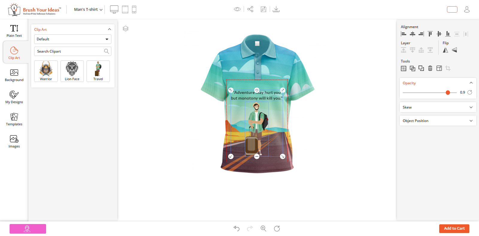
Opacity: To adjust the opacity (transparency) of the text.
MANAGE NAME AND NUMBER
This feature of the Premium pack allows the customers to add their favorite Name & Number on the product using our PrintXpand Product Designer Tool.
Back End Configuration
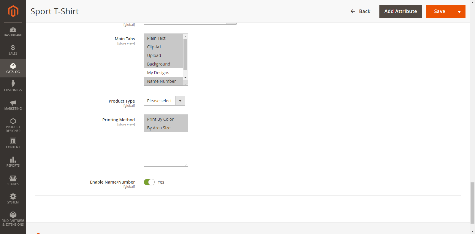
The Name/Number option will be enabled only for the ‘Configurable Products’. After the product configurations, you will get an option as ‘Enable name/Number’ in the Product Designer option from the Product page.
If you want to provide Name/Number option to the customers, select ‘Yes’ for “Enable Name/Number” toggle button.
Front End View
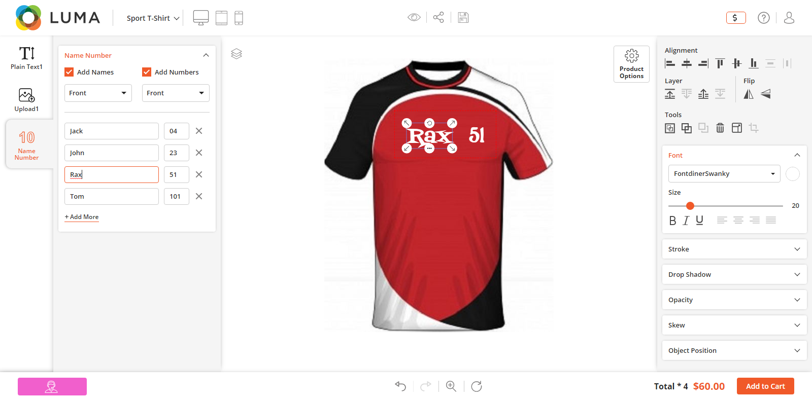
After the Back End configuration, the Name/Number will appear on the “Designer Explorer” (left side).
Now, the customers are able to add the Name/Number on their choice of product.
Customers can add multiple rows by clicking on +Add More buttons beside ‘Name’ and ‘Numbers’ options. Customers can add up to 25 rows of Name & Number.
They can also select the sides for Name & Numbers which are managed from the Back End.
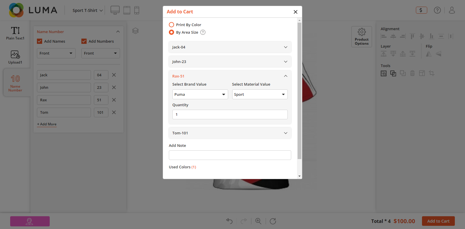
When ordering in bulk, On the front end, the customers will only be able to preview one Name/number design. The rest of the designs will be available on the backend with the original order and they need to be generated from the Back End by the admin itself.
MANAGE IMAGE EFFECTS AND FILTERS
Your customers can apply filters on images while designing the product by using our Image filters feature.
Backend Configuration
The designer tool comes with effects like blur, brightness, contrast, hue, Noise, Pixelate, and Saturation. Also, there are filters available like Black and white, brownie, emboss, grayscale, invert, and sepia, and more based on the tool’s package you purchase. Users can apply any of the filters and edit it using effects to get the desired output.
The list of effects and filters is already provided. You have the rights to Enable/Disable them as per your convenience.
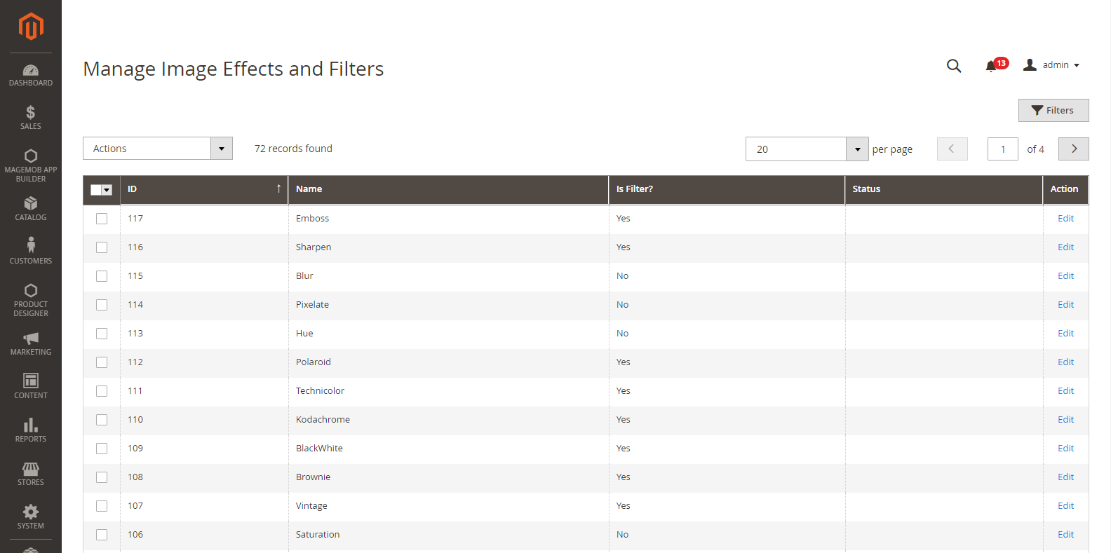
To edit and manage the Image effects, go to Product Designer → Manage Image effects and filters
Here, you can view the list of Image effects with the details like ID, Name of Image effects default Status and Actions.
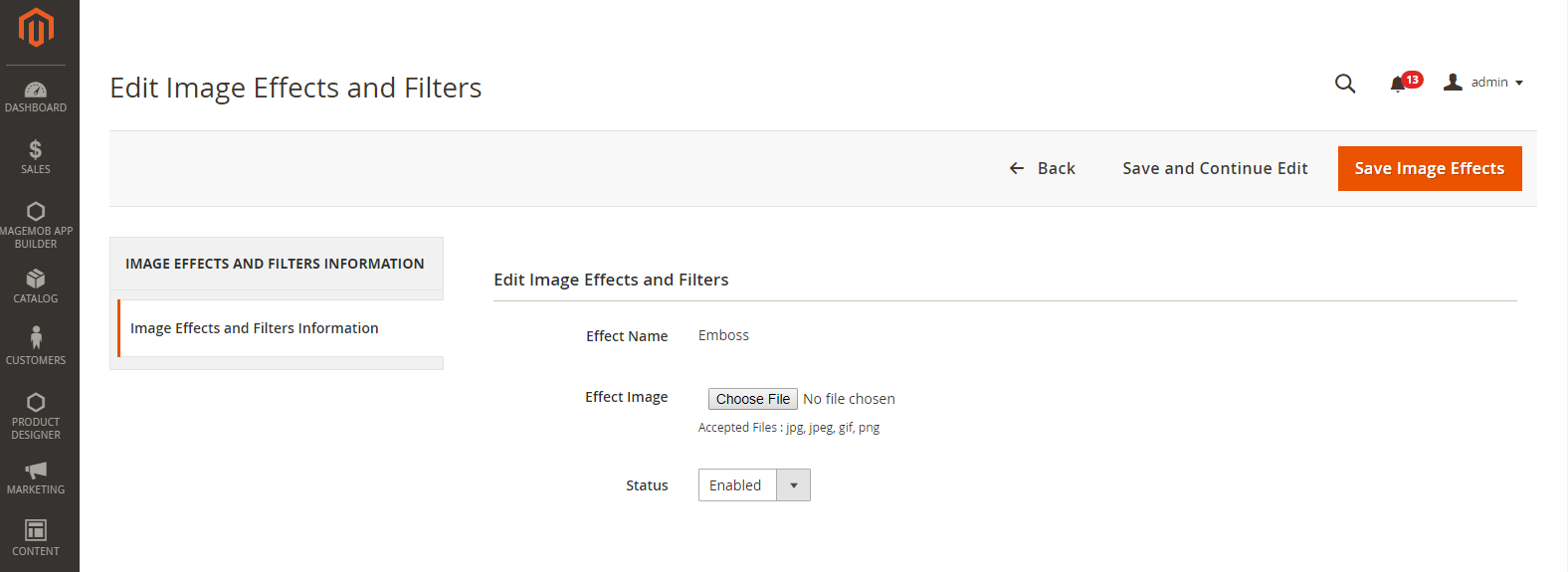
To ‘Edit’ any of the image effects from the list, click on the “Edit” option. By clicking on it, you will be redirected to the Edit Image effects page.
Effect Image: To update the image for it, click on ‘Choose File’ button and select the file to be uploaded.
Status: Choose the current status of it. (Enable/Disable)
After editing, click on ‘Save’ button to save the changes.
Note: Image effects are part of the Premium package.
Front End View
Image Filters
Once image effects have been configured and managed from the Back End, your customers can view the Image Filters in the Designer Tool (right side).
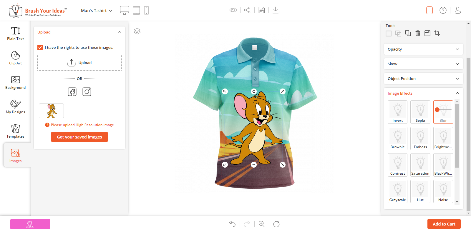
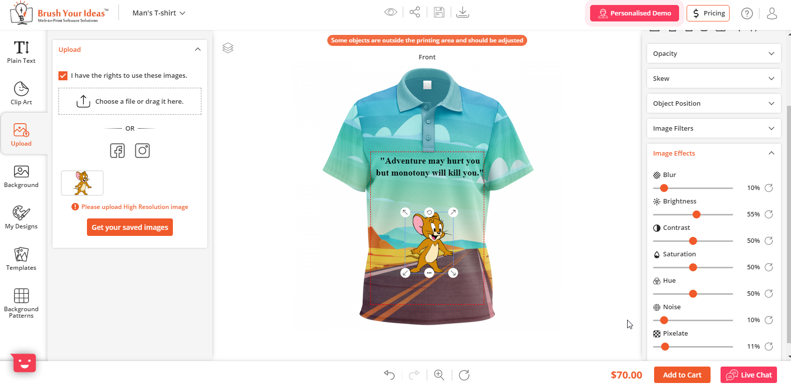
When the customers will upload an image from the “Upload Image” option or Clipart (PNG, JPG) and add to the canvas, the Image Effects tool will be displayed in the designer tool (right side).
Note: These Image Filters will apply only if the file format of an image is JPEG & PNG. But, if the file format is SVG, the customers can only change the internal colors of that image.
BACKGROUND PATTERNS
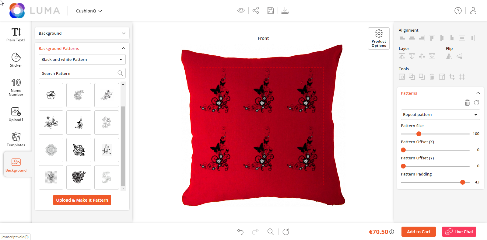
Customers can apply background patterns from this section. Customers can use any of the patterns set by admin or use any image as a custom pattern. To set custom design pattern go to Product Designer → Mange Clipart Categories and mark the category as a pattern in the setting.
There are two ways customers can use this feature:
Existing patterns:
You can offer a library of patterns to your users. Users can select any of them and use them in the image as a pattern. You can upload patterns from backend in the pattern category.
Custom Background Pattern:
Customers can select any of the image files and make it as a background pattern. To use an image as a pattern, select the image on the canvas and click on the `make a pattern` button in the `Tool section` in the `Designer section` on the right side.
You can apply various operations on the pattern as:
Pattern Type:
~Repeat Pattern:
To repeat the pattern on the canvas.
~No Repeat:
To use a single image as a pattern.
~Repeat X Pattern:
To repeat the pattern horizontally.
~Repeat Y Pattern:
To repeat the pattern vertically.
Pattern Size:
To set the zooming effect on the pattern.
Pattern Offset:
To move the pattern horizontally and vertically.
Pattern Angle:
To rotate the image to a certain angle.
Pattern Padding:
To control padding in between images of the pattern. You can also reset or delete the pattern from here
CLIPART
Your customers can spice up their product designs with attractive and stylish Cliparts!
Our PrintXpand designer tool provides Clipart Gallery for your customers that contains pre-loaded unique designs which they can add to their products.
Backend Configuration
Manage Clipart Categories
You can manage and categorize the Clipart images. It is easy to set the parent and the child categories for the Cliparts.
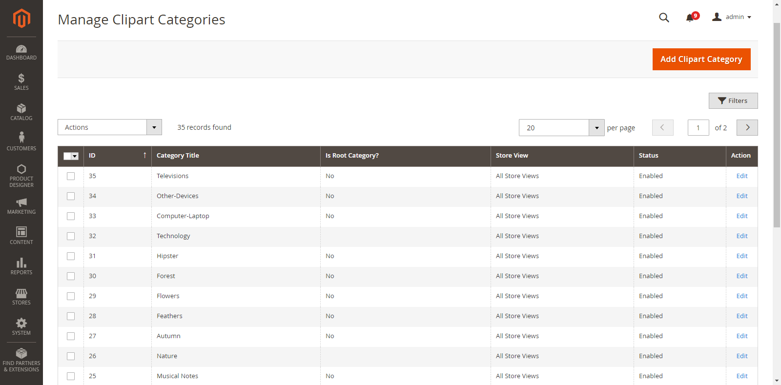
To add and manage the Clipart and its Category, go to Product Designer → Mange Clipart Categories
As you click on Manage Clipart Categories, you will get the list of already added clipart categories. You can manage and edit them as per your requirement.
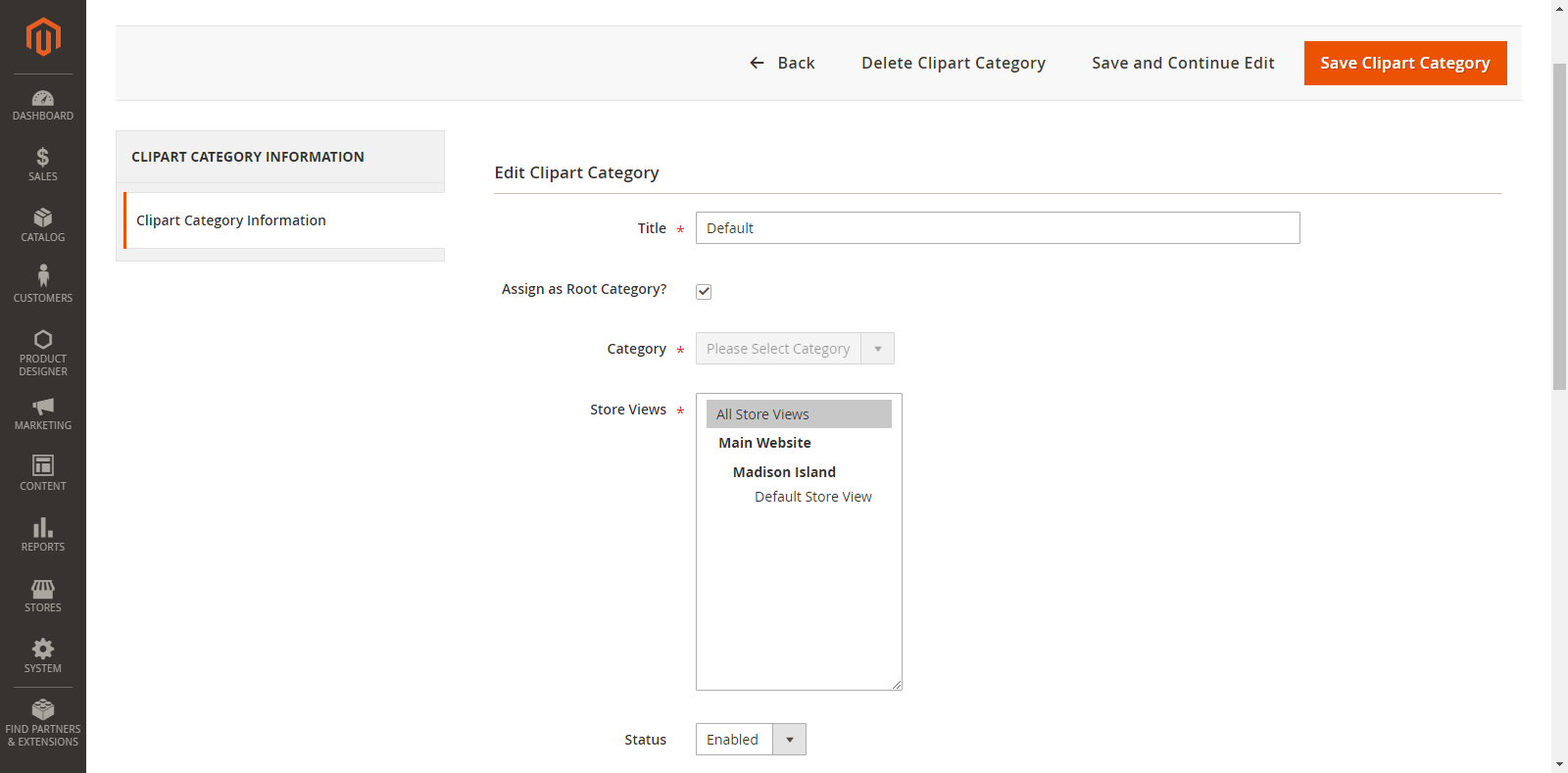
By clicking on “Add Clipart Category”, you will be redirected to the “Add Clipart Category” page where you can add a new Clipart Category and Clipart Images.
Now, select the parent/subcategory and enter the details as shown below:
Title: Enter the relevant name of a Clipart.
Assign as Root Category: Tick this option if it is a ‘parent category’.
Category: If you are adding clipart for ‘subcategory’, select its ‘parent category’ from the dropdown list.
Store Views: Select the stores in which the Clipart will be displayed.
Status: Choose the current status of Clipart. (Enable/Disable)
Add Clipart Images: Browse and upload the images to be added in the Clipart category.
JPG, JPEG, PNG and SVG formats can only be supported.
Label & Tags: Enter Clipart’s ‘Label & Tags‘ to ease out of the search.
Position: Enter the No. of position in which you would like to display the Clipart image at the Front End.
Exclude: Enable this option if you don’t want to display the clipart in the front end instead of permanently deleting.
Remove: Customer can permanently remove clipart image using this option.
After inserting all the details, click on the “Save Clipart Category” button and it will be added in the “Manage Clipart Categories” list. Later, you can edit as per your need.
To ‘Delete’ any Clipart Category, select it and click on “Delete” option from the “Actions” dropdown. As you click on the ‘Delete’ option, a confirmation message will appear. By clicking on the “OK” button, the selected clipart category will be deleted.
Clipart Configuration
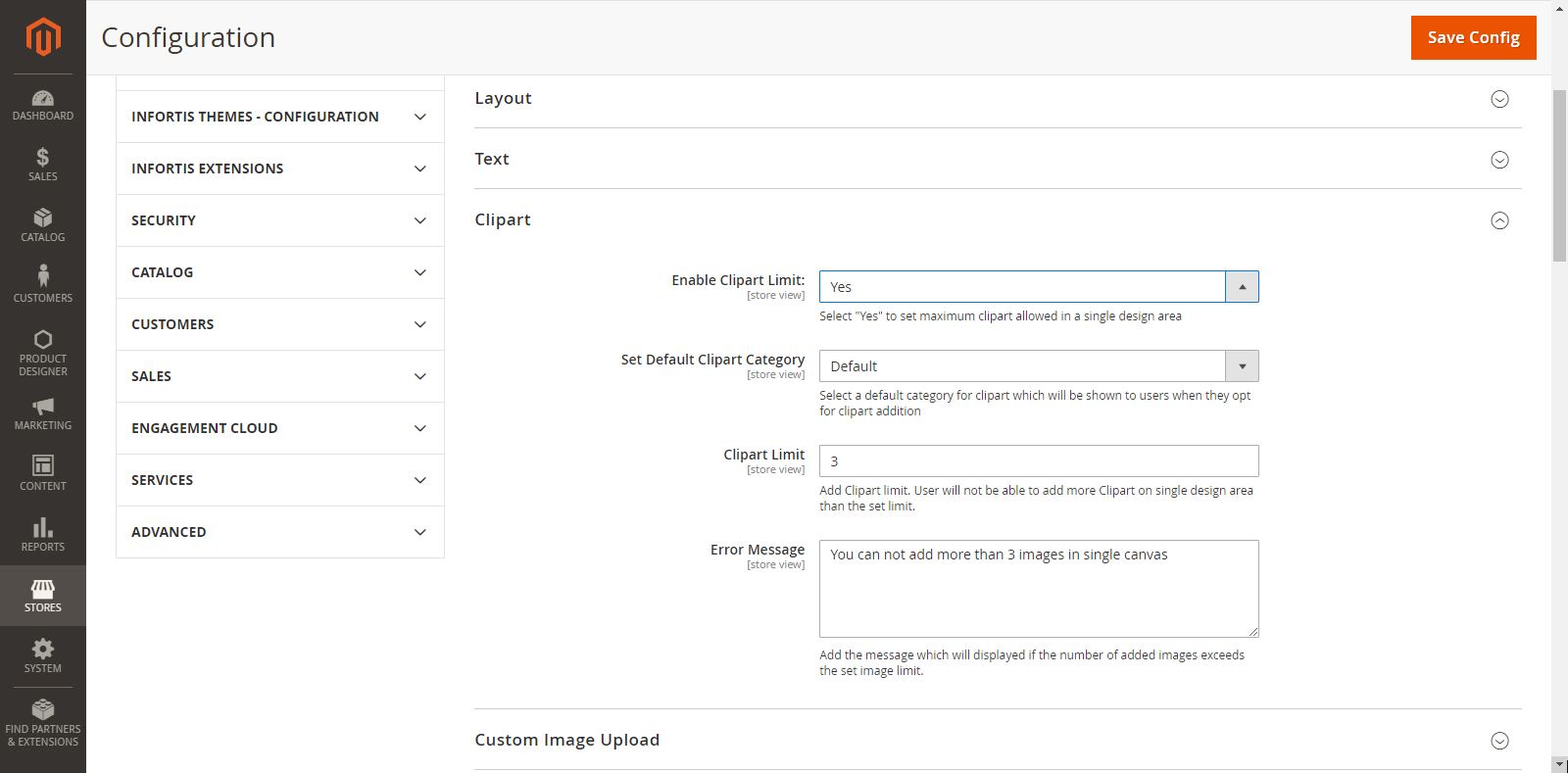
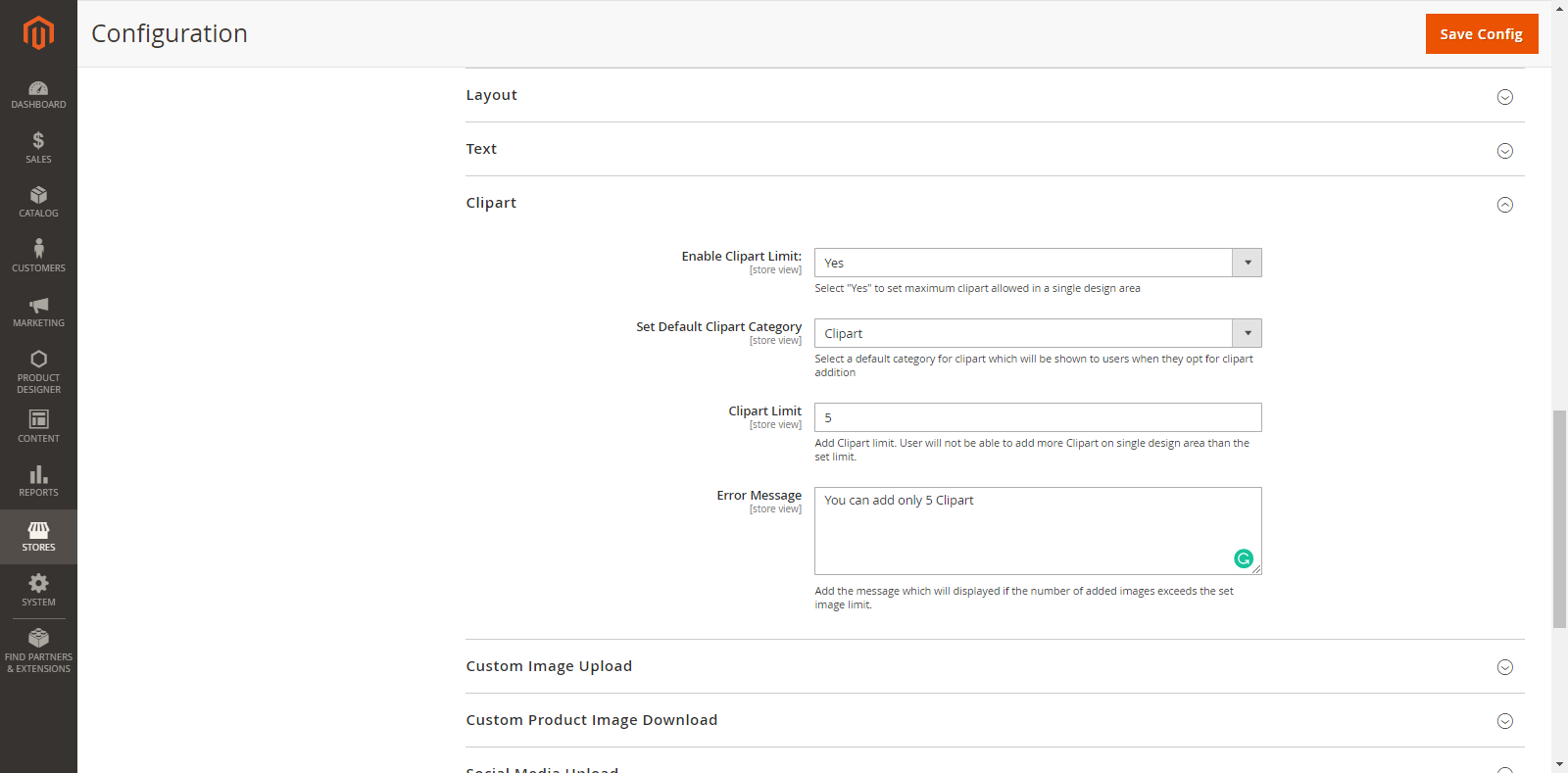
To set the general Clipart Configurations from the Back End, go to Stores → Configurations → Clipart
From here, you can set the default configuration to display in the Front End.
The general Clipart Configurations are shown as below:
Enable Clipart Limit: Select ‘Yes’ to set maximum clipart allowed in a single design area.
Set Default Clipart Category: Select a default Clipart Category which will be displayed when the customers click on the Clipart option.
Clipart Limit: Enter the value of Clipart limit so the customers cannot exceed the limit on the single design area.
Error Message Clipart: Enter the relevant Error Message which will be displayed when the customers exceed the limit.
Front End View
View Added Cliparts
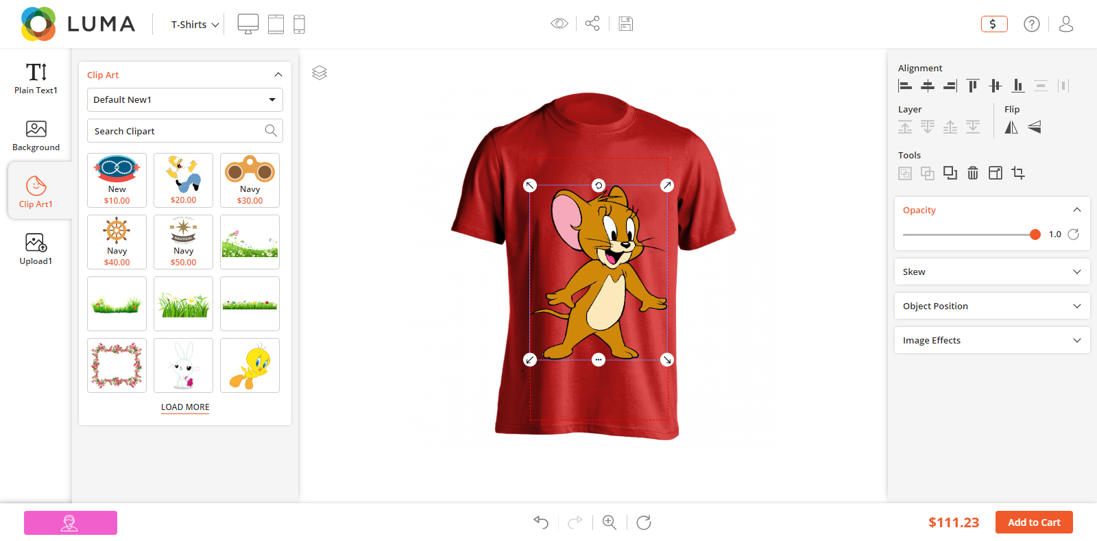
Click on Clipart tab from the ‘Designer Explorer’ (left side). The customer will see the Cliparts in the grid view and explore the clipart provided as configured from the backend. They can search and filter the clipart.
Now, the customers can add their favorite Clipart image and they can apply the Image Effects from the ‘Designer Tools’ tab (right side). They can set the alignment of the clipart, Front/Back positions by Layer, rotate and flip horizontal & vertical.
Note: The customers can crop the Clipart Images but the cropping will not be applied on SVG format images.
MANAGE PRINTABLE COLORS
You can add and manage the Colors from Back End configuration. The customers can select only those colors which you have enabled.
Backend Configuration
Printable Color Management
You can provide the Printable Colors to the customers as per the compatibility of your printer or availability of printable colors.
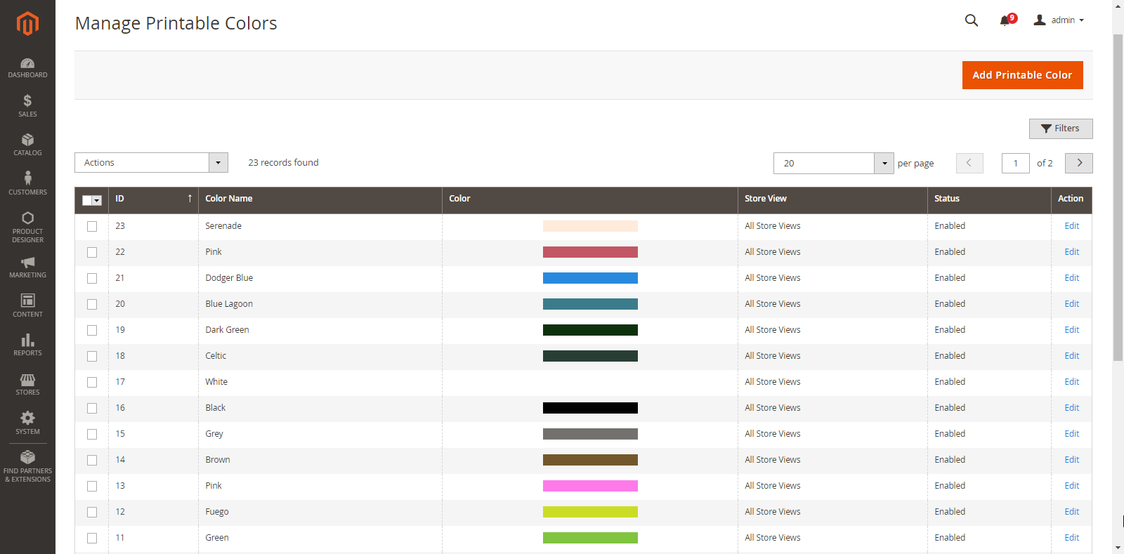
To manage the Printable Colors, go to Product Designer → Manage Printable Colors.
By clicking on “Manage Printable Colors”, you will get the list of already inserted printable colors with the details like printable color ID, Color Name, Color, Store View, Status and Action to Edit.
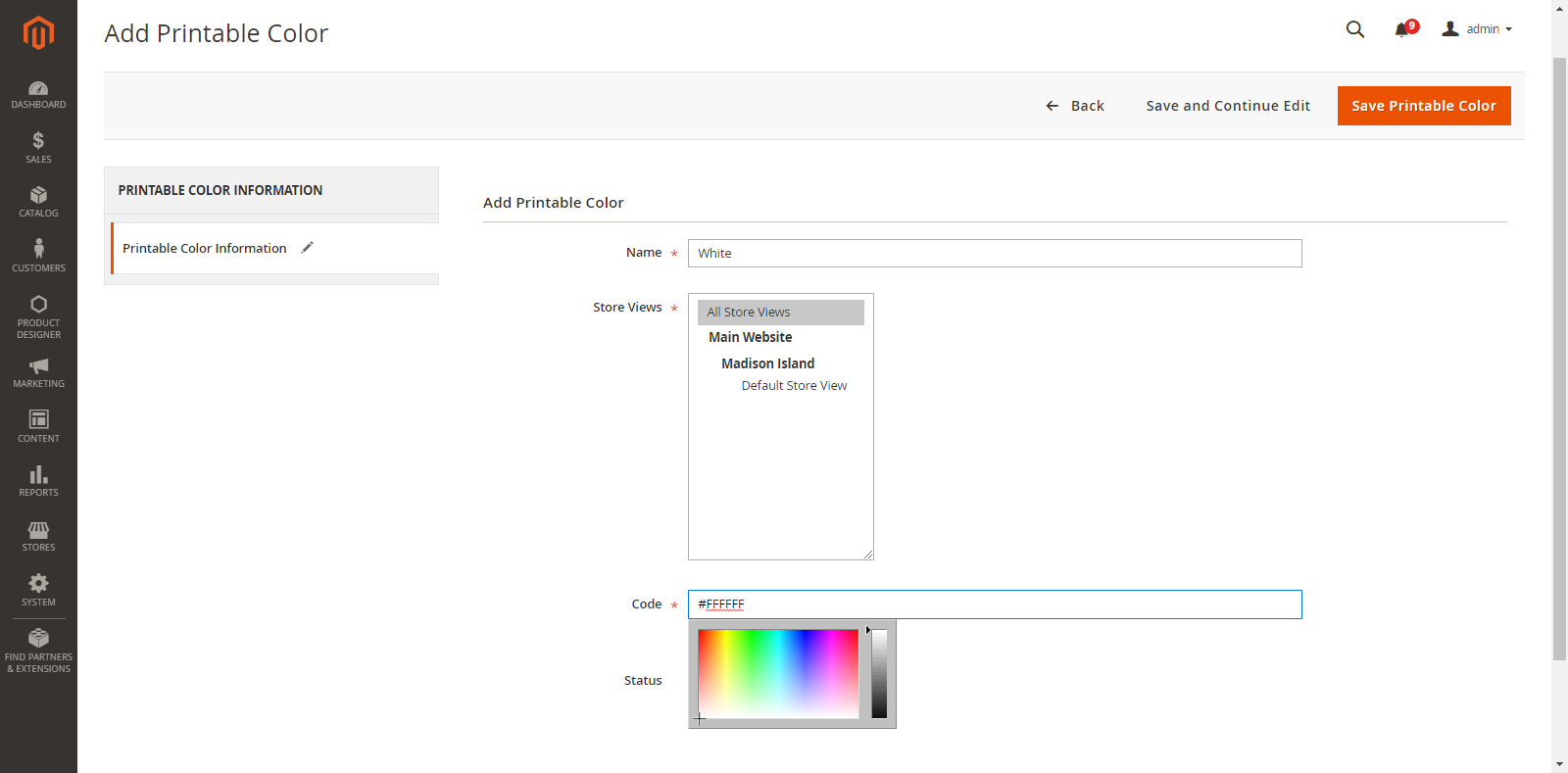
To add a new Printable Color, click on the Add Printable Color button. By clicking on the “Add Printable Color” button, you will be navigated to the “Add Printable Color” page.
Now, add the following details:
Name: Enter the printable color name.
Store Views: Select the stores on which the color will be accessible.
Code: Enter the color code of particular printable color (hex color code) or select the color through color picker pointer.
Status: Choose the default status of the printable color. (Enable/Disable)
After inserting all the details, click on “Save Printable Color” and then a Color will be saved.
Now, the color can be seen on the list. You can edit any color just by clicking on “Edit” from the Action Column.
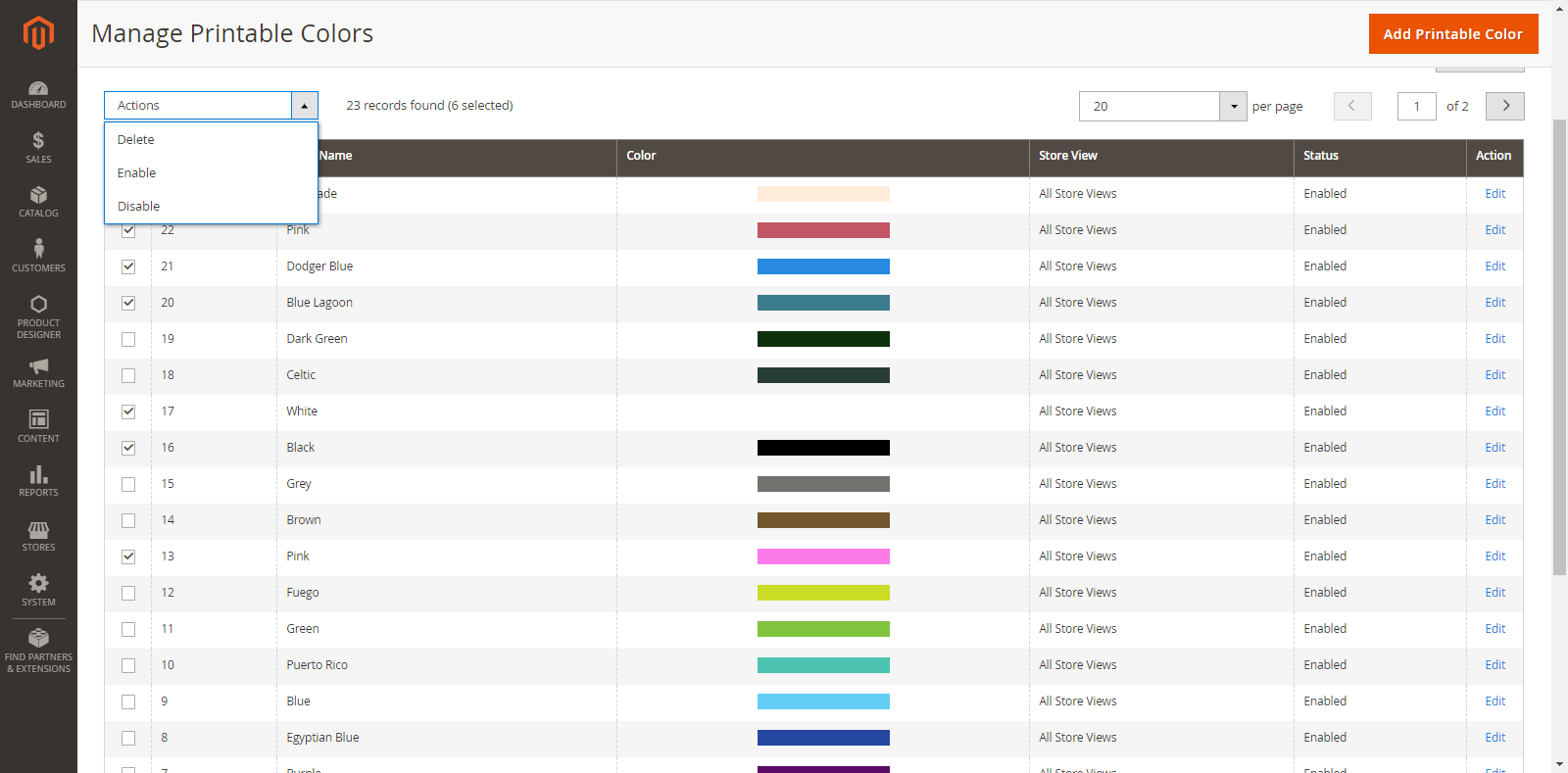
If you want to ‘Delete’ any Color, select the Color and click on the ‘Delete’ option from ‘Actions’ dropdown list. A confirmation pop-up will appear after you click on the ‘Delete’ option. Select “Ok” to perform the delete action.
Similarly, you can change the printable color status to Enable / Disable from ‘Actions’ dropdown list.
To set the default Color
You can set the default color. So when the customers insert any ‘Text’ or ‘Name/Number, the object will appear in that default color. (screenshot)
To set the default color for preset, go to Stores → Configuration → Color Picker
Here, select Yes to ‘Default Color for Color Picker’ option.
Front End View
After setting the Back End Configuration and default color selection, the customers can access the color and select from the Designer Tool.
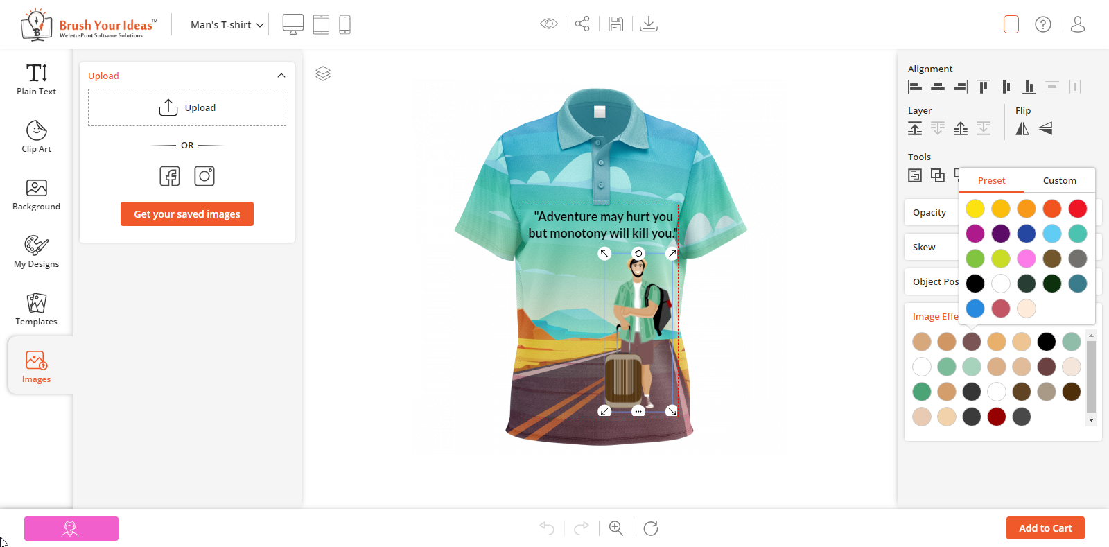
The customers will get the list of colors in the ‘Preset’ tab which is added in ‘Manage Printable Colors’ from the Back End.
While adding any Text Object, the customers will get the default color which is selected from the Back End.
CUSTOM IMAGE UPLOAD
Using our PrintXpand Designer Tool, your customers can upload their favorite and treasured images from their device to give the personalized touch in designing their product.
Back End Configuration
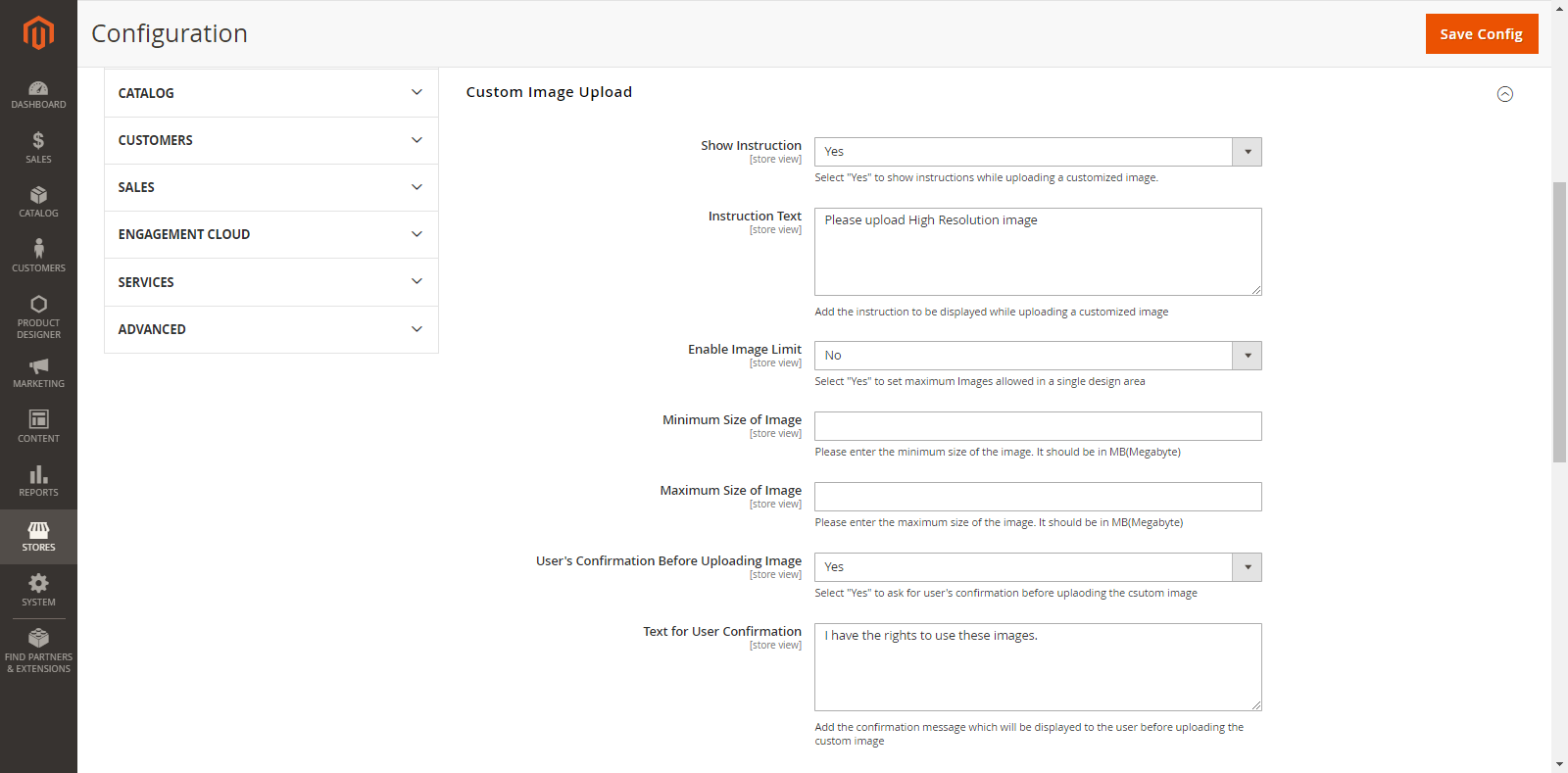
For custom image upload configurations, go to Stores → Configuration → Custom Image Upload.
Add custom image upload details as follows:
Show Instruction: Select ‘Yes’ to show instructions while uploading a custom image.
Instruction Text: Enter the instructions to be displayed while uploading the custom image.
Enable Image Limit: Select ‘Yes’ to set a limit for uploading a custom image. This avoids the overlapping of more images in the product design area.
Image Limit: Enter the limit for uploading maximum images.
Error Message: Enter the error message to be displayed if the number of images exceeds the limit of custom images.
Minimum Size of Image: Enter the minimum size of an image in MegaByte (MB).
Maximum Size of Image: Enter the maximum size of an image in MegaByte (MB).
User’s Confirmation Before Uploading Image: Select ‘Yes’ to ask for the customer’s confirmation.
Text for User Confirmation: Enter the relevant confirmation message which will be displayed above the Upload Image button.
Frontend View
Upload Images
After setting up and managing the ‘Custom Image Upload’ from the Back End Configuration, the customers can upload images for their product design.
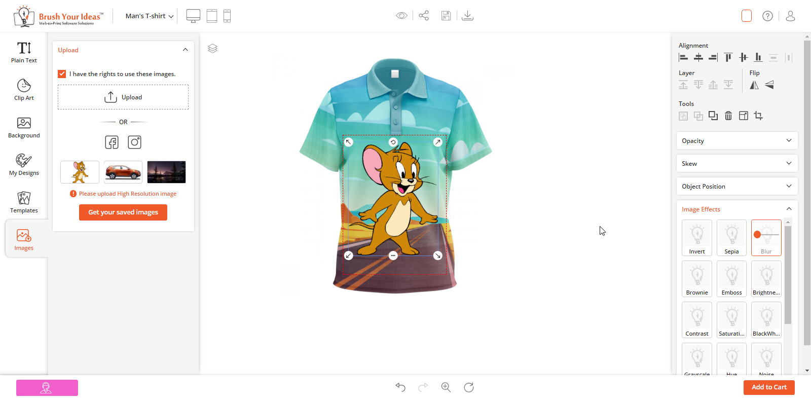
The customers can upload images by navigating to “Upload” tab from the designer explorer (left side).
If you have enabled “User’s confirmation before uploading image” option from the back end, then the customers will have to check the confirmation checkbox and then only they can upload any image from the system’s folder.
The customers can also get the uploaded images by click on “Get Your saved Images”.
Note: Customers should be logged in to their accounts to get the previously uploaded images.
After uploading the images, they can perform various activities from the ‘Designer Tools’ tab (right side) like applying image effects, set the alignment of the clipart, Front/Back positions by Layer, rotate and flip horizontal & vertical.
Crop Feature
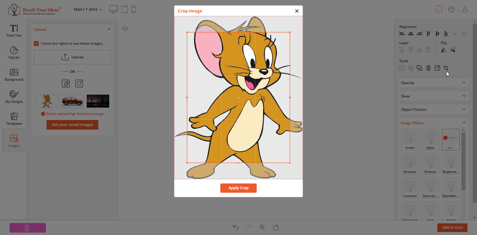
The ‘crop’ option is given on the Designer tool (right side) under the ‘Tool’ option. The customers can ‘crop’ uploaded Images which are in JPEG & PNG formats but the SVG format images will not support for cropping.
To ‘Delete’ any of the uploaded images, customers can click on ‘Delete’ icon which would appear on dragging mouse cursor on a particular image.
Background Removal
Backend Configuration
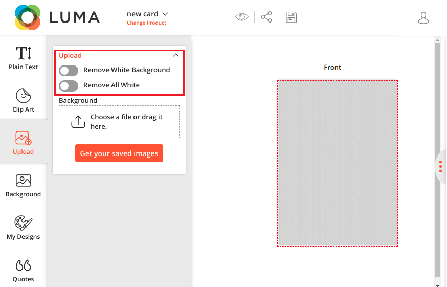
‘Display remove all White color’ option: Enable this option to allow customers to remove the White background only from the uploaded custom image.
‘Display white background remove’ option: Enable this option to allow customers to remove all the White color from the uploaded custom image.
Frontend View
The customers will get the “White Removal” options enabled as per what you have enabled from the backend.
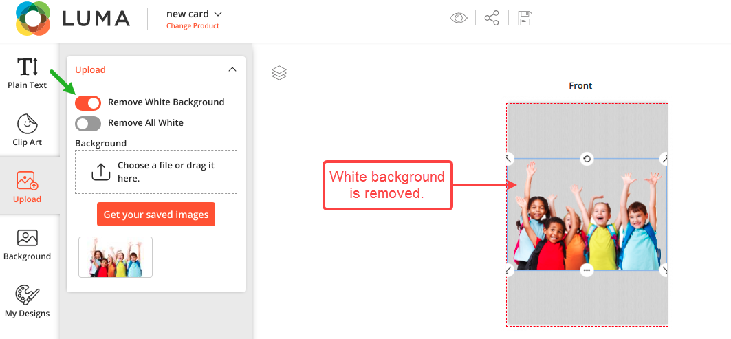
Once the customers uploaded the image and it has a white background, they can remove the background by enabling the “Remove White Background” option.
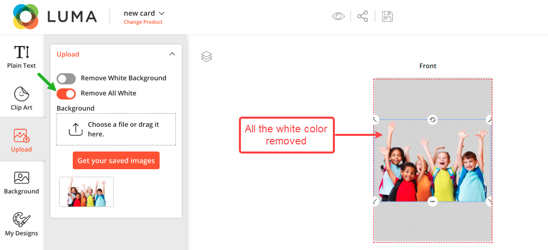
But if the customers enabled the “Remove All White options”, all the white colors including the background will be removed.
DRAG AND DROP IMAGES
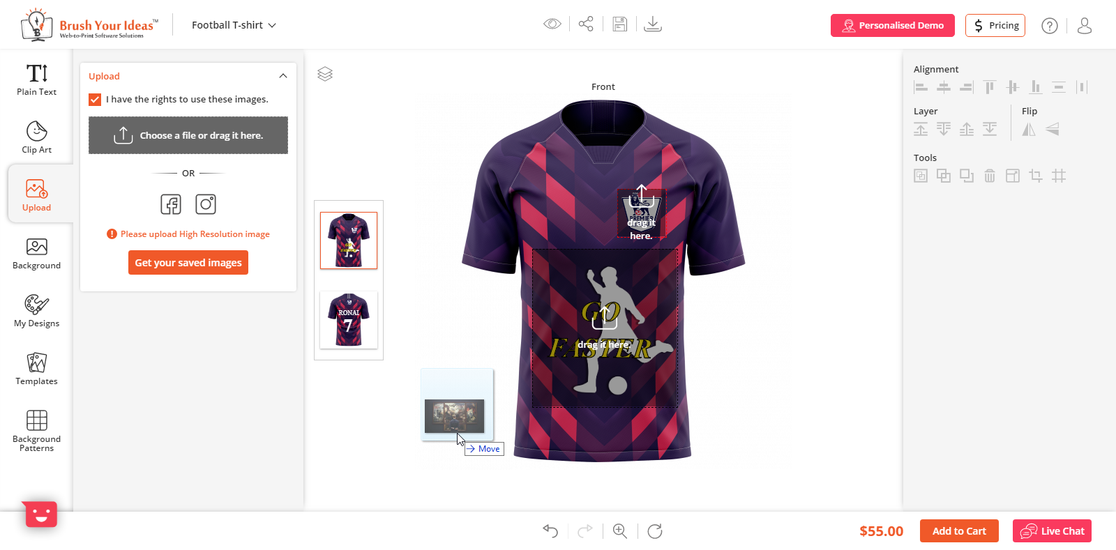
To easily upload images and clipart, there is a drag and drop functionality available.
Users can directly drag and drop an image from their system to design canvas or in the upload image section.
Users can also use it to upload any image from the designer section onto the product canvas.
CUSTOM PRODUCT IMAGE DOWNLOAD
Back end Configuration
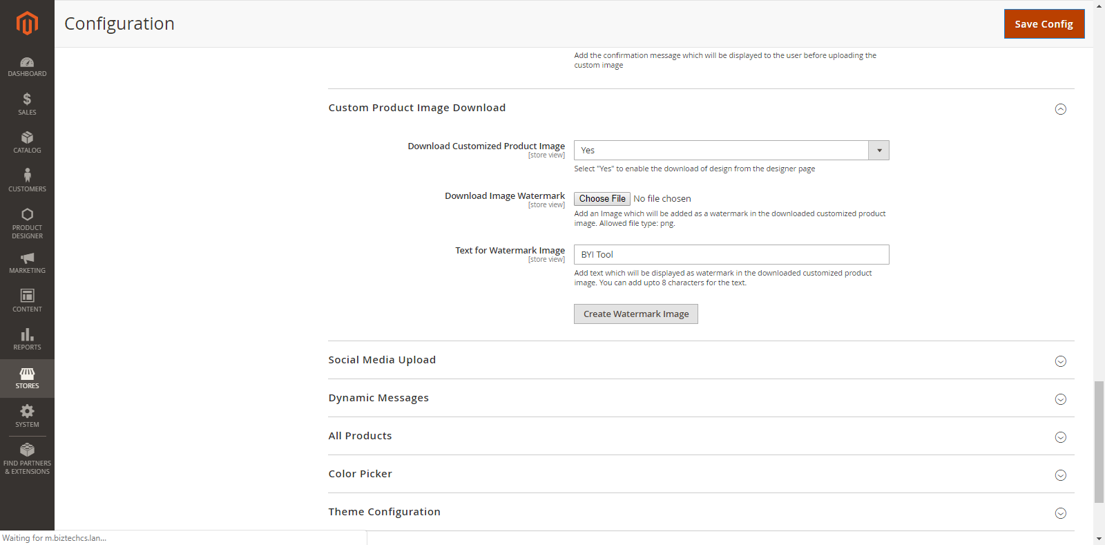
To set the ‘Custom Product Image Download’ configuration, go to Stores → Configuration → Custom Product Image Upload.
The Custom Product Image Download configurations are shown as below:
Download Customized Product Image: Select ‘Yes’ to enable the ‘Download’ option for the product designer page.
Additionally in Premium
Backend Configuration
Image Download with Watermark
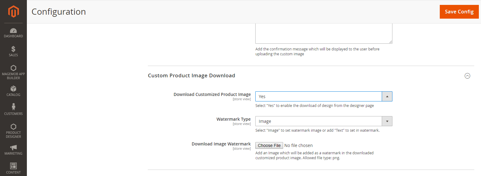
PrintXpand designer tool lets your customers download an image of their product designs. You can set a ‘watermark’ option for all downloadable images.
To set the ‘Custom Product Image Download’ with watermark configuration, go to Stores → Configuration → Custom Product Image Upload.
Download Customized Product Image: To enable design download option for tool users.
Watermark Type:
By selecting the watermark, choose the available options to set watermark as:
~Image Watermark: Choose and Upload an image that you want to add as a watermark in the downloaded customized product image. The image must be in png format.
~Delete Image: To delete the previously uploaded watermark image, check this checkbox.
Text Watermark:
Enter the text to be displayed as a watermark in the downloaded customized product image and click on ‘Create Watermark Image’ to create a watermark image.
OBJECT MANAGEMENT
In the PrintXpand product designing tool, the customers can easily align the individual objects on the canvas and manage the sides with interactive Tool. They can also rotate and flip the elements with the tool.
Customers can manage the alignments and the sides in the product designer page using mentioned below tools.
Layer Management
Object Alignment
Layer Management
Using the PrintXpand product designing tool, the customer can View/Hide any object, Lock and Delete the objects. It is possible to manage the order of the objects with the ‘Back’ and ‘Front’ options with regards to other elements.
By clicking on “Layer” icon, it will expand and display all the options of layer management for individual design objects. These options include View/Hide, Back/Front, Lock and Delete.
View / Hide:
The customers can View & Hide any object by clicking on View/Hide icon. In the layer management panel, the view icon of the hidden object can be seen in Red.
Back / Front:
By clicking on the Front/back icons, the customers can manage the Forward/Backward positions of the object as per their need.
Lock:
Click on the lock icon, to lock an object. This will prevent the editing of that object. so that any change of other objects will not affect. The lock icon of the locked object will mark in Red.
Delete:
To delete any of the object layers, click on the ‘Delete’ icon beside that particular object.
Layer in Designer Tool
Your customers can also manage Forward/Backward object positions from the Right side in Layer section. Your customers can manage positions when the objects are more than two. In Right side there are four options are given:
Bring Forward: To forward an object. i.e. 3rd position to 2nd position. (This option is also available in the layer management panel)
Send to Back: To send an object in last position i.e. 1st position to last position.
Bring Backward: To backward an object. i.e. 1st position to 2nd position. (This option is also available in the layer management panel)
Send to Front: To send an object in front in 1st position. i.e. Last position to 1st position.
Note: ‘Send to Back’ and ‘Send to Front’ options are enabled based on the selected object in the product design area.
Object Alignment
The customers can manage the alignment of objects in product design. The following options are given to manage the alignments:
Align Left: Click on this icon to align the object towards left in the canvas.
Align Horizontal Center: Click on this icon to align the object in the center horizontally in the canvas.
Align Right: Click on this icon to align the object towards the right in the canvas.
Align Top: Click on this icon to align the object towards the top in the canvas.
Align Vertical Center: Click on this icon to align the object in the center vertically in the canvas.
Align Bottom: Click on this icon to align the object towards the bottom in the canvas.
Additionally in Premium
Object Grouping
In the Premium version, your customers will get the option to group the objects together and edit them in the group easily. They can also manage the alignment of the grouped objects.
They will be able to Select All/Deselect All the objects on the canvas from the Tools section in the Designer tool. The multiple selections feature can be performed by dragging the mouse over the objects.
If three or more objects are selected, the last two ‘Alignment’ icons (Distributed Horizontal, Distributed Vertical) from the ‘Alignment’ section in the Designer Tool will be enabled.
By using both icons customers can align the objects horizontally/vertically to maintain the distance.
Object Alignment Position
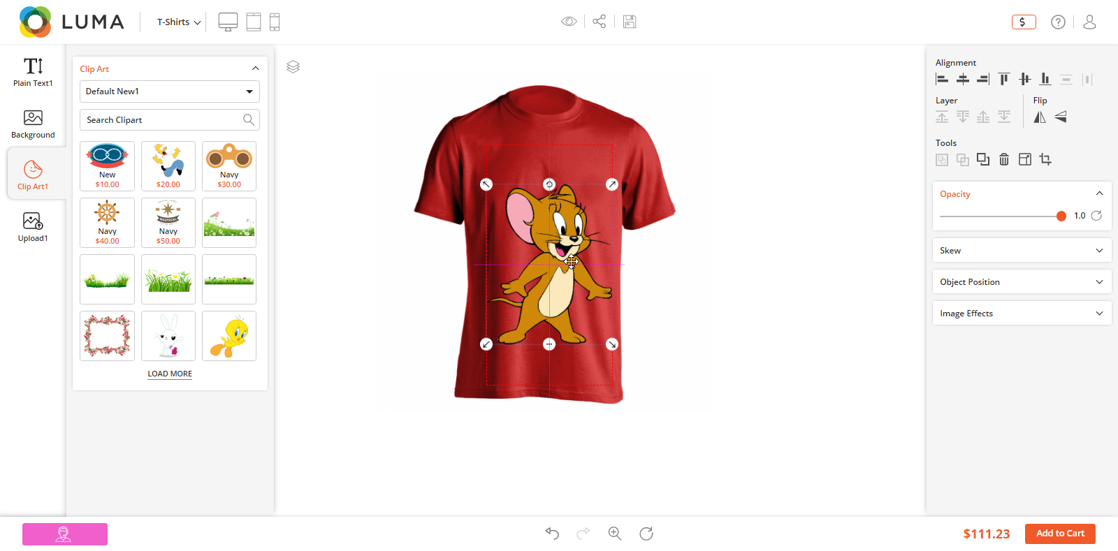
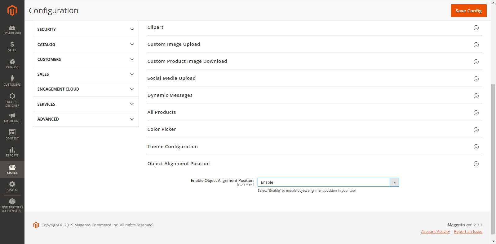
You can set the auto ‘Object Alignment’.
Stores → Configurations → Object Alignment Position
Enable the ‘Object Alignment Position’ to align any object with respect to other objects and design canvas.
THEME CONFIGURATION
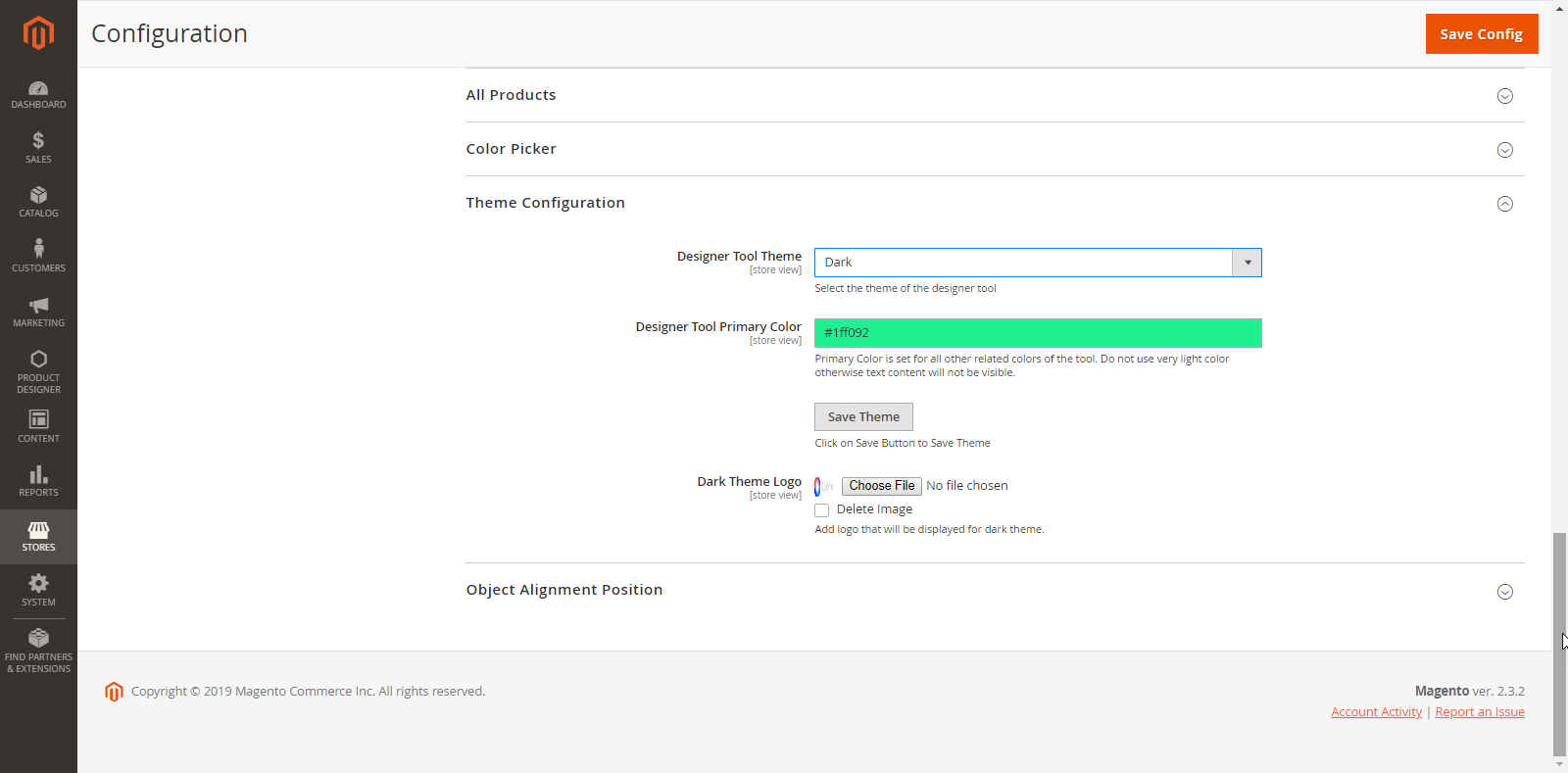
Product Designer Settings
Configure the theme of your store as you want.
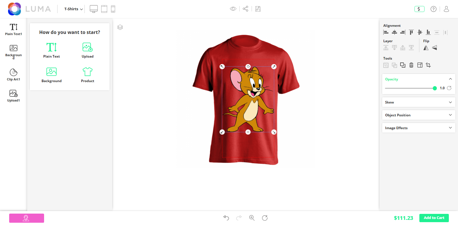
Designer Tool Theme Type: Select the theme type that will be applied for the background. You have two options:
Light: If you select the Light theme, the background will be displayed in white.
Dark: If you select the Dark theme, the background will be displayed in dark color and the “Dark Theme Logo” option will be enabled to upload a website logo in the Dark Theme.
Designer Tool Primary Color: Pick a primary color for the designer tool elements.
Dark Theme Logo: Add a logo that will display only for the Dark theme.
Delete Image: You can delete a previously uploaded logo.
PRODUCT DESIGN PREVIEW
Once the customers have finished designing their product, they can see how their printed products will look like through a “full-screen preview”.
Front End View
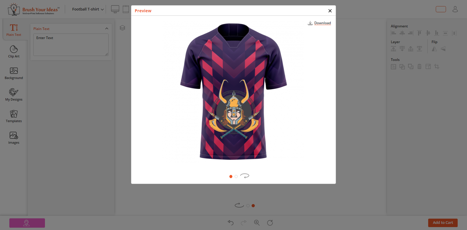
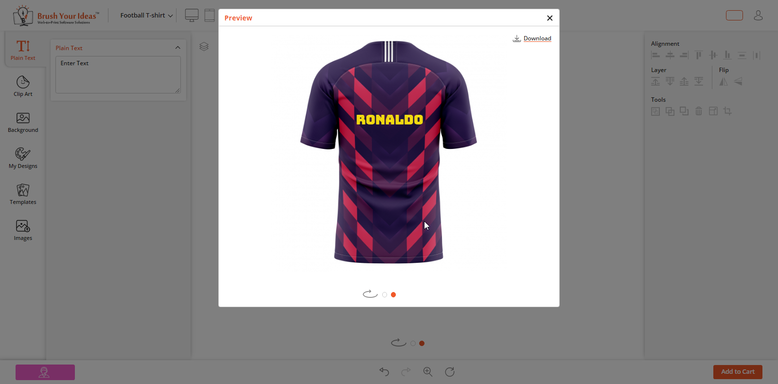
In the Product designer preview, the customers can check a preview of complete product design before placing an order. To view design in “full-screen preview”, click on ‘Preview’ icon.
After clicking a product preview icon, a preview window will pop-up on the screen displaying product with the design.
MANAGE PRINTING FILES
Back End Configuration
Once your customers have designed their products and placed the order, you can view their product designs from the Back End.
Go to: Sales → Orders
By clicking on Orders, you will get the list of the orders placed by your customers. Click on “View” from the Action Column.
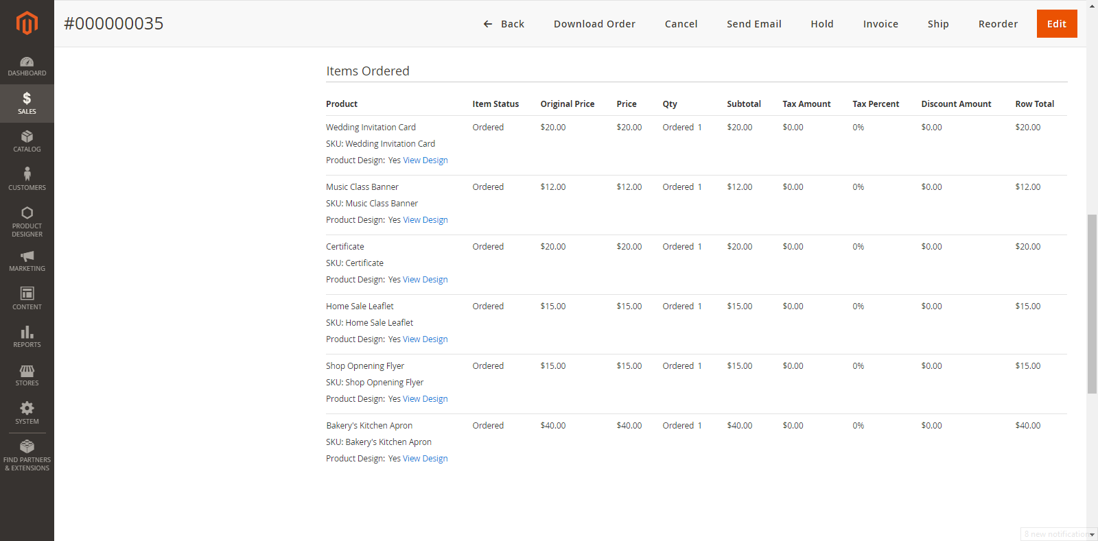
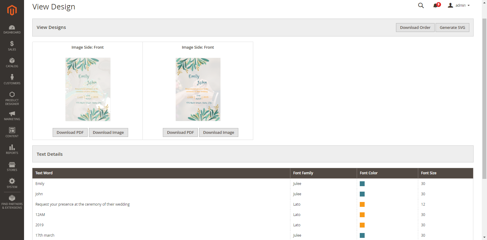
Now, navigate to the ‘Items Ordered’ section and click on View Design. By clicking on it, you will be redirected to a new tab where you can view the Product design and images with all the sides added by the customers.
You can download as per your requirement:
Download PDF: To download a particular Image in PDF
Download Image: To download a particular Image
Download Order: To download all the images
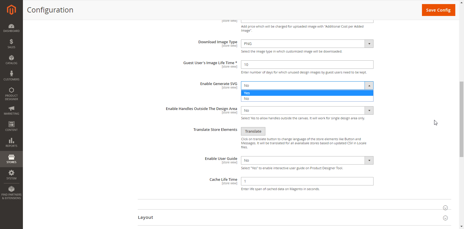
Generate SVG: To generate SVG format images.
Note: “Generate SVG” option can be enabled from the store configurations.
Additionally in Premium
Editable PDF (Vector PDF)
You can generate Editable PDF (Vector PDF) as per the following instruction:
Single Design Area
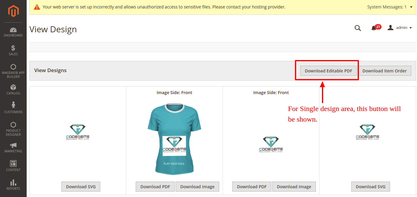
If a product which is to be printed has only Single Design Area, the SVG file will already be generated and you will get the Download Editable PDF button on the ‘View Designs’ page (On Header).
Note: The product with multiple sides having Single Design Area will also get the “Download Editable PDF” button.
Multiple Design Area
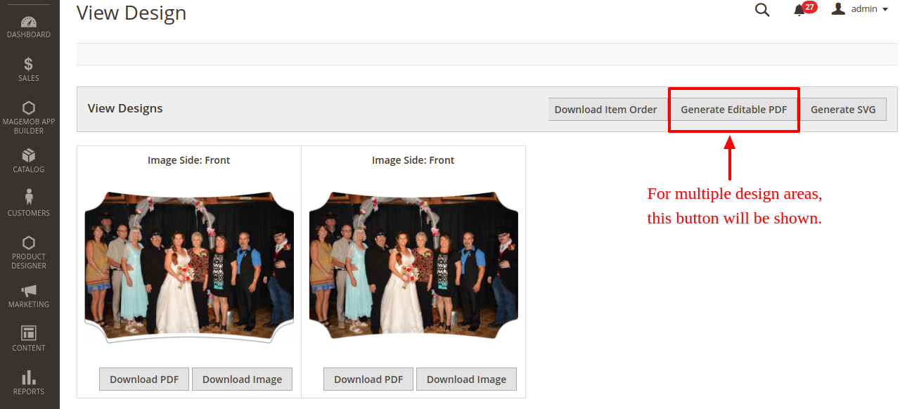
If a product which is to be printed has Multiple Design Area, you need to ‘Generate Editable PDF’ (Generate SVG) by clicking on Generate Editable PDF button from the View Designs page. It will redirect to the product design view page.
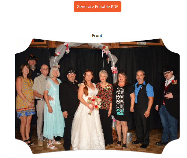
There you will find the Generate Editable PDF button, by clicking on it the ‘Editable PDF’ & ‘SVG’ files will be generated and you will get the Download Editable PDF button from the “View Designs” page.
By clicking on it, the file will be downloaded in a zip file.
Note: In case the product with multiple sides having ‘Multiple Design Area, you must generate the Editable PDF & SVG files manually as shown in the above steps.
Single Design Area + Single Side & Single Design Area + Multiple Sides
–> SVG files will already be generated and the Download Editable PDF button will appear.
Multiple Design Area + Single Side & Multiple Design Area + Multiple Sides
–> Generate Editable PDF manually. After generating, the Download Editable PDF button will appear.
Following conditions must be fulfilled for Vector PDF:
> OTF fonts do not support.
> Arc and Drop Shadow Text will not work as Editable Text for Editable PDF.
> Canvas Background will work as an image in Editable PDF, so you cannot change the background color.
CUSTOM OUTPUT
Set custom dimensions of the output files which are ready for printing. You can enter the values for height and width output files in pixels.
To set values, go to the Product Page → Product Designer option and Set your preferred height and width in Custom output width, and Custom output height attributes.
Front End View
After designing the product, the customers can share their own designs on the Social Media platform like Facebook, Twitter & Pinterest by clicking on the ‘Share’ icon. They can also share via Email.
By clicking on the ‘Share’ icon, select the social media platform. You will be redirected to the respective login credential page. After proper authentication, your amazing designs will be a part of your social media profiles.
FASTER OUTPUT
Sometimes while designing a product with so many sides taking more time while adding that product to the cart. So to overcome this the PrintXpand provides a faster output option at the product level especially when the product has multiple sides. (i.e. Sport T-shirt, Photobook, etc)
Backend Configuration
Navigate to the product which has multiple sides and requires faster output when it loads.
By navigating any product from the Designer Tool backend: Catalog → Products, scroll down to the Product details page and click on the ‘Product Designer Tool’.
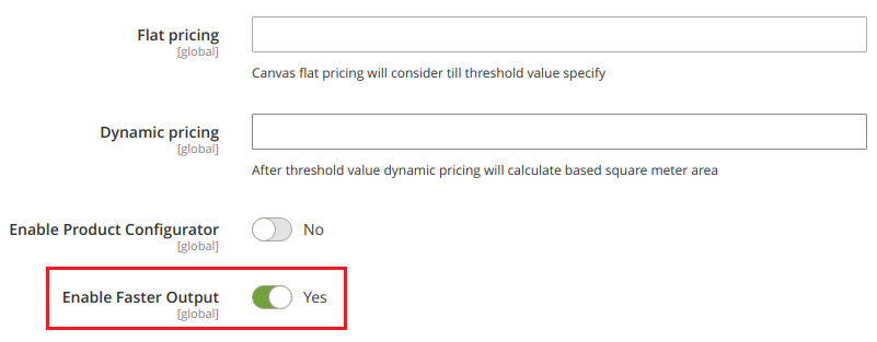
Under the Product Designer Tool, you will find the Enable Faster Output option. By enabling it, the selected product will be added to the cart without taking a long time and added fast. Adding the designed product with multiple sides to the cart process will become faster.
Note: You must have added the node from your server-side.
DETAILED LIVE PRICING
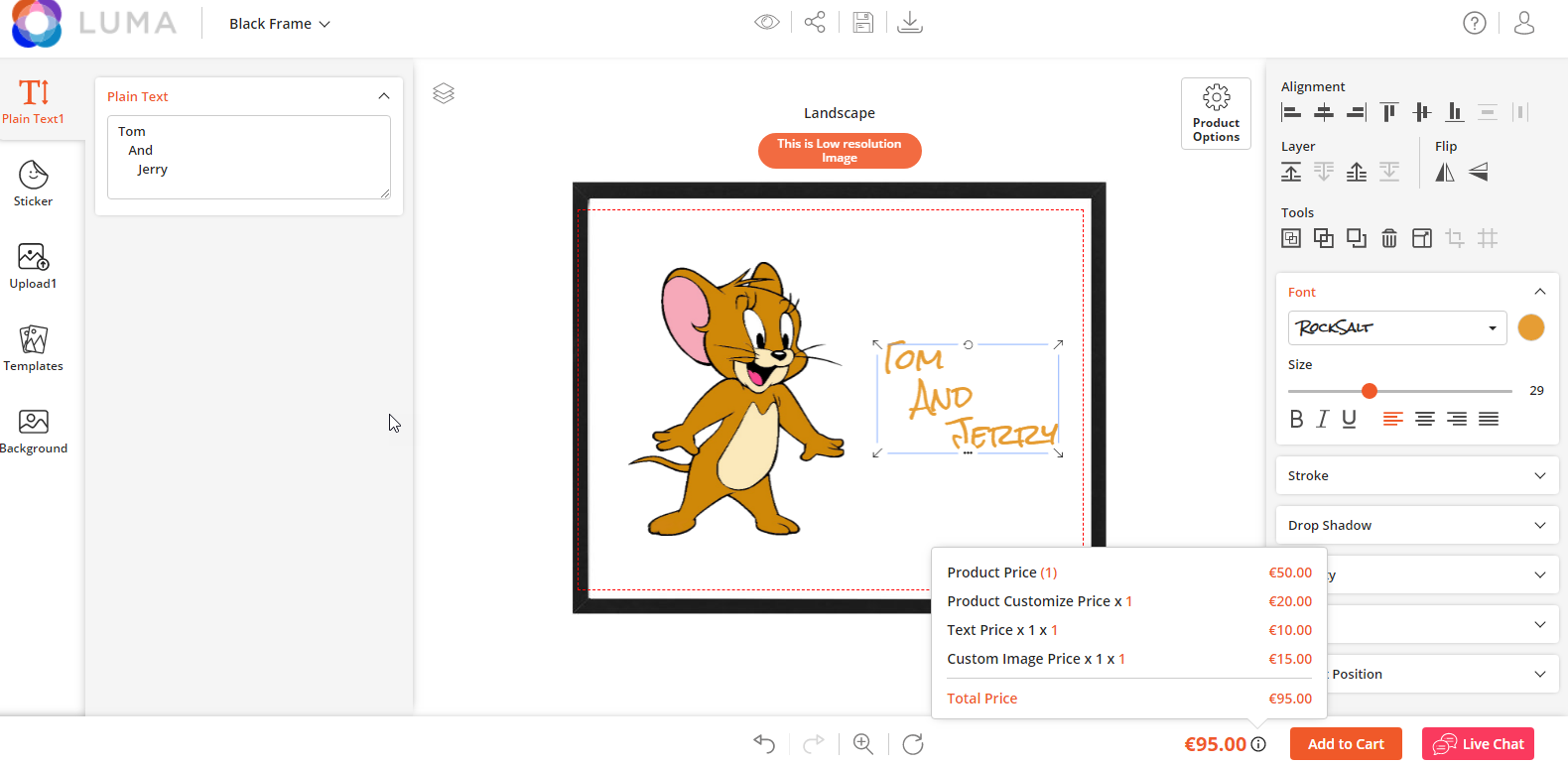
With Live price generation, customers get the complete bifurcation of design customization price on the tool itself while designing.
By clicking on the information icon next to product price at the bottom right of the tool, the user can find a total final price with product quantity, customization cost, and design object (text, image, clipart, etc.) cost.
DYNAMIC MESSAGES
Back End Configuration
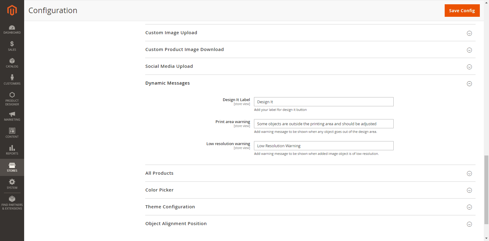
You can label the designing button and add Warning messages for Designing Area by navigating to Stores→ Configuration → Dynamics Messages.
Design it Label: From here, you can Label (name) the button that will be shown on the front end for designing.
Print Area Warning: Add a warning message when any object design is being out of the design area.
Low Resolution: Add a warning message when the customers upload a low-resolution image.
Frontend View
As shown in the screenshot, the customers will get the “Personalize It” button for designing the product. Also, note that your customers will get the designing button only if you have enabled the Product Designer. (Catalogue → Product)
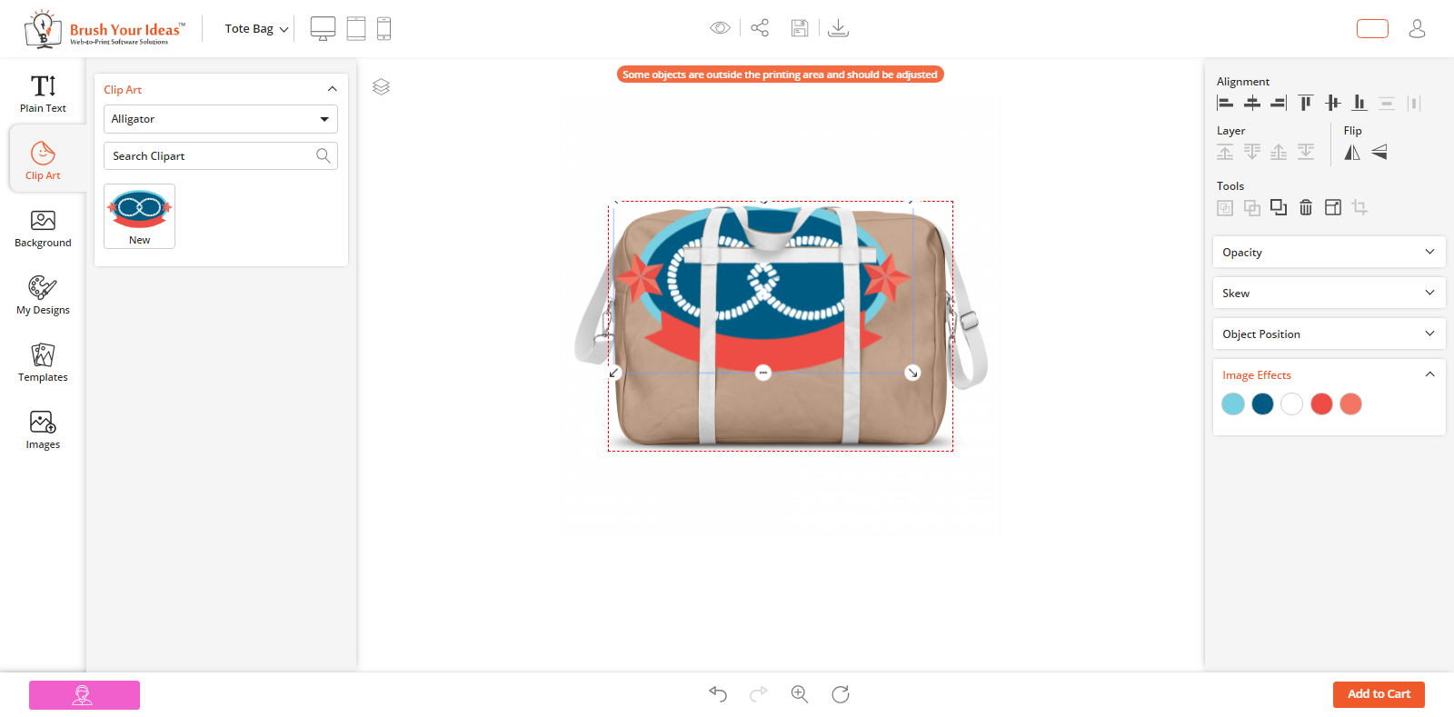
If any object is being out of the product designing area, your customer will get a Warning message as per your Back End configuration (Product Designer Settings).
If your customers upload a low-resolution image on product designing area, they will get a Warning message as per your Back End configuration (Product Designer Settings).
ALL PRODUCTS
Back End Configuration
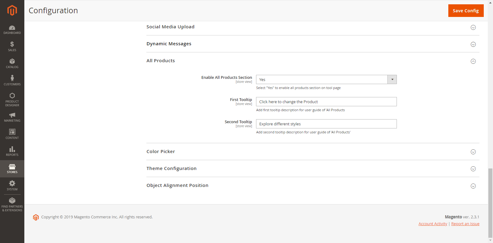
You can enable the “Products” section on the designer tool page for giving the option to change. You can show the tooltip for the Product section & option.
Go to Stores → Configuration → All Products
Enable All Product Sections: Select Yes to enable the “All Products” Section on the designer tool page. If you have selected Yes, you can add tooltip for “All Products” section and “Product options”.
First Tooltip: Add a tooltip description for “All Products” Section.
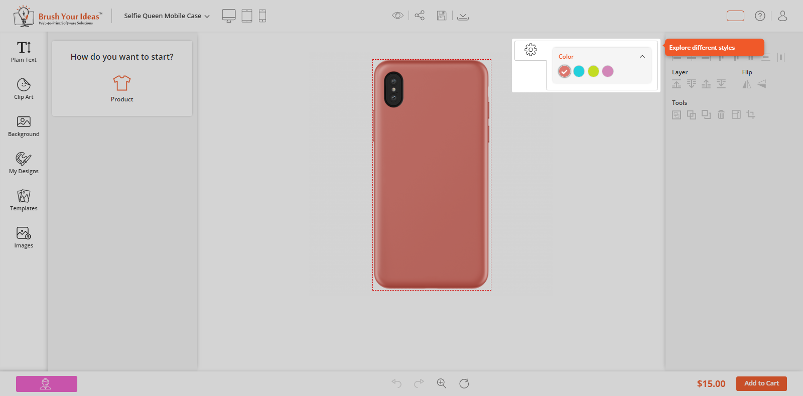
Second Tooltip: Add a tooltip description for “Product Options”. (If a Product is Configurable)
Front End View
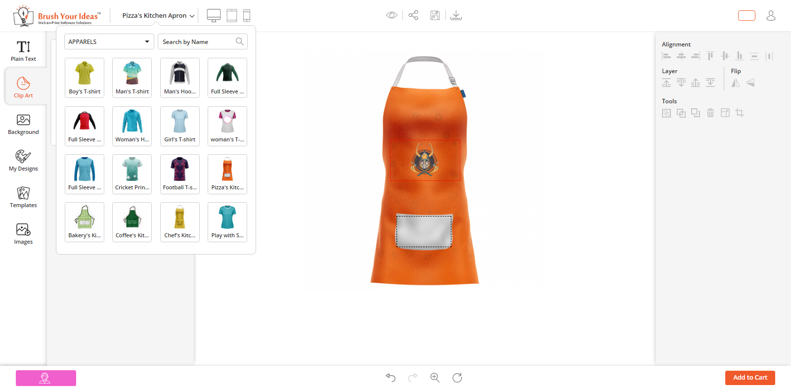
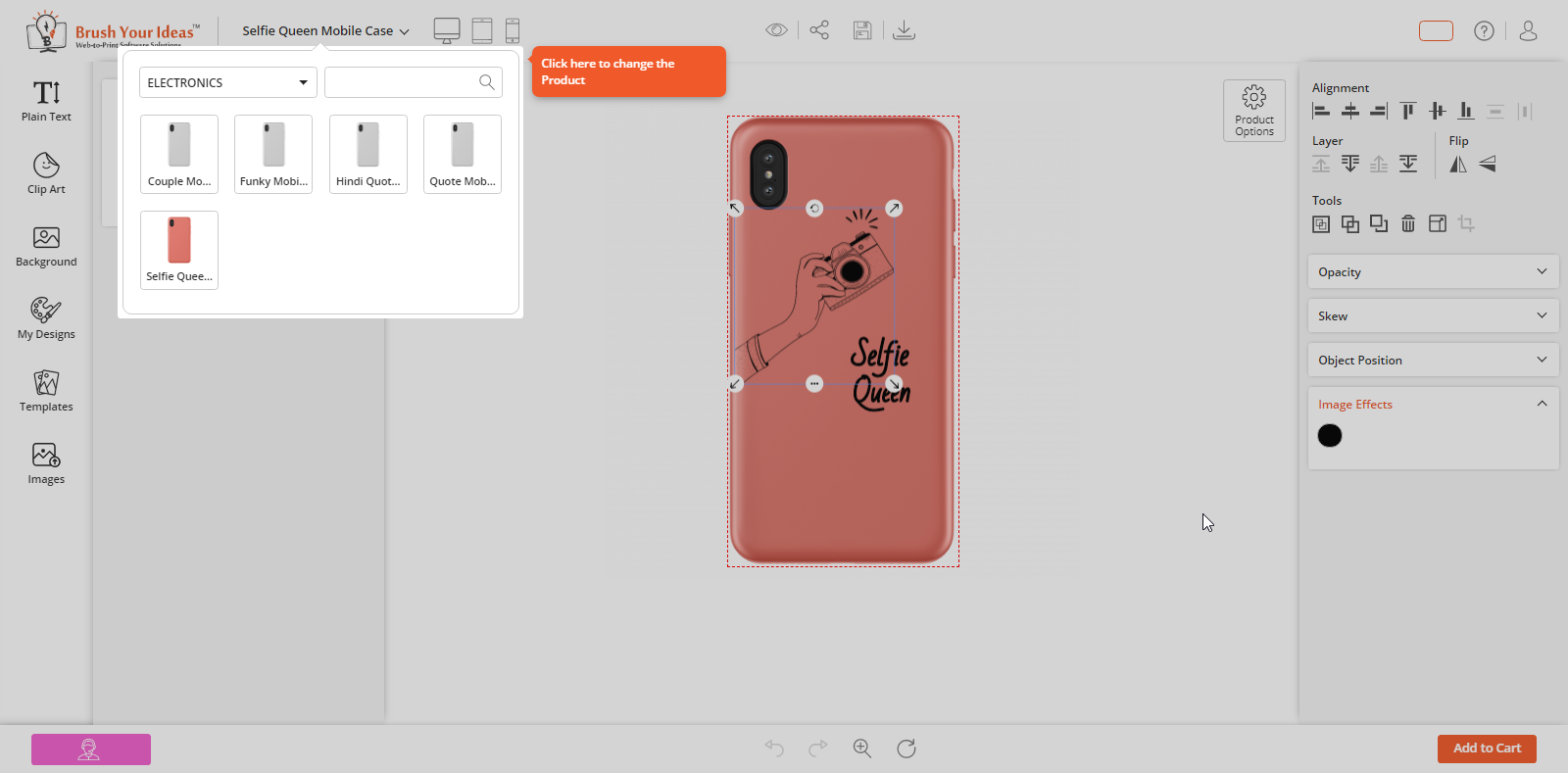
As per the Back End configuration, your customers can see the “All Products” section on the designer tool page. From here they can easily change the product.
As customers click on “All Products” section, they will see the First Tooltip. If a product is configurable, by selecting a Product from “All Products” section, they will see the Second Tooltip.
CMYK & RGB Color Picker
Everyone will love if they are allowed to pick their favorite color from the Custom Color for product designing! Yes, your customers can pick any color using the “Color Picker” feature in the PrintXpand designer tool.
Enable Custom Color Picker
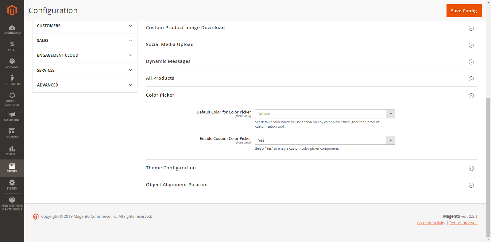
To configure ‘Custom Color Picker’ feature and to ‘Set Default Color’ appearance, go to Stores → Configuration → Color Picker
Default Color for Color Picker: Set default color that will be directly applied to the specific content when the customer adds that content into the designing area.
Enable Custom Color Picker: Select ‘Yes’ to enable the Custom Color Picker component in the Front End. So, the customers can choose their desired color from the color picker.
Enable CMYK
To enable the ‘CMYK’, go to Stores → Configuration → CMYK.
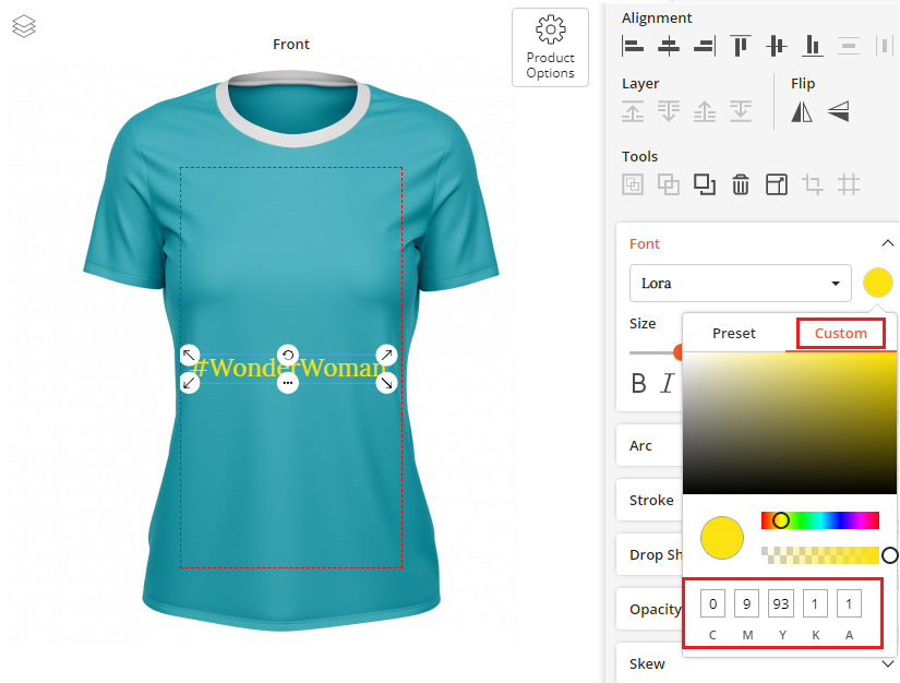
Enable CMYK to display the ‘CMYK input boxes’ in the color picker that displays the value of the selected color in that box.
Note: If you have selected ‘No’ to this option, the RGB Color picker will be appeared in the Color Picker Tool.
Front End View
After the Backend configuration, your customers can pick their desired color from the “Custom” tab.
Your customers can see the CMYK boxes at the bottom of the ‘Custom’ tab if you have enabled the CMYK. Customers can choose the color by inserting the CMYK values if they already know.
Note: If you have disabled the CMYK, the RGB Color picker will appear under the ‘Custom Color’ tab.
RULER GRIDLINE
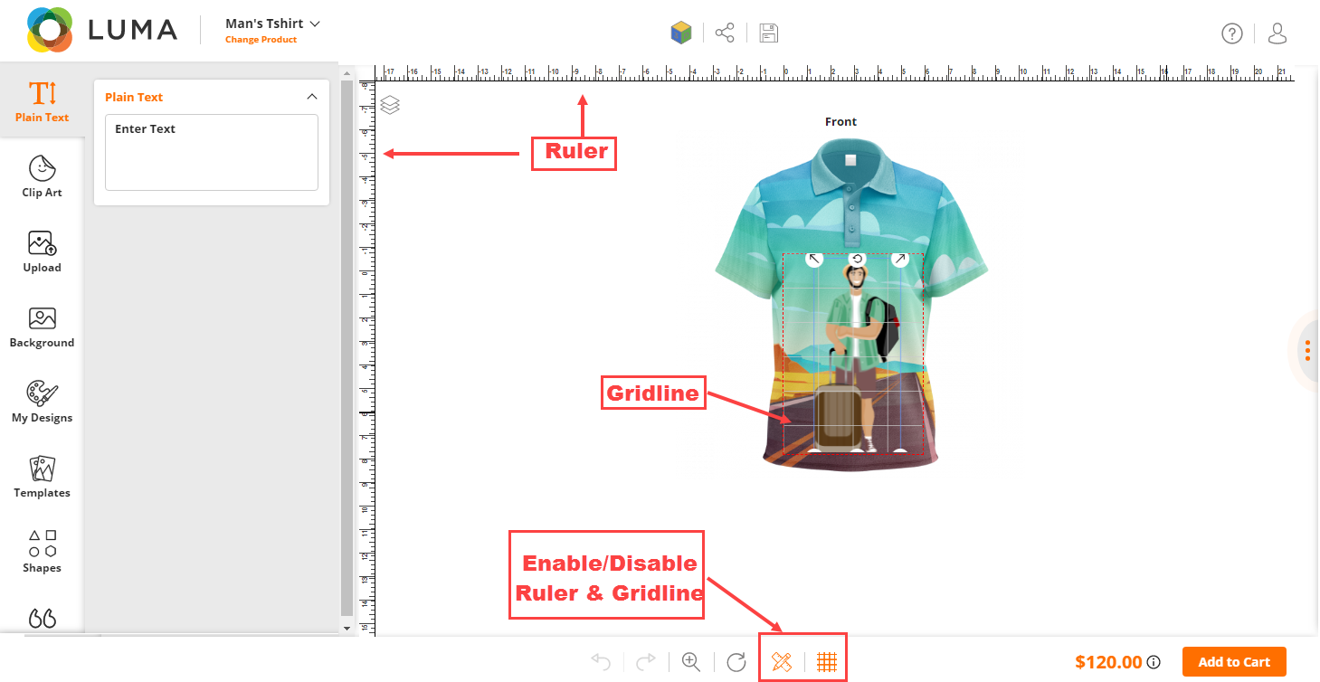
Display the Ruler and Gridline to design the product properly. You can configure the Ruler Gridline from the Stores Configuration & at the product level configuration.
Backend Configuration
Stores -> Configuration
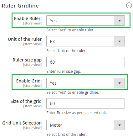
To set the fields for the Ruler and Gridline, go to the Stores -> Configuration. In the Ruler Gridline section, there are the following required fields for the admin to be set.
Enable Ruler: Admin can Enable/Disable a ruler by selecting Yes/No from the dropdown. If the admin has selected ‘Yes’ then the Ruler will be enabled and below mentioned field will be displayed.
Unit of the Ruler: Admin will be able to select the unit of the ruler among Px, inch, or cm from the dropdown. There will be two cases based on the Unit selected by the admin and they are following.
Enable Grid: Admin can Enable/Disable a Grid by selecting Yes/No from the dropdown. If the admin has selected ‘Yes’ then the gird will be enabled and below mentioned field will be displayed.
Size of the grid: Admin will be able to set the size of the grid.
Grid Unit Selection: Admin can select the unit for the grid from the dropdown.
Product Level Configurations
To enable the Ruler and Gridline for the particular product, the admin can go to the Catalog -> Products, it will redirect to the Product listing page and add/edit the product. It will redirect to the product detail page.
Navigate to the Product Designer section from the product details page, there are two fields as following.
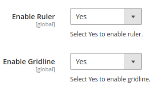
Enable Ruler: Admin can Enable/Disable a Ruler by selecting Yes/No from the dropdown. If the admin selects ‘Yes’ then the ruler will be enabled for that particular product.
Enable Gridline: Admin can Enable/Disable a Gridline by selecting Yes/No from the dropdown. If the admin selects ‘Yes’ then the gridline will be enabled for that particular product.
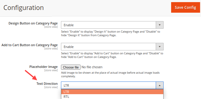
TEXT DIRECTION (LTR <-> RTL)
You can change and Product Designer Tool layout position & all the text direction from LTR to RTL.
Backend Configuration:
To change the text direction and layout position “Left to Right” to “Right to Left”, navigate to the Stores -> Configuration -> Product Designer Tool.
Under the ‘General’ settings, you will find the “Text Direction” setting to change the Text direction & the layout “LTR to RTL”.
USER GUIDE
With this feature, you can help your customers utilize all the main tabs and designing features properly. These will work as tips and guide your customers throughout the designing process.
Back End Configuration
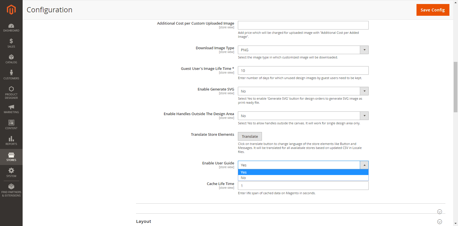
First, you must enable the User Guide option from the Stores → Configuration → PrintXpand → Product Designer Settings → General. From here, you can enable the “User Guide” by selecting Yes.
Now, you can add the interactive User Guide keeping the Main Tabs in mind.
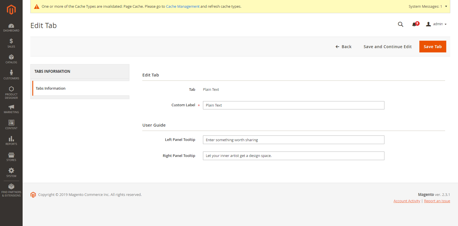
For that go to Product Designer → Manage Tabs.
Here, you will get the list of all the Main Tabs.
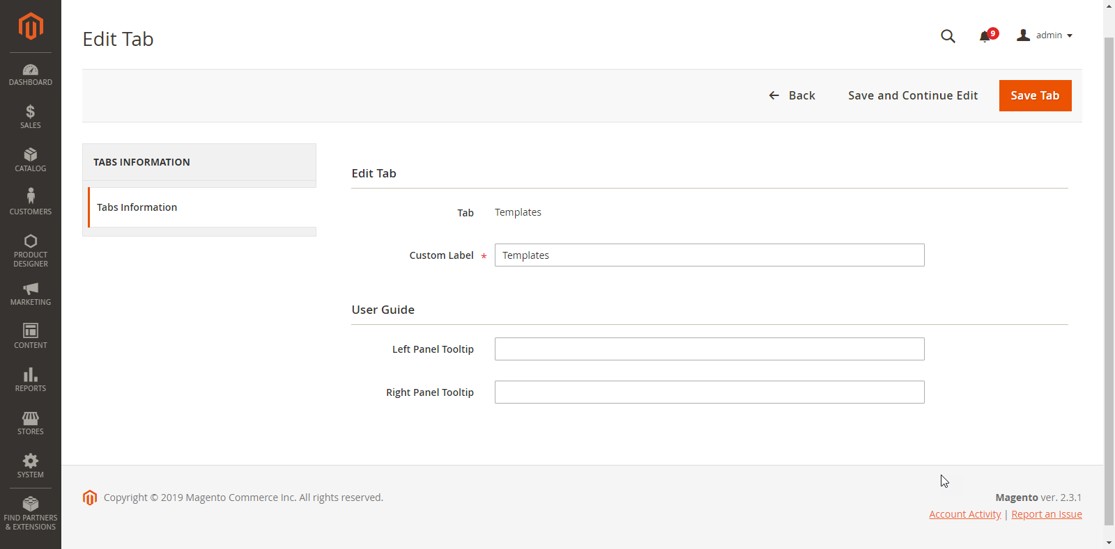
By clicking on the ‘Edit’ option under the ‘Action’ tab, you will be redirected to the Tab Detail Page.
Now, under the User Guide heading, you can add respective text in “Left Panel Tooltip” & “Right Panel Tooltip”.
Front End View
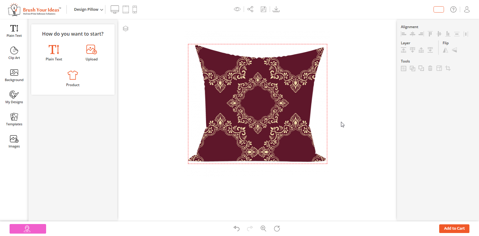
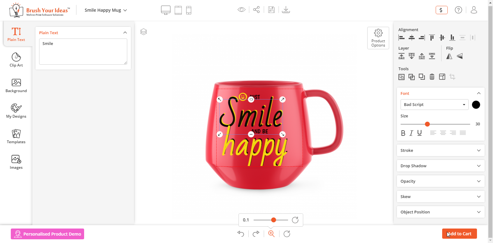
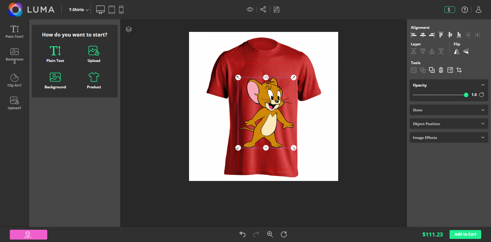
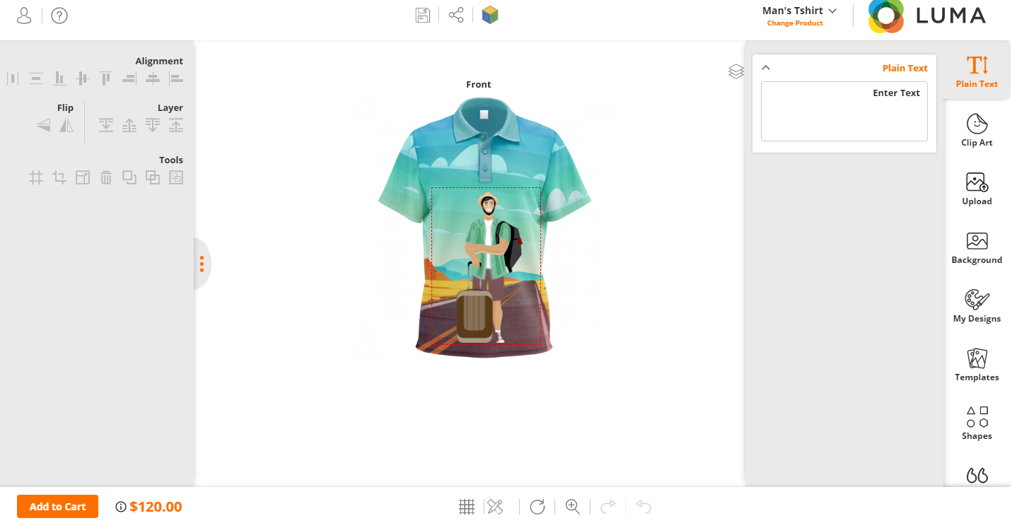
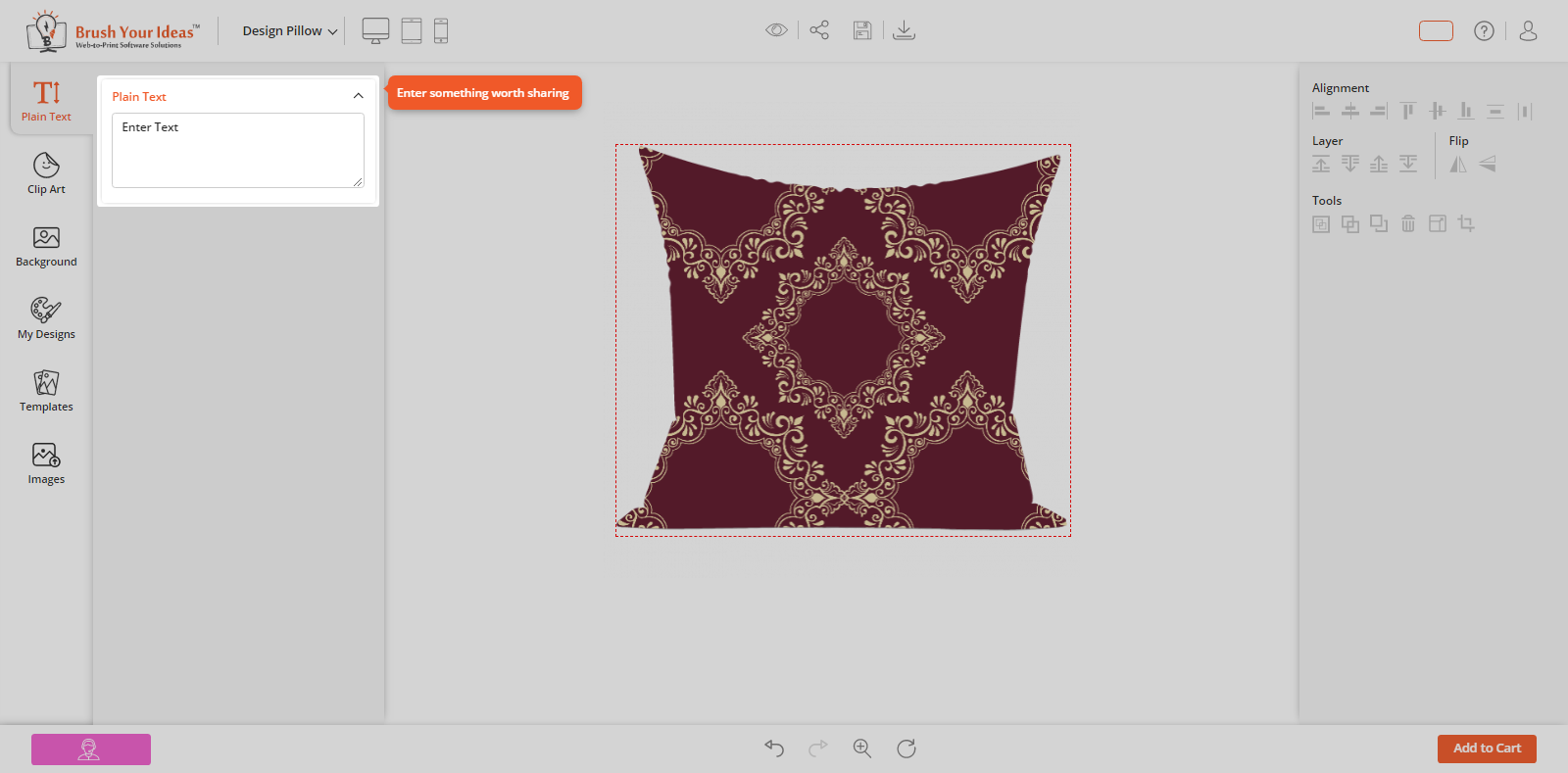
After Back End configurations, the customers will get the User Guide by clicking on any Tab which is located on the “How do you want to start “page. You will get this page by clicking on the ‘User Guide (Help)’ icon above the Designer Tool.
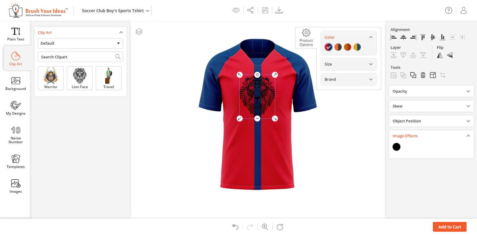
If you have added a short message in the ‘Left Panel Tooltip’ from the Back End, your customers will get the User Guide message on the left side.
If you have added a short message in the ‘Right Panel Tooltip’ from the Back End, your customers will get the User Guide message on the right side.






SOCIAL MEDIA SHARING
Sharing our creative ideas on social media is always exciting. Our PrintXpand designer tool lets your customer share their own design on social media directly through the product designing tool.